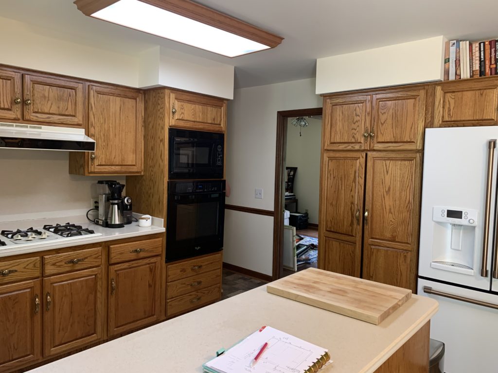
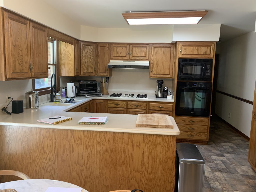
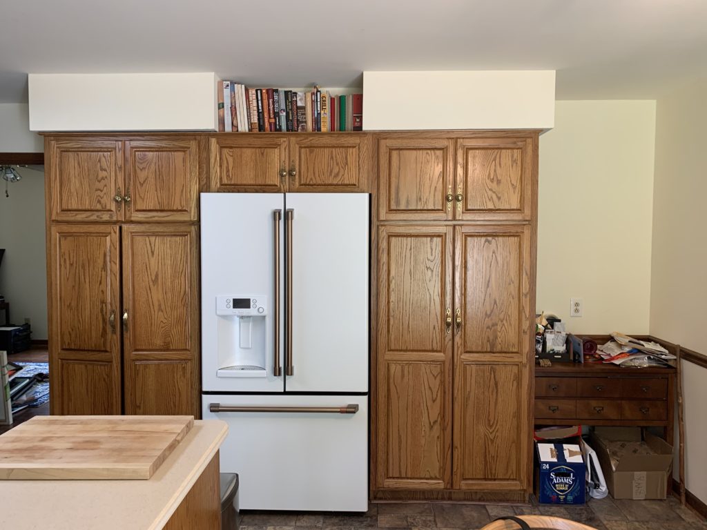
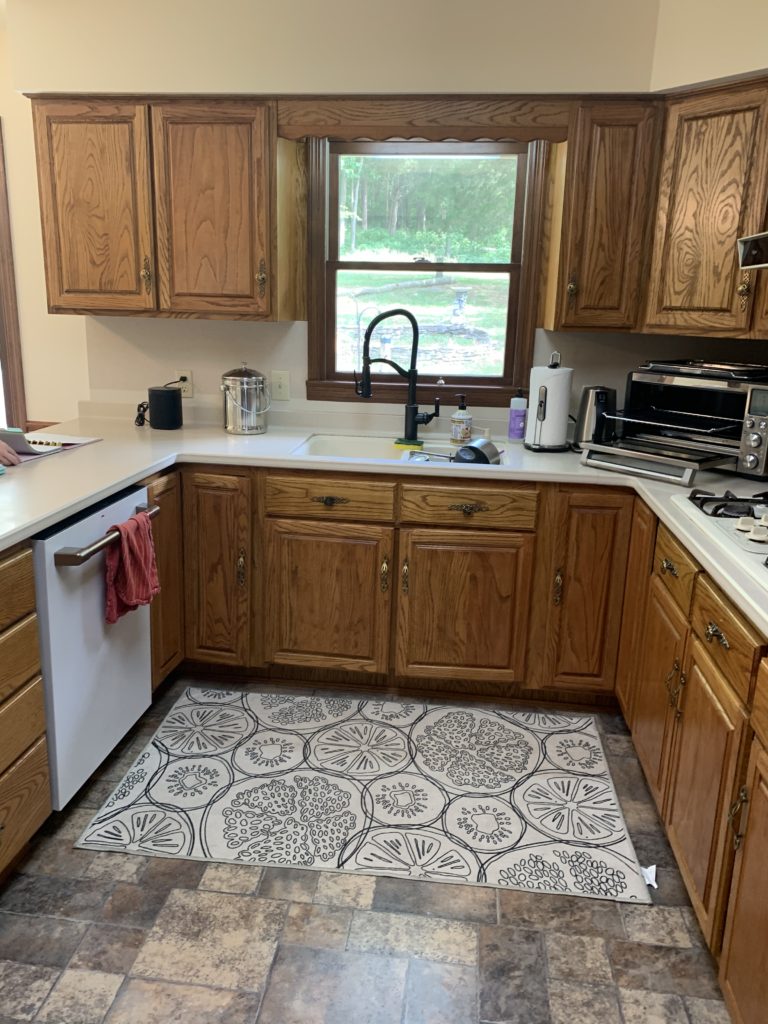
When we met this client, we knew the goal was turning this traditional 80’s ranch Kitchen into a more mid-century modern one. They wanted a Kitchen that was clean and bright. We needed to make the layout more functional, update the finishes, and for goodness sake – take out the soffits! Why does every Kitchen from this era have them? I know the answer, of course, it just isn’t a good look. Not to worry, we had a plan.
Here is how we designed their new Kitchen:
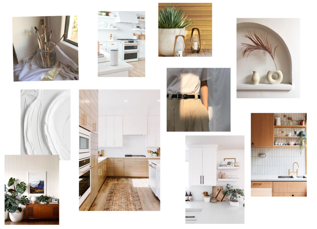
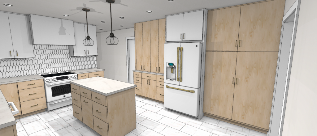
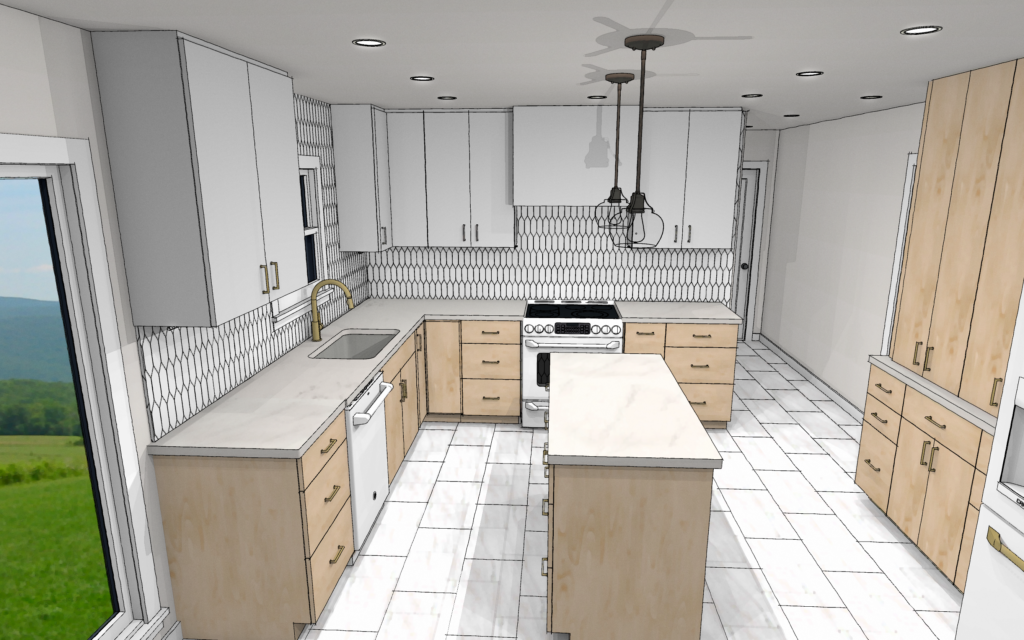
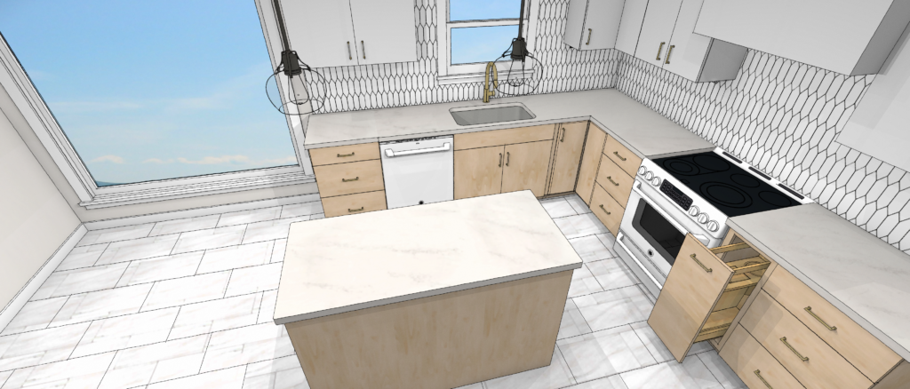
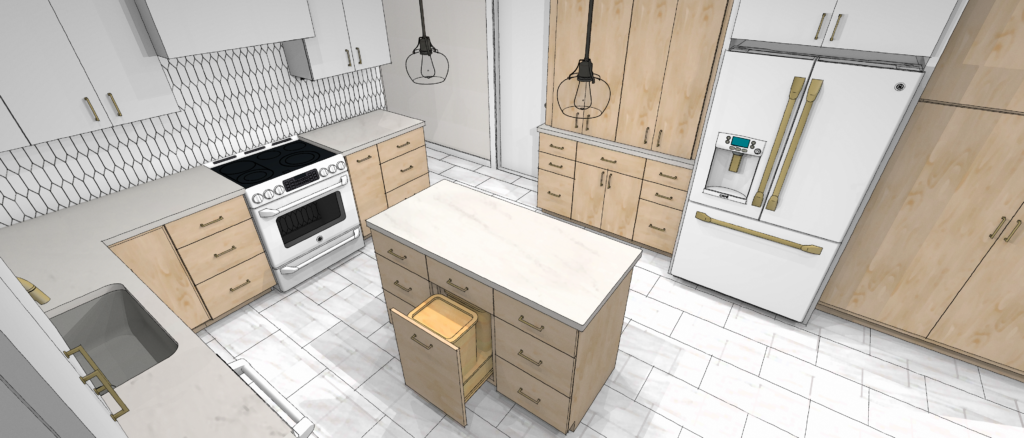
Knowing the things we were keeping, like their new Cafe Series Fridge and Dishwasher, we built the room with that and the aesthetic they wanted. There are two things we do as we are building the concept. The first is coming up with functional floor plan layouts, making sure everything is up to code and industry standards. We also build the design direction with a mood board and material presentation. Below is some of what we showed our client. This couple was so much fun to work with. Both of them are very creative, so we had fun exploring and putting their concept together. We knew they wanted a Modern & clean look. They wanted to brighten the room and let texture tell the story. Natural elements pulled the finishing touches together.
The Design
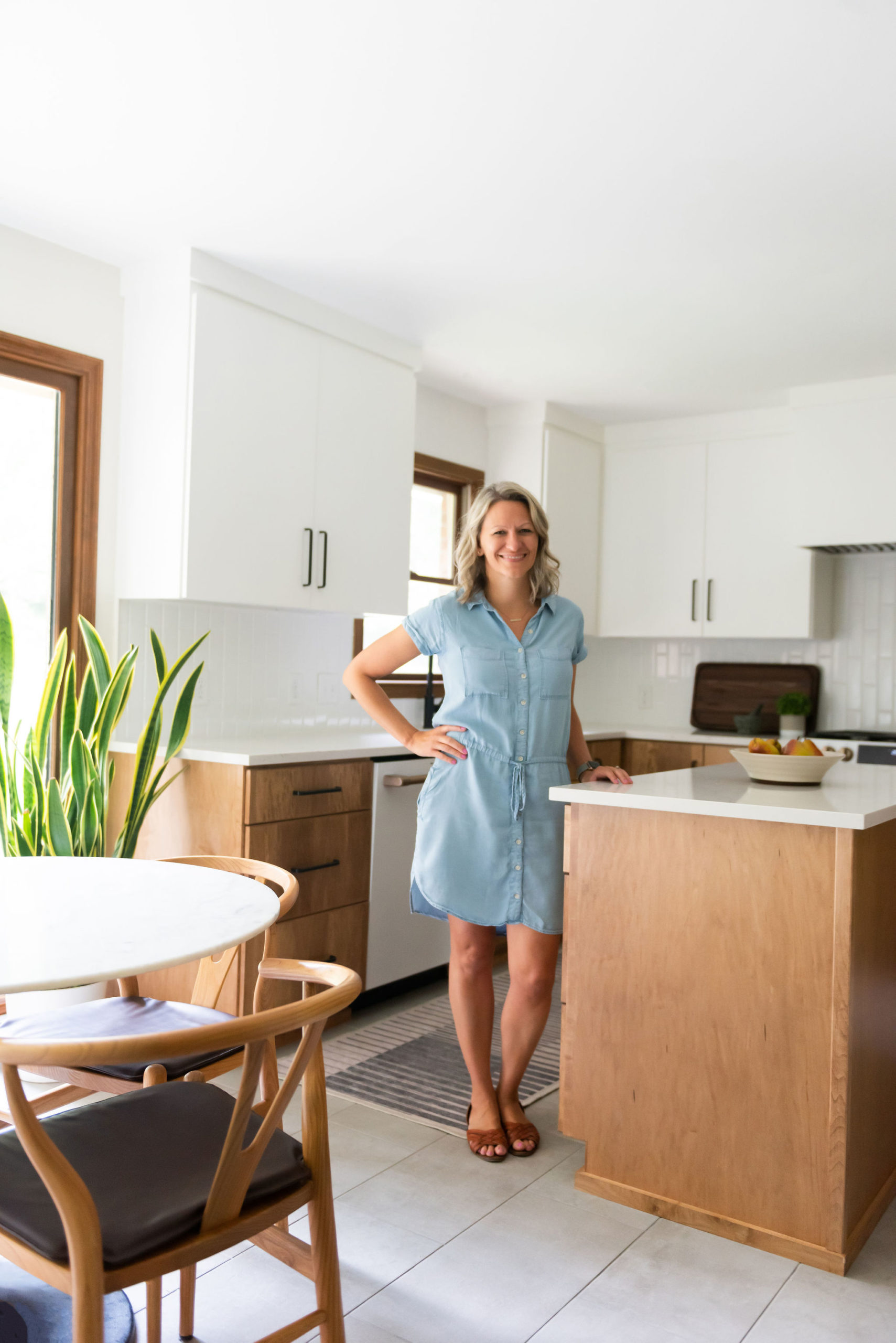
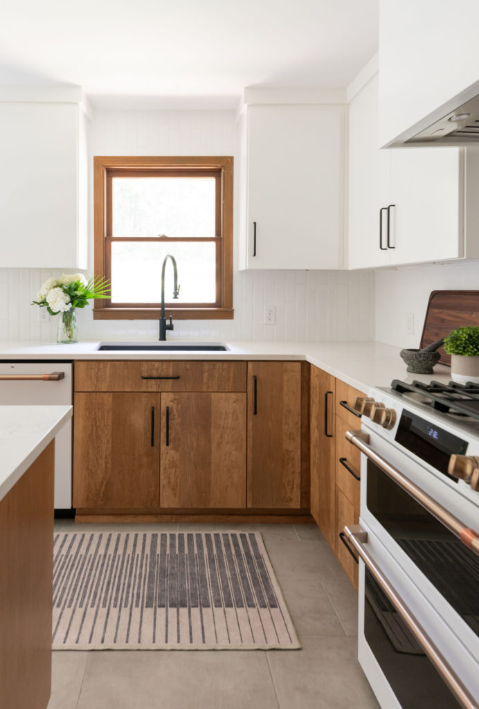
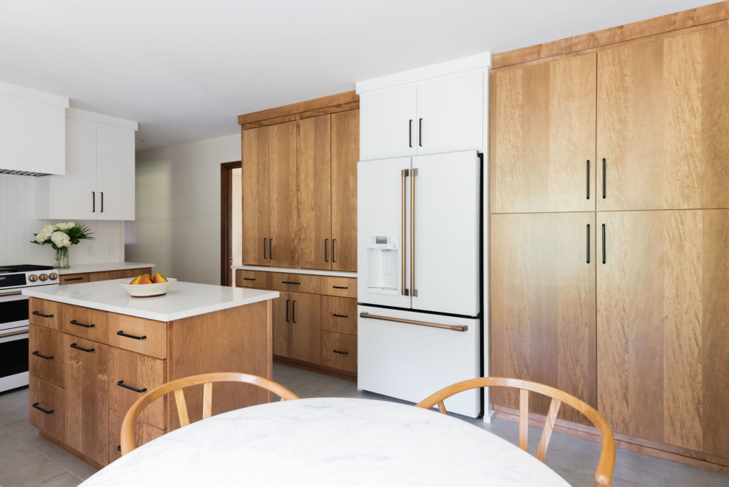
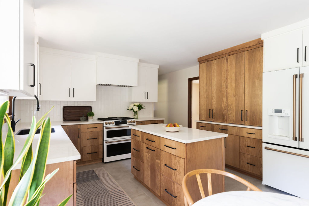
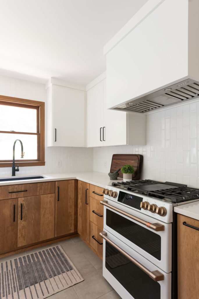
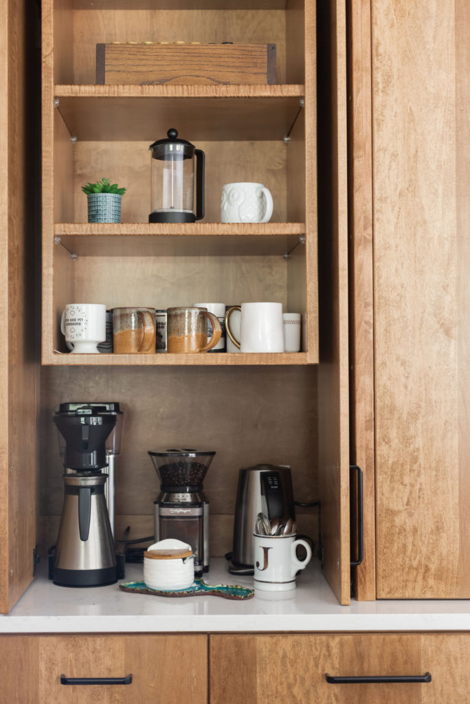
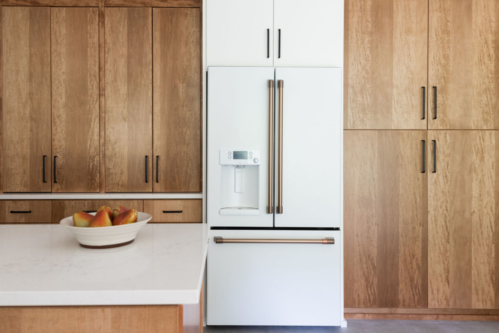
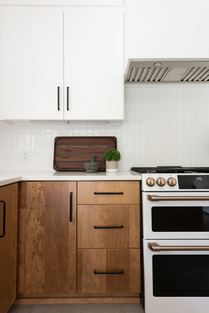
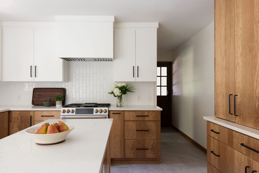
We took out the peninsula and gave them an island. Anytime our client has room, we like to do this. It opens up the room and its passageways making the room more accessible from all points. What was once an unused corner (on the right side of the fridge) was now an incredible pantry area. The cabinets on the left side of the fridge are housing all the small appliances and they can be closed off in an instant. The result is a clean wall and now without a soffit, we were able to take the cabinets to the ceiling, elevating the whole room. Since the client was going to do the Cafe Double oven, we were able to give them more counter space and room to work. We love how the white wall cabinets lighten the space and are a nice balance paired with the warm wood.
After
We absolutely are smitten with how this Kitchen turned out! From the beautiful cabinetry and finishes to the entire layout, it is exactly what they wanted and now fits in perfectly with their mid-century modern style.

What they had to say
“We absolutely could not be happier! She worked with us on the layout and features of our new kitchen, went shopping (multiple times) with us for materials and fixtures, helped us pick a contractor (who we also loved), and helped maintain a high standard of work throughout the project…even with a few tile SNAFUs along the way. We will be using Monarch Lane again, for sure!”
Builder | Kingdom Builders
Photographer | Ruby & Peach – Allison Elefante
Be the first to comment