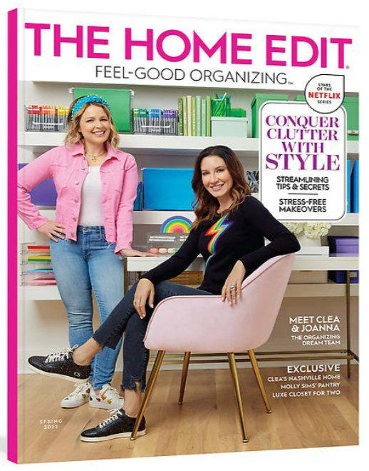
Today we want to share with you a project that was recently published with The Home Edit magazine.” (pages 31,38,39,94) In this project we worked with Kingdom Builders and architect, Anna Bowlds to add an entire adult wing over the garage and house.
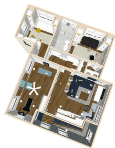
To the left you will see an overview plan of the project. Let me walk you room by room so we can show you what we did!
This wing included a living area to watch tv with a kitchenette with seating area. Right off the Living and through the arched iron doors is a swoon worthy home gym that would get you excited to work out. Past the living room is hall with two offices for the home owners and a full bathroom in between.
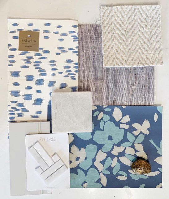
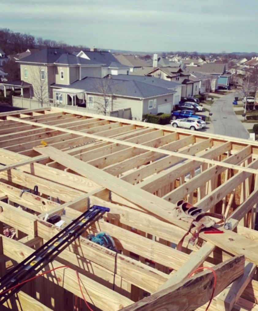
From Inspiration to completion, a lot happens in between. We make sure every detail is thought through, selections are final, and a great drawing set is ready for the builder.
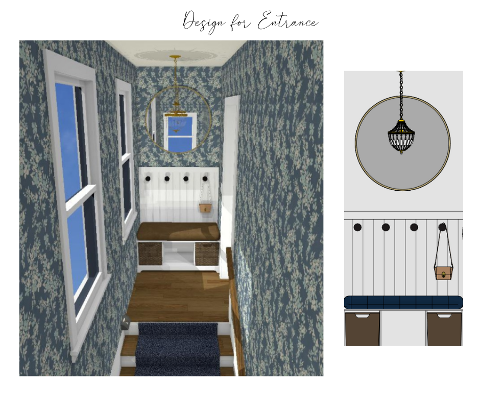
We needed a WOW moment when you entered this Adult wing!
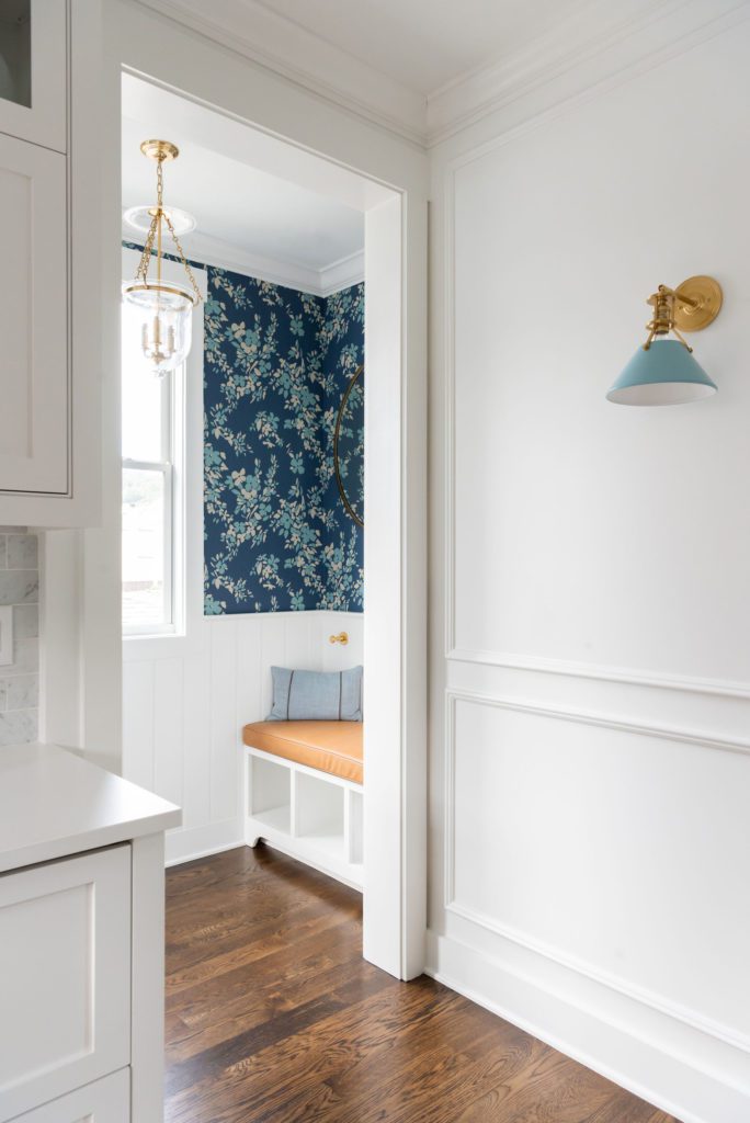
The home owner has amazing taste and was excited about lots of color and pattern. So we got the opportunity to show off bold fabrics and wallpaper throughout. This L-shaped stairwell is enveloped with this great floral pattern. It is truly a happy paper that sets the tone for the space you are entering. See below for the after photos of this entry.
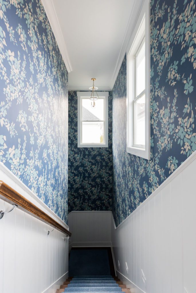
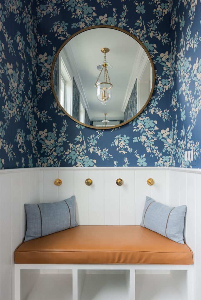
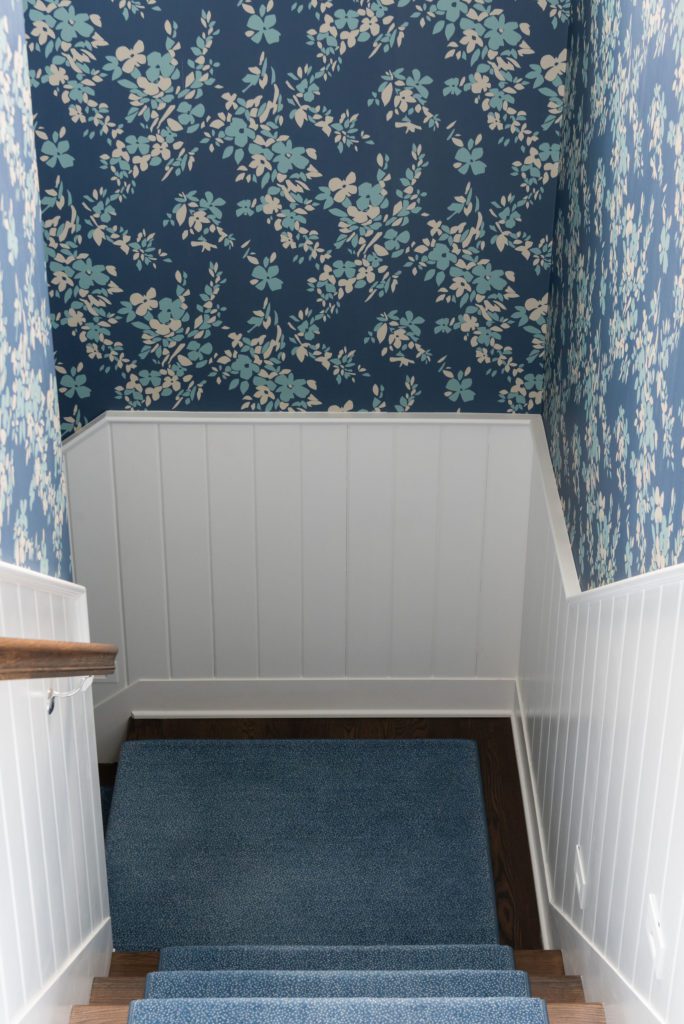
We had V-groove wood molding to break up the wall, but made sure to put this fabulous wallpaper to the ceiling which accentuates the height of this stairwell. Who doesn’t love a great entry bench to drop your bag or shoes? This custom leather bench and pillows are the perfect compliment to the wallpaper.
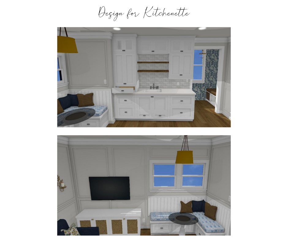
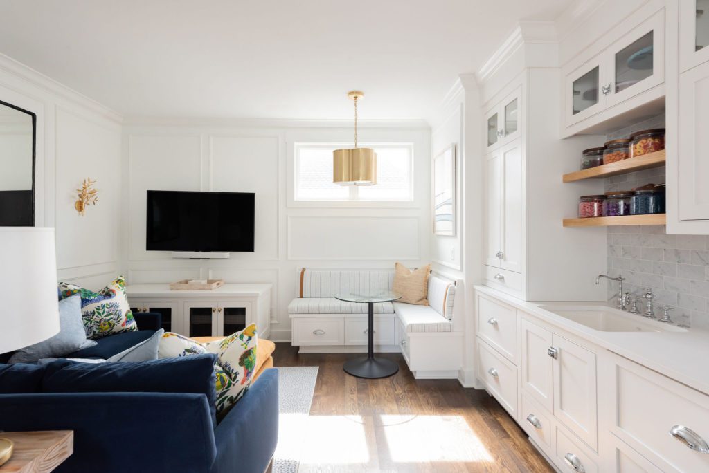
When you arrive to the top of the stairs, you enter the Main Living Area. Like all Bonus type rooms, it ends up serving multiple purposes. In this space we have a kitchenette, Corner Banquette area for seating, and TV hang out area. The perfect place to gather with friends or family!
Below is the afters!
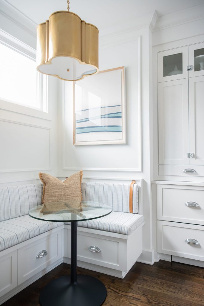
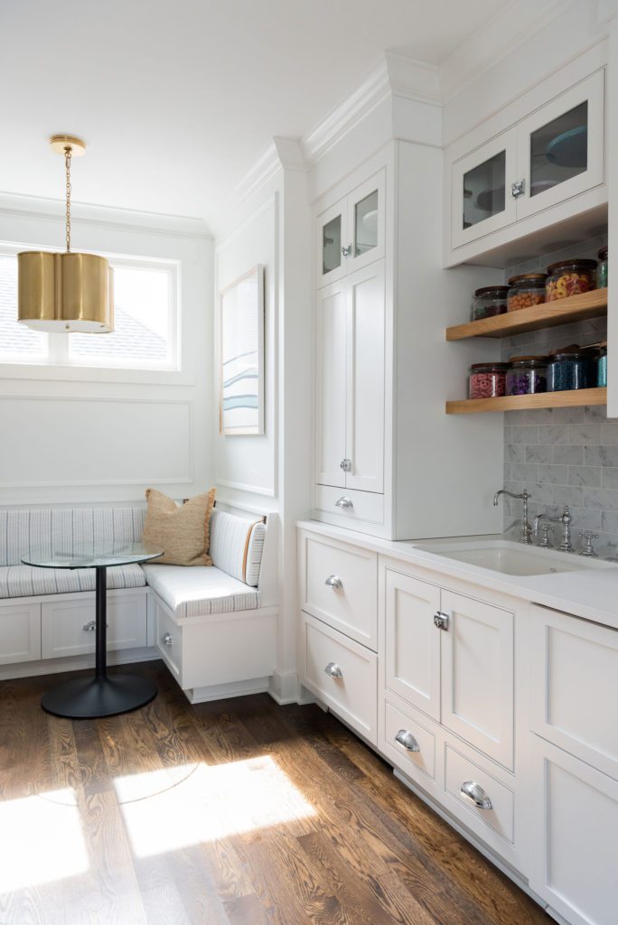
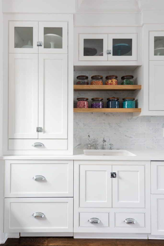
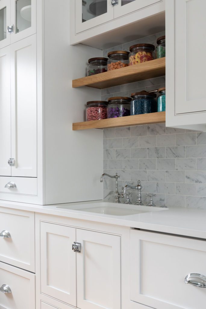
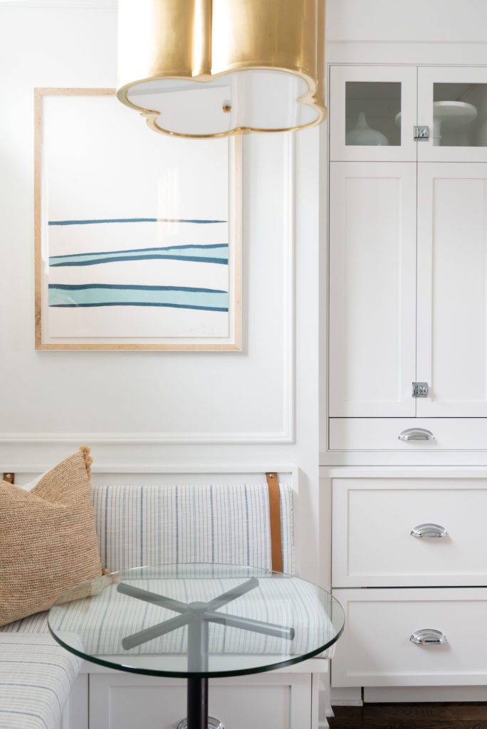
When designing the custom cabinets, we knew a banquette would be a great space saver while allowing balanced seating, room to walk through, and a designated place to enjoy a bite to eat.
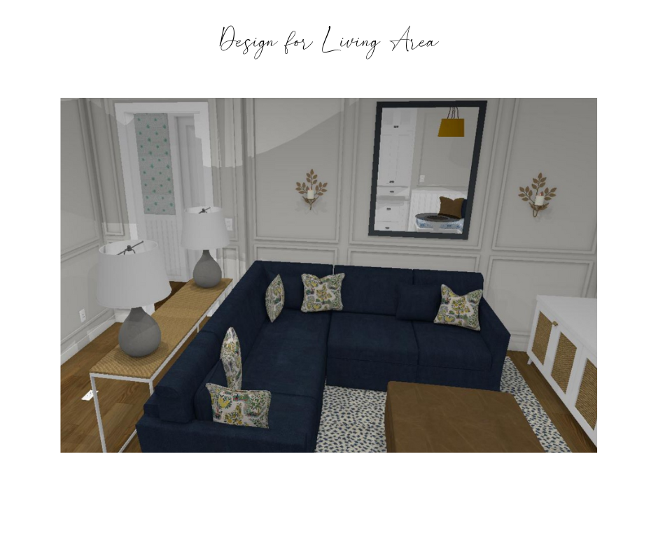
Creating a very sophisticated palette of navy and white, we balanced it with warm leathers, wood, and gold light fixtures. The pillows are a whimsical touch to this gorgeous room. Adding the floor to ceiling picture frame molding elevates the style and adds to its classic nature. See how the design turned out below.
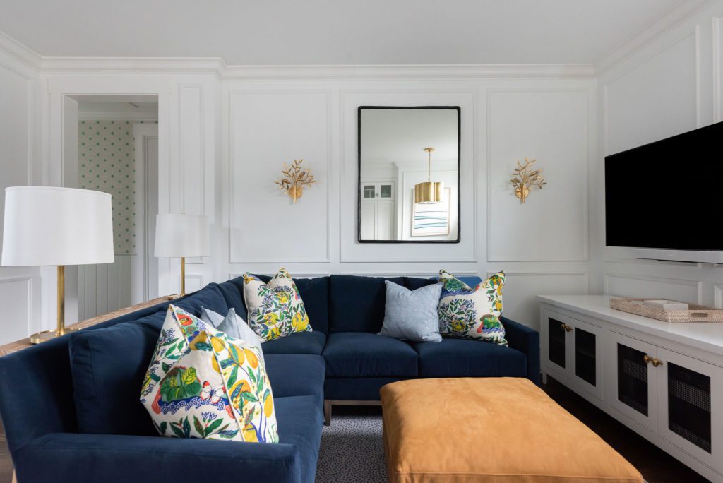
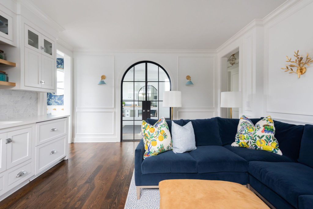
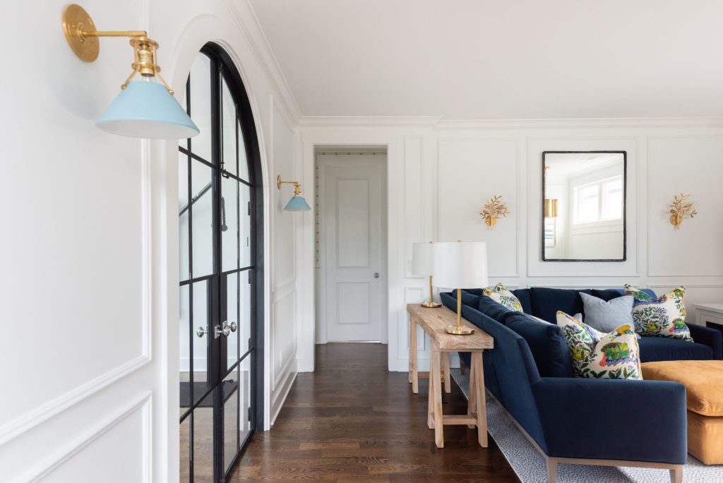
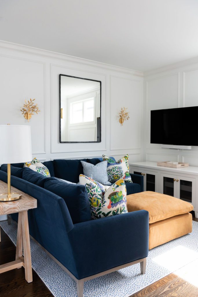
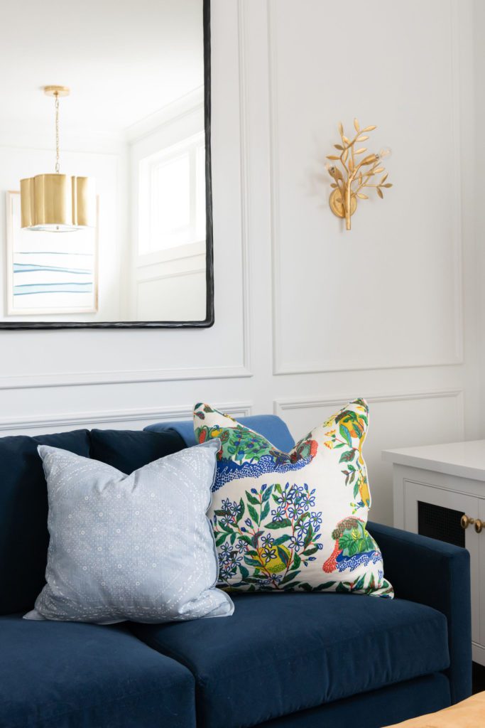
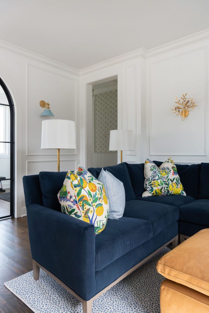
This Living Room turned out exactly like we hoped! It is rich, cozy, and sophisticated!
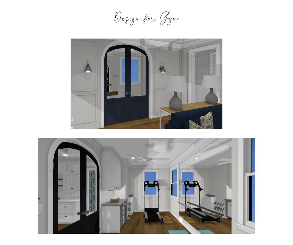
Located directly behind the Living Area & Kitchenette is the gym. Lets just talk about how fabulous those metal doors are! While the drawings don’t show the door exactly, we knew the arched iron door was going to yet another show stopper! The goal in this room was to be so clean and joyful so that you would want to go work out. See photos below.
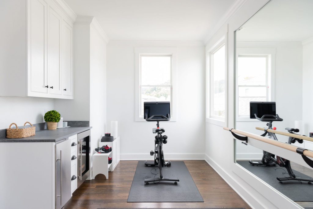
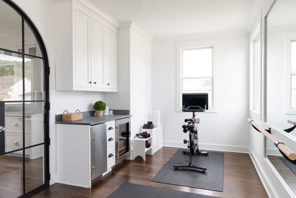
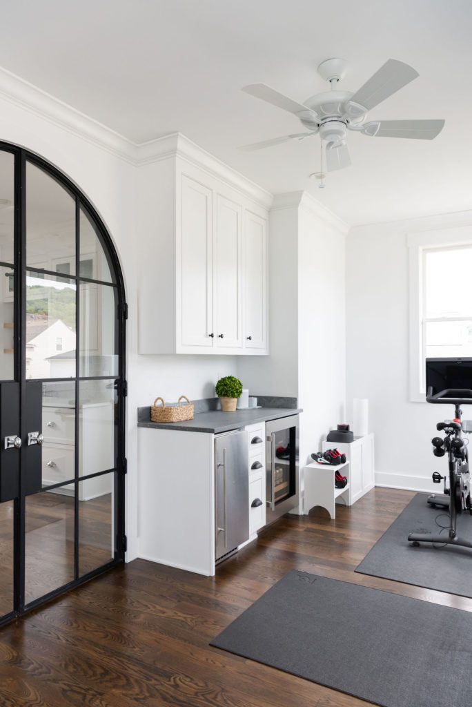
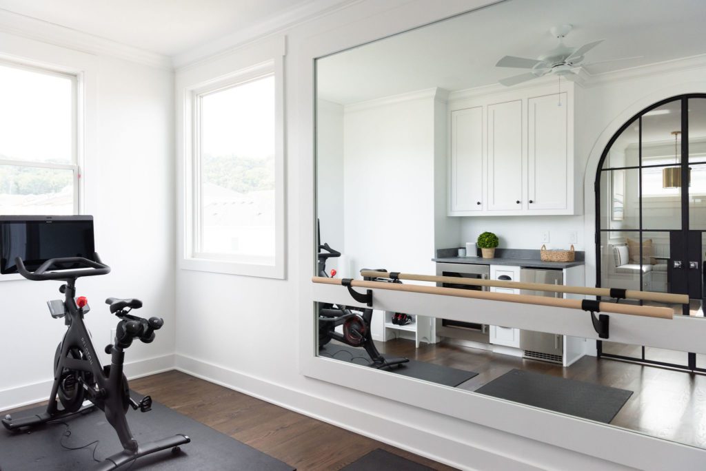
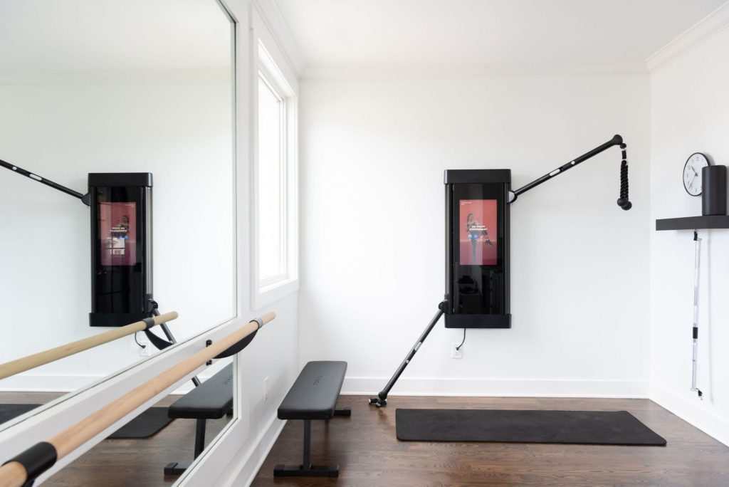
We put a lot of care into the space planning for this room. Once we found the perfect layout, we needed to make sure that we had the proper backing to handle the heavy equipment, huge custom mirror, and ballet bar. Even though we have a Kitchenette in the next room, we decided this room also needed a place to grab a cold water, some ice, and store towels and other equipment. We even have a cubby in the corner that was built for yoga mats and shoes.
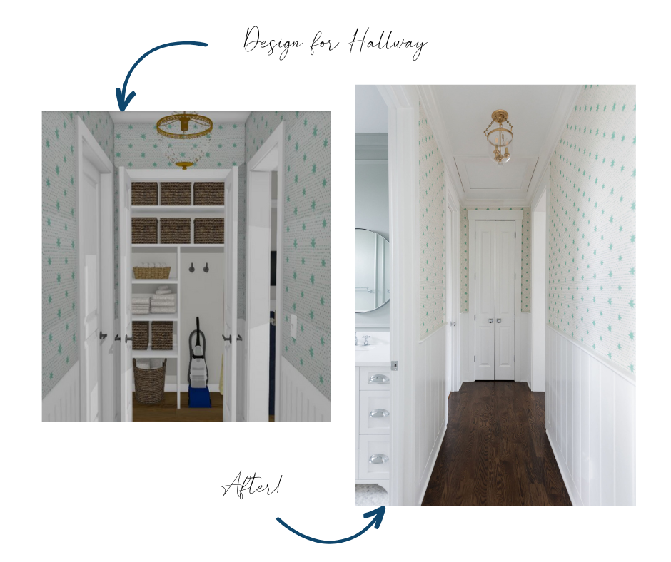
Beyond the Living Area is a Hallway that leads to two Offices for the homeowners and a Full Bathroom in between. Making sure to make every space intentional and beautiful, we adorned this hallway with this playful star wallpaper and repeated the V-groove board wainscotting. The closet is organized with back stock for the entire addition and electrical components to charge the vacuum.
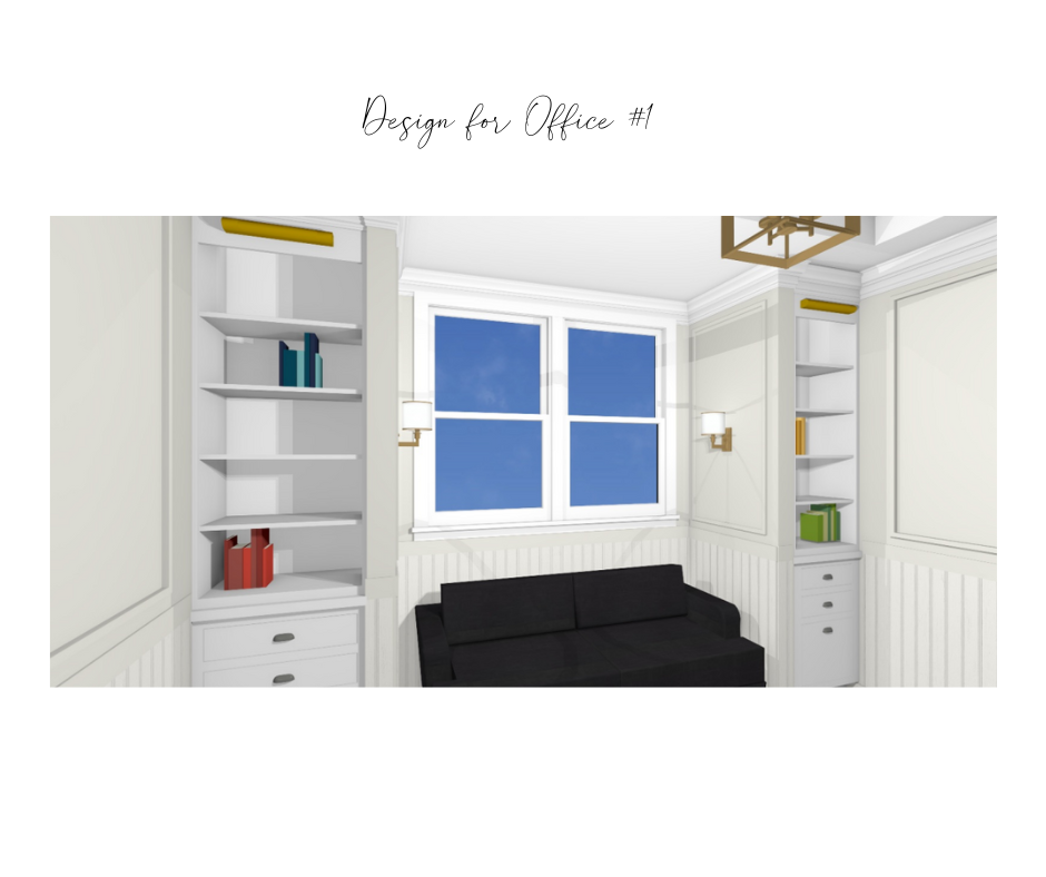
The first Office down the hallway was for my client’s husband. What I love is that he never saw the design and never saw it during construction, but when it was ready, he loved it and has enjoyed it! I just love a good reveal story! My drawing above cannot do it justice! Check out how it came together below.
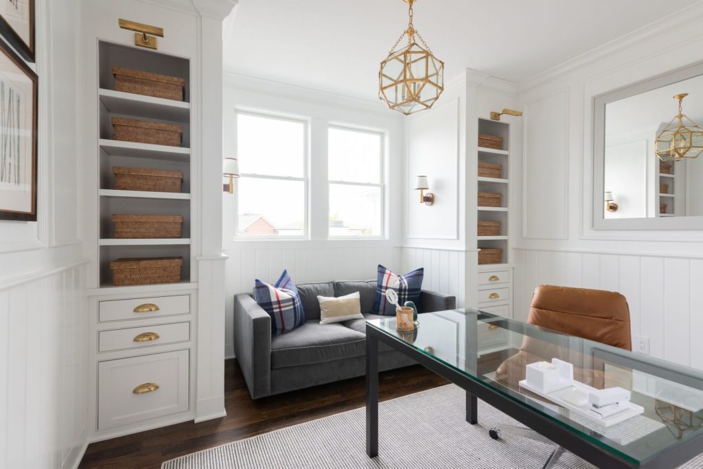
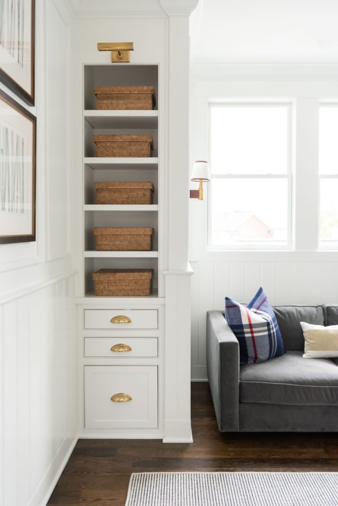
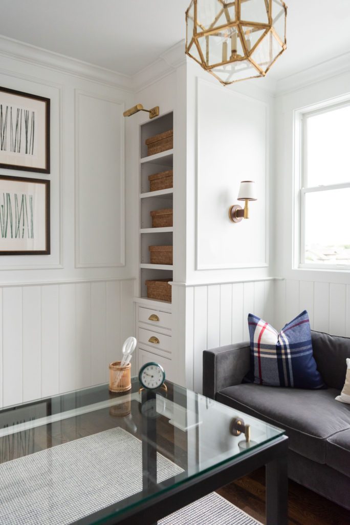
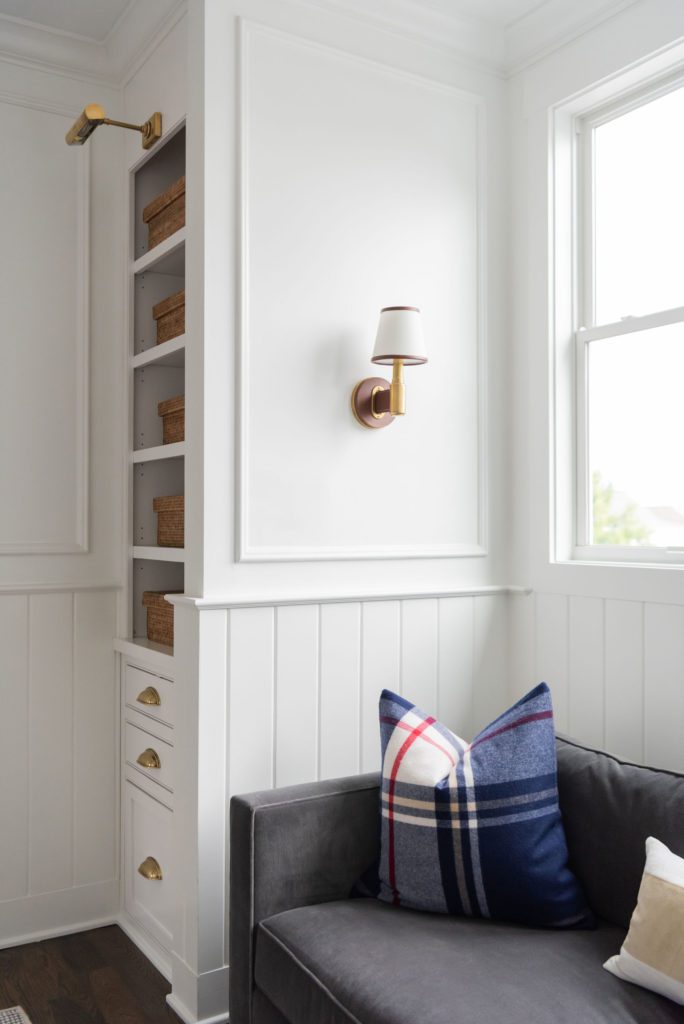
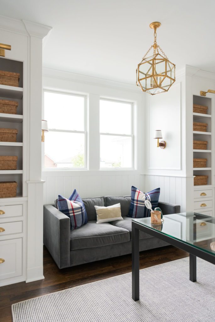
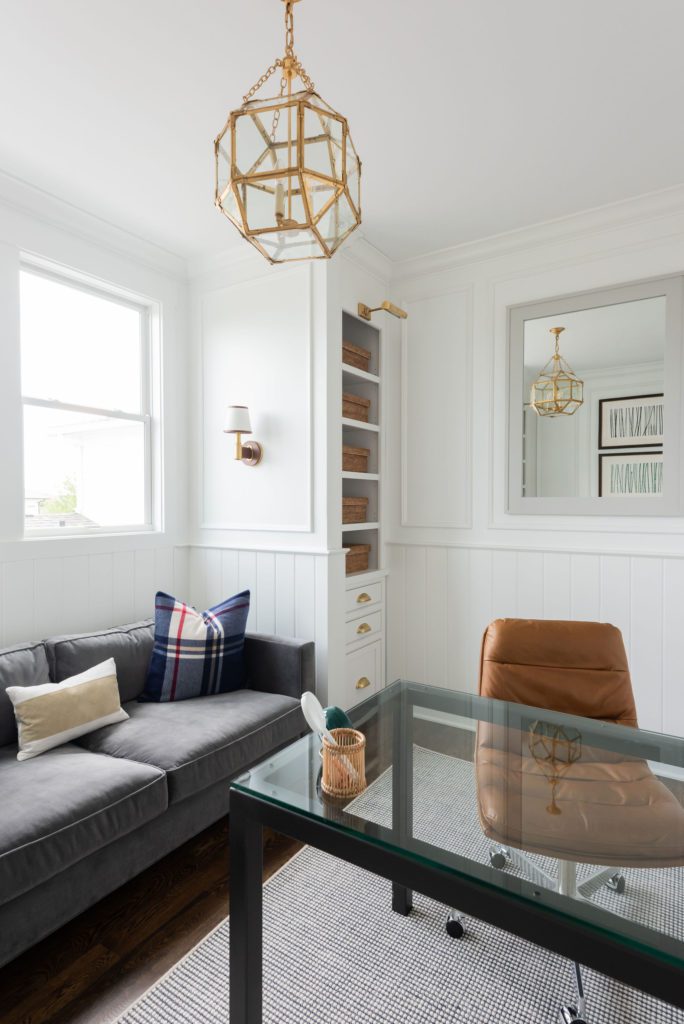
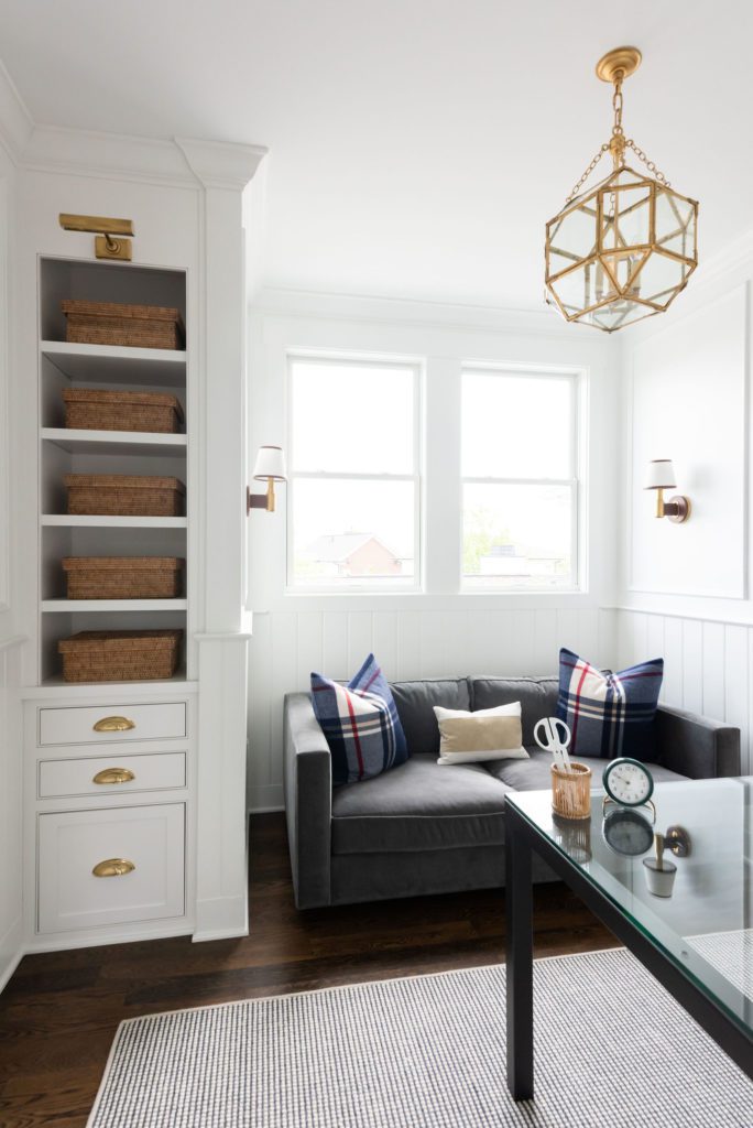
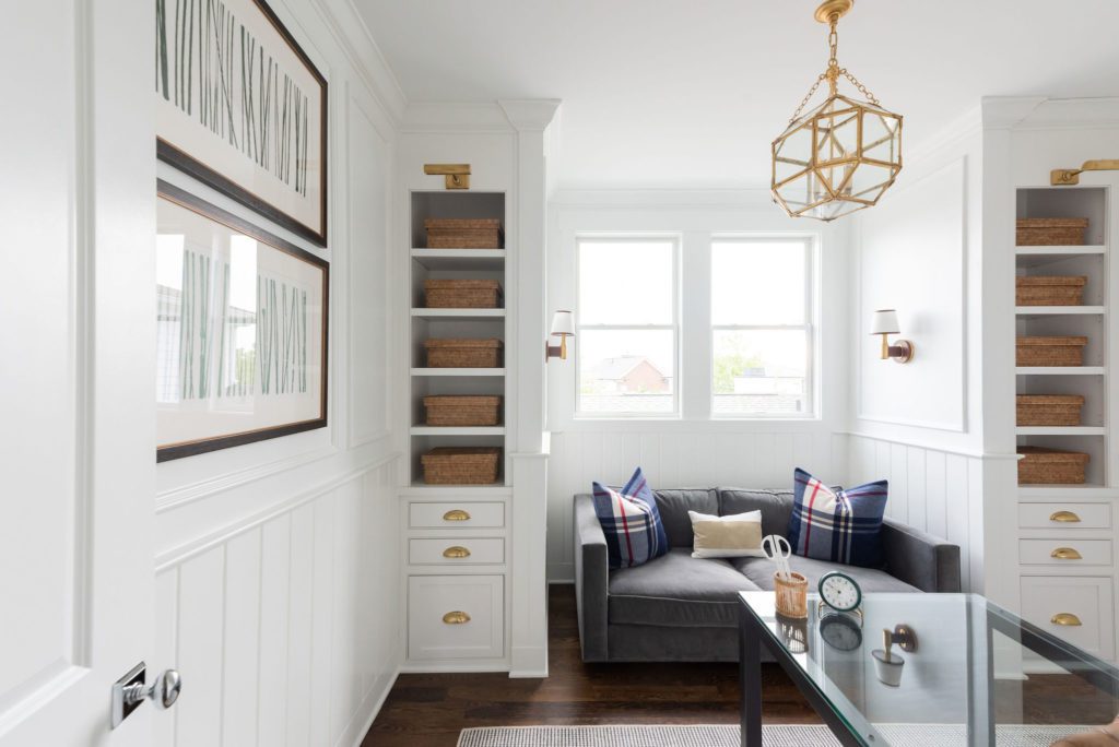
For this room we continued the V- groove and picture frame molding above, keeping the finishes clean and simple. The bookcases create a reading nook by the window and allow plenty of storage when working from home. The slate gray sofa and plaid pillows give it a masculine appeal.
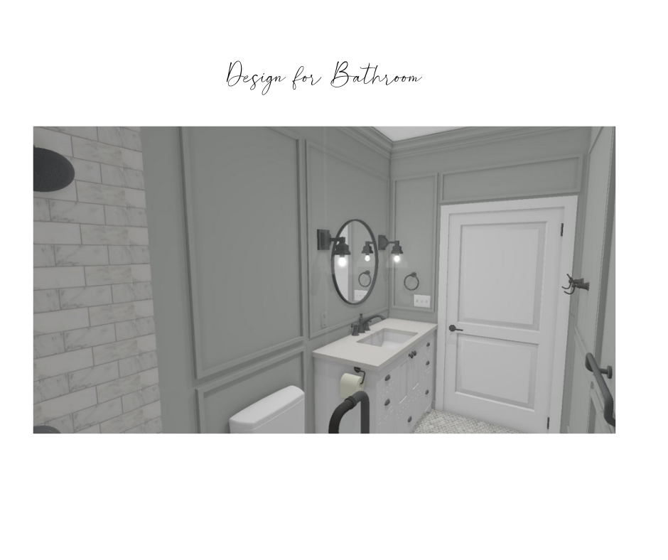
Between the two offices is a full bathroom. While the bathroom is necessary to support all of these rooms, a shower is so great for many reasons. It is great to have near your home gym. That way if like to workout in the morning, you can take a shower near the gym and not wake anyone else up. I’m a big fan of a morning routine where none of my people bug me. Ha ha! See how the bathroom turned out below.
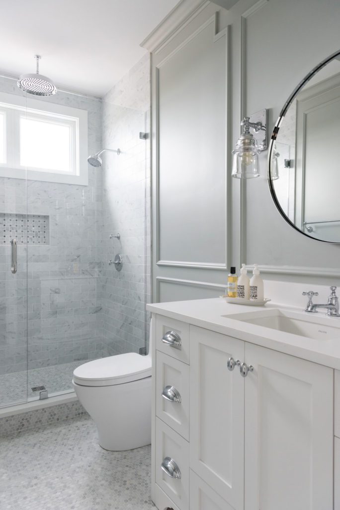
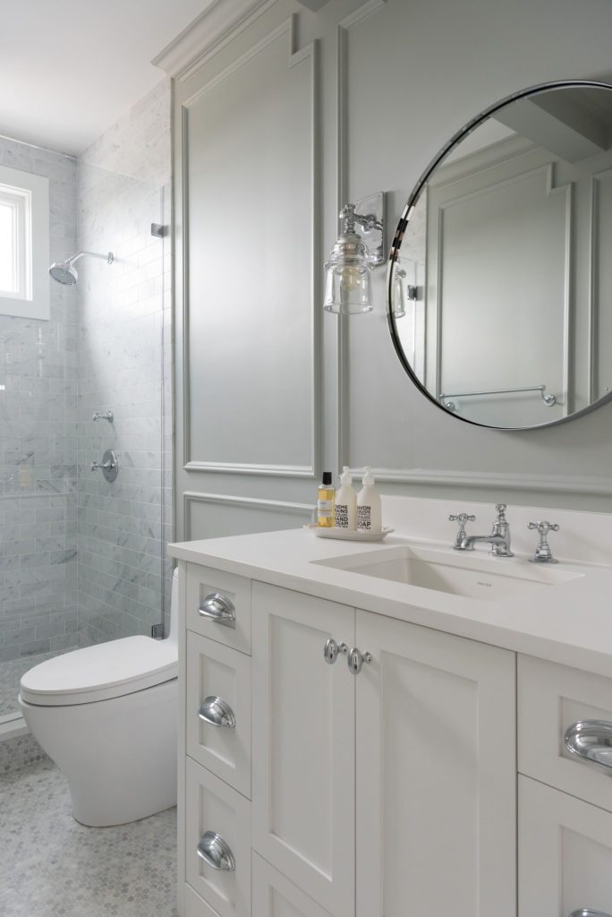
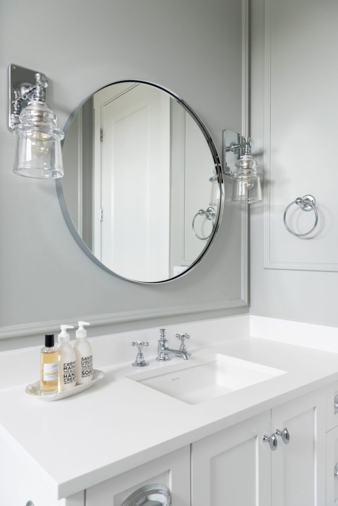
The bathroom we chose a soothing gray to grace the walls and kept the picture frame molding throughout. Carrara Marble is the stone we chose for the floors and shower walls. And for the cabinet, we kept everything clean with a white quartz and crisp white cabinet.
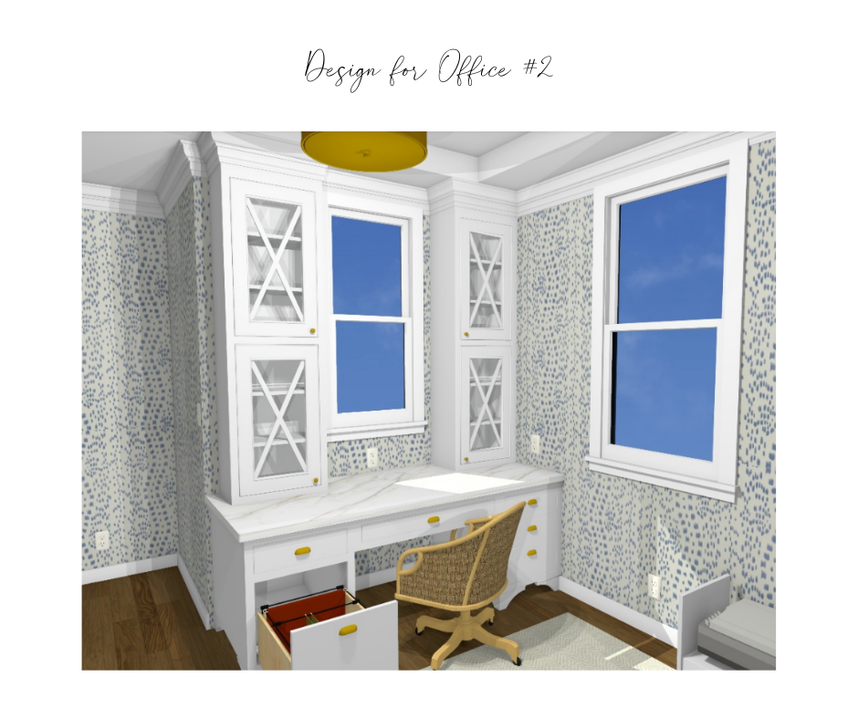
The final room is Office #2 which was my client’s office. Everything in here is custom. From the desk, to the daybed with bookcases, This room was built for her! See how it turned out below.
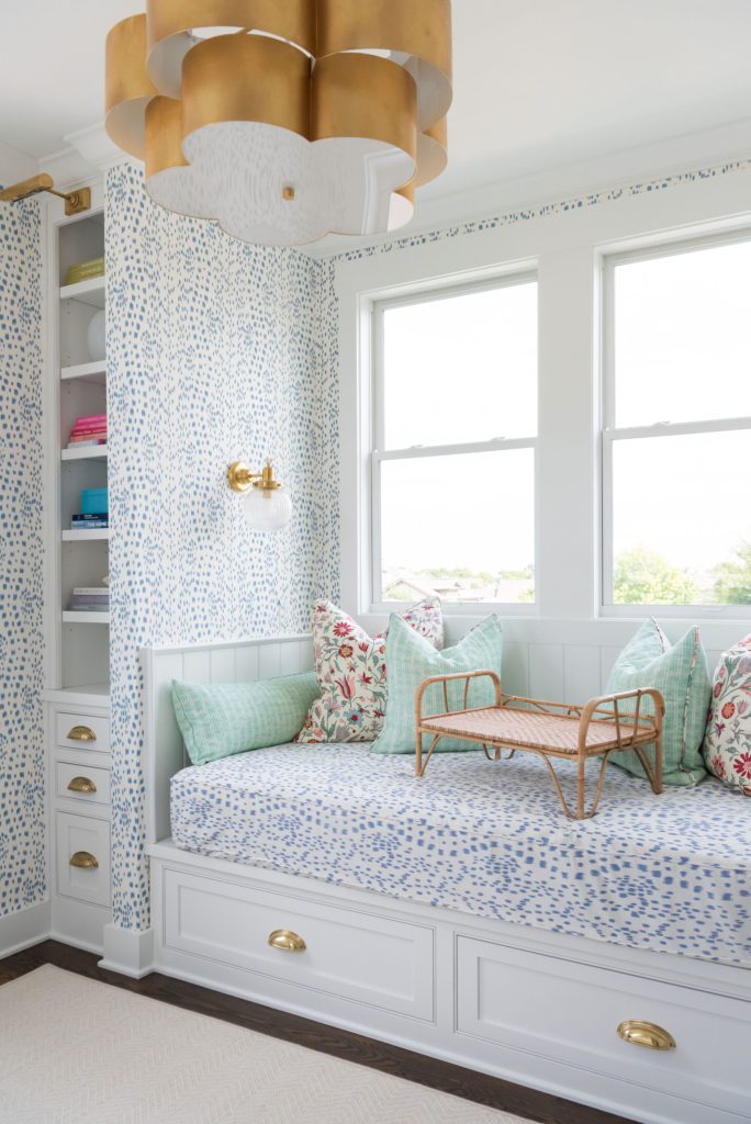
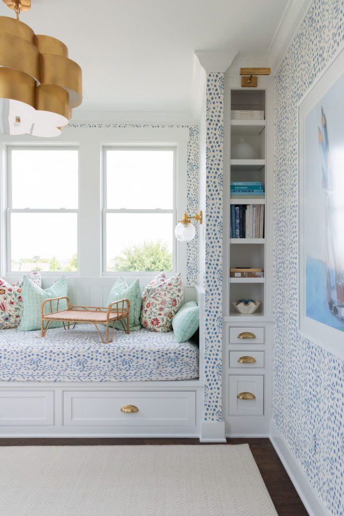
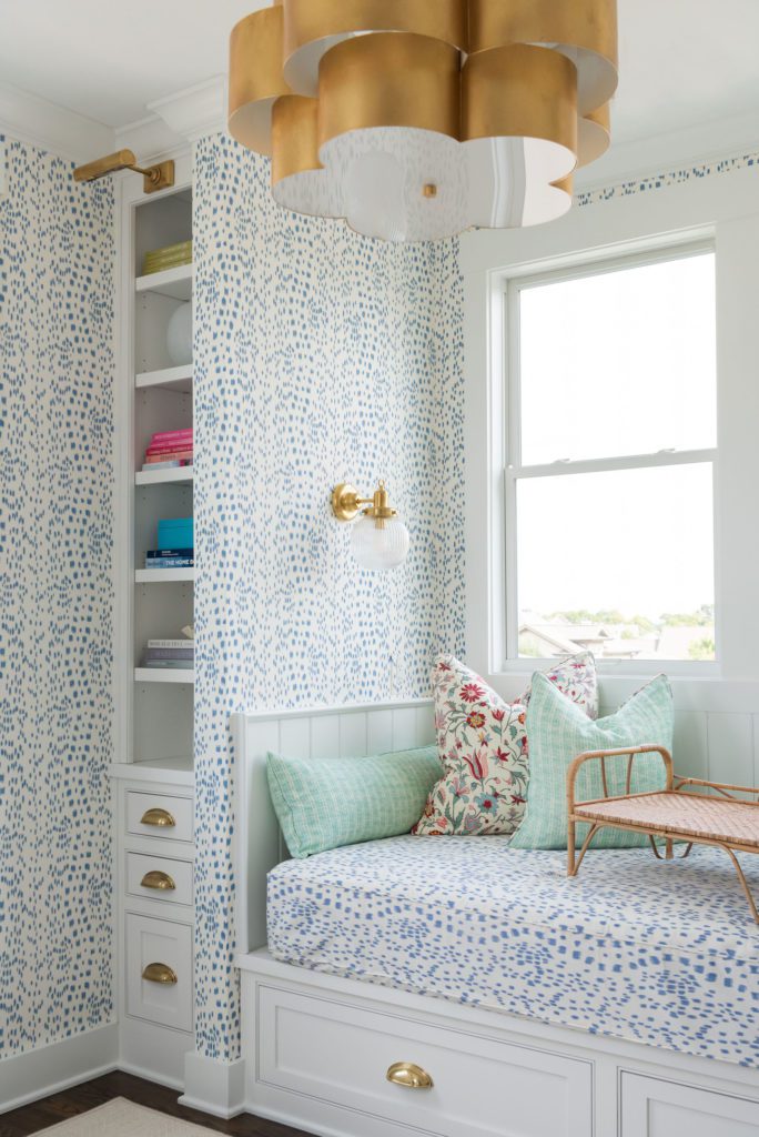
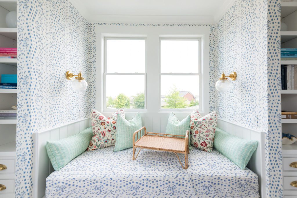
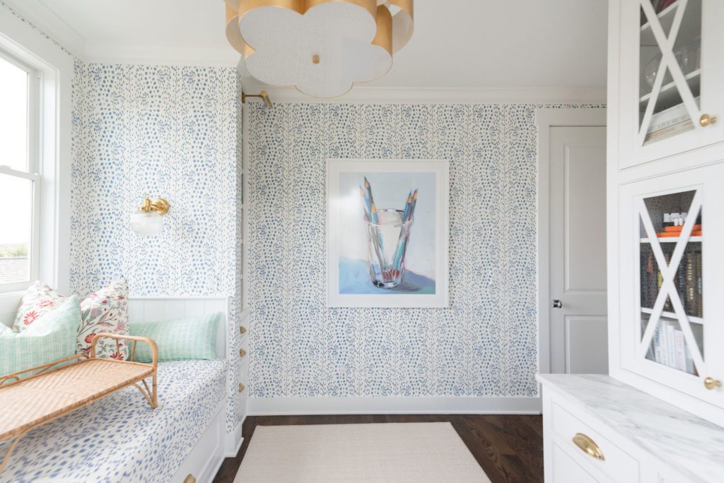
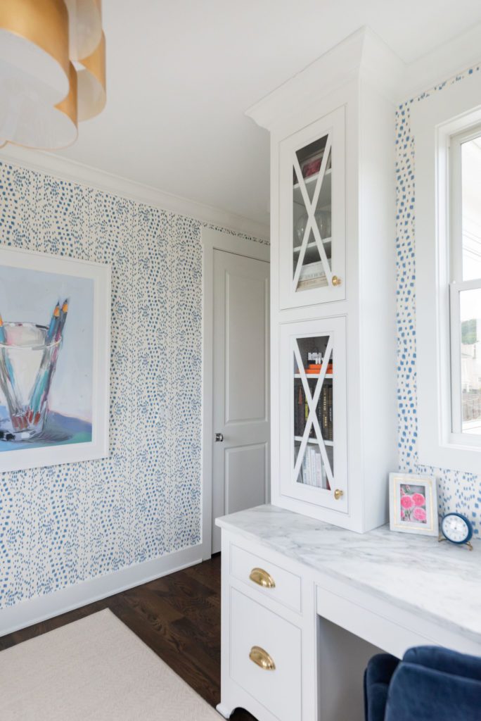
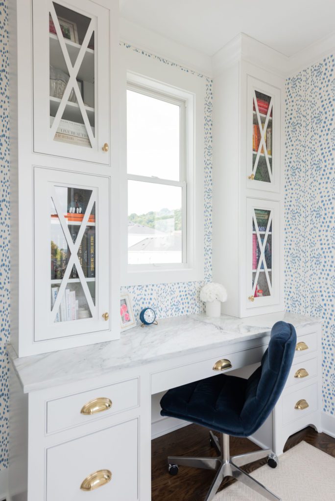
An energizing and happy place to work, I love the way that her home office turned out! I love having multiple places to sit and work and this room provides her desk and a comfy daybed to prop up in. We have custom pullouts and features that work well for what she needs but is tucked away so everything is polished!
I hope you loved this tour of our #polishedbliss project! If you want to see more, you can check it out in the latest Home Edit Magazine.

Be the first to comment