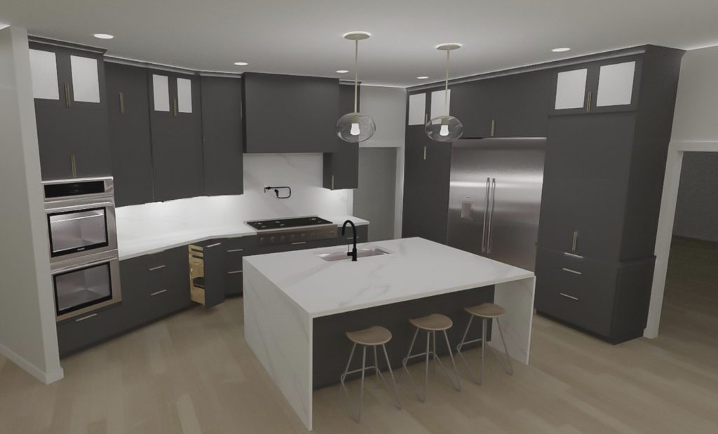
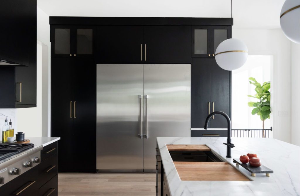
Some projects come along and we instantly know what the project name should be. I like to pick up a paint fan deck for color name inspiration and black caviar stood out. Welcome to our #CaviarTuesday project- Easy to love, even on a Tuesday. But as elegant and refined as bold caviar.
This name also explains our client really well. We loved working with this couple even more than the design we created for them. It was truly an honor to help them. If you go to our instagram page, you can click on our highlights to see the all the stories from this project, including stories our client posted. 🥰
The Befores
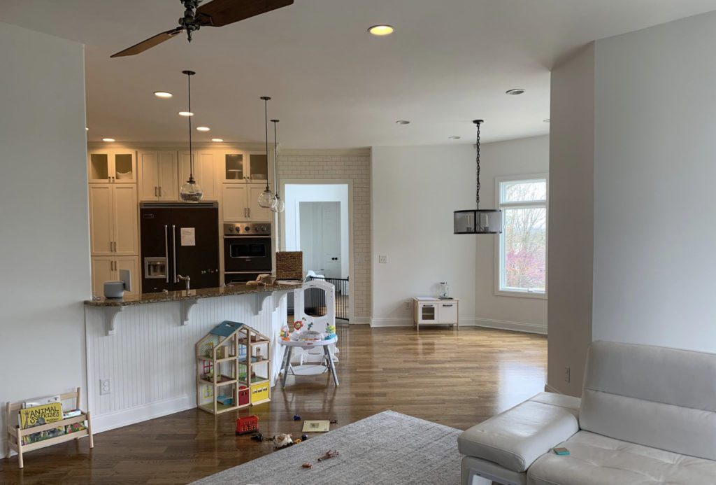
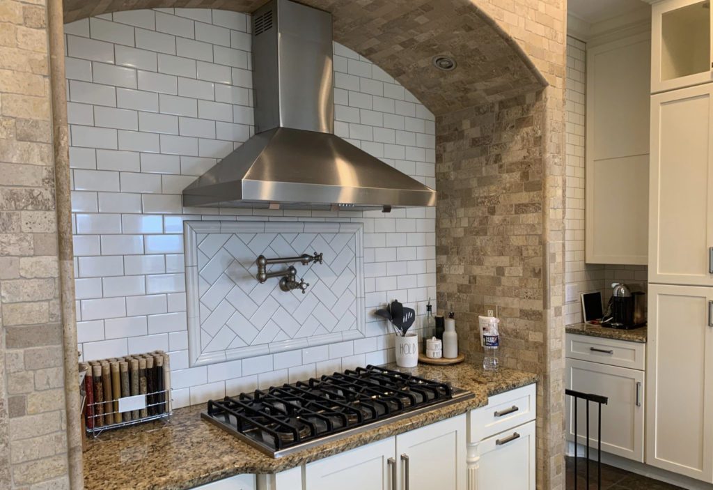
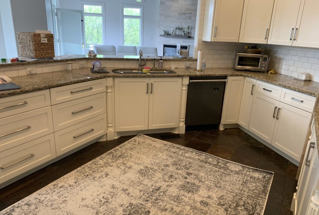
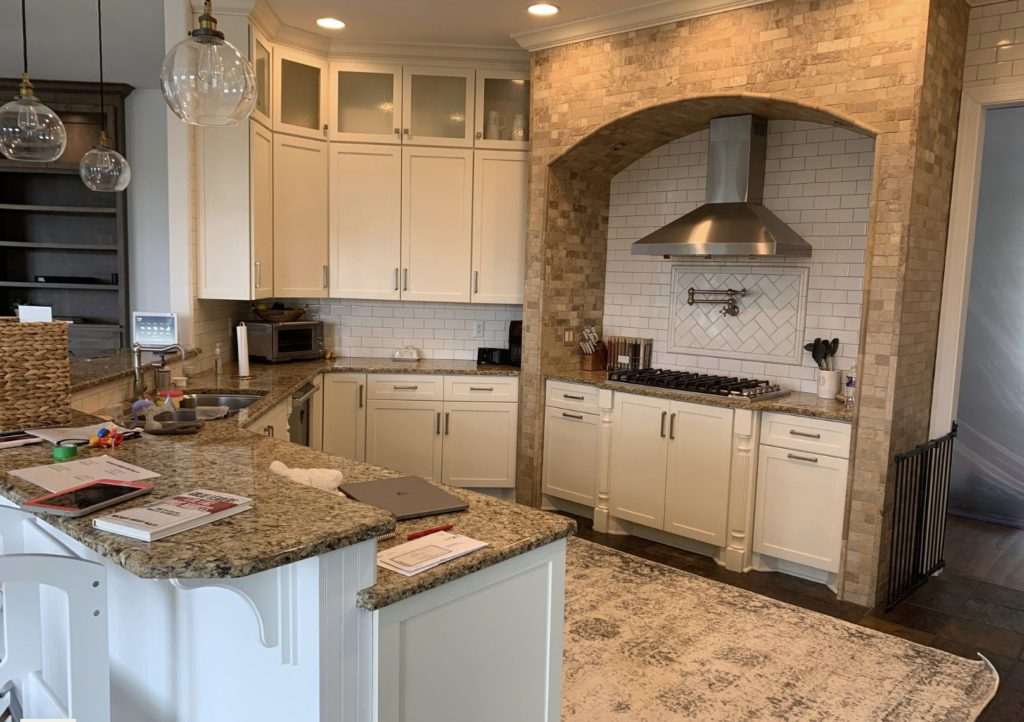
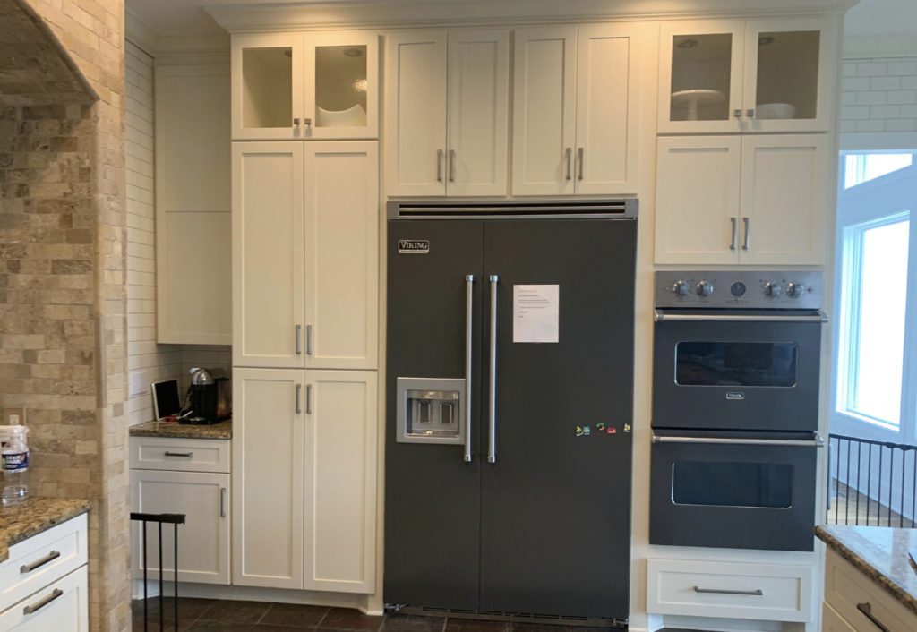
Here is where we begin. While the entire downstairs was very open and bright, the hardwood floors stopped abruptly at the kitchen and was sectioned off with a rough slate tile that they mentioned stubbing their toes on. Ouch! The other thing that stood out to me was how the angeled peninsula really interrupted the flow from the kitchen to other rooms. I knew it would be the first thing to go! The client did not like the current finishes or the room’s traditional appeal. So we got to work designing the kitchen as well as the living room adjacent. Below are some pictures of that room.
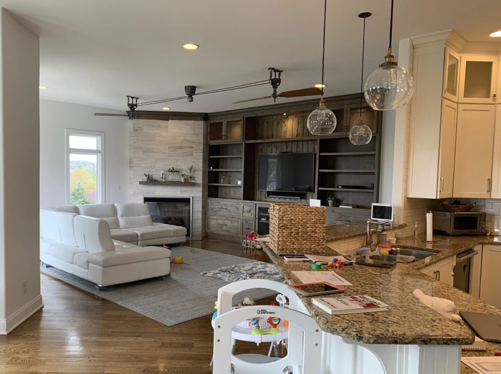
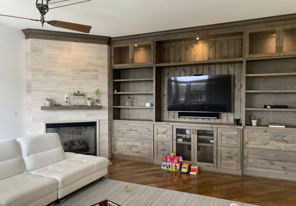
The Living Room was simple. We just needed a more modern aesthetic and to reduce the brown tones.
The Design
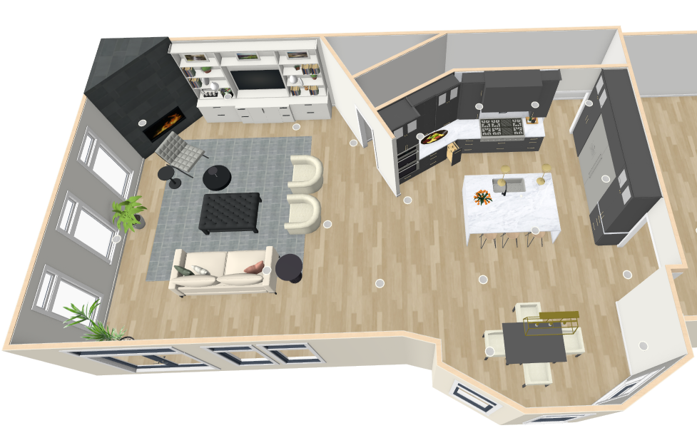
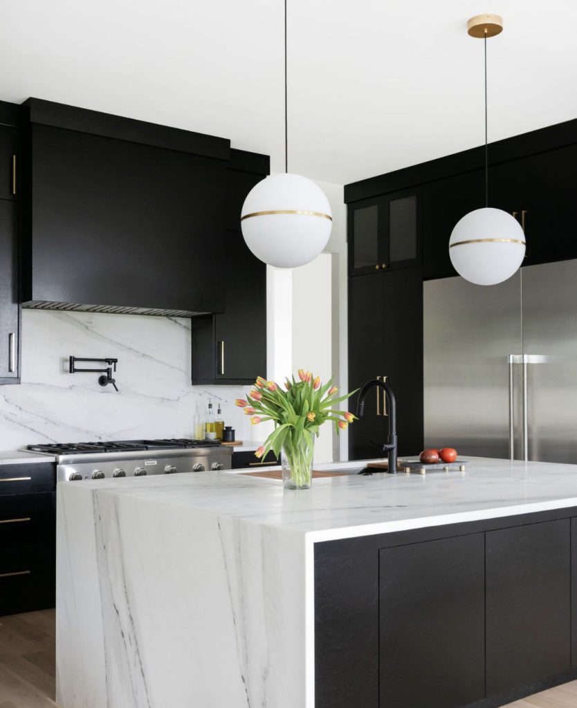
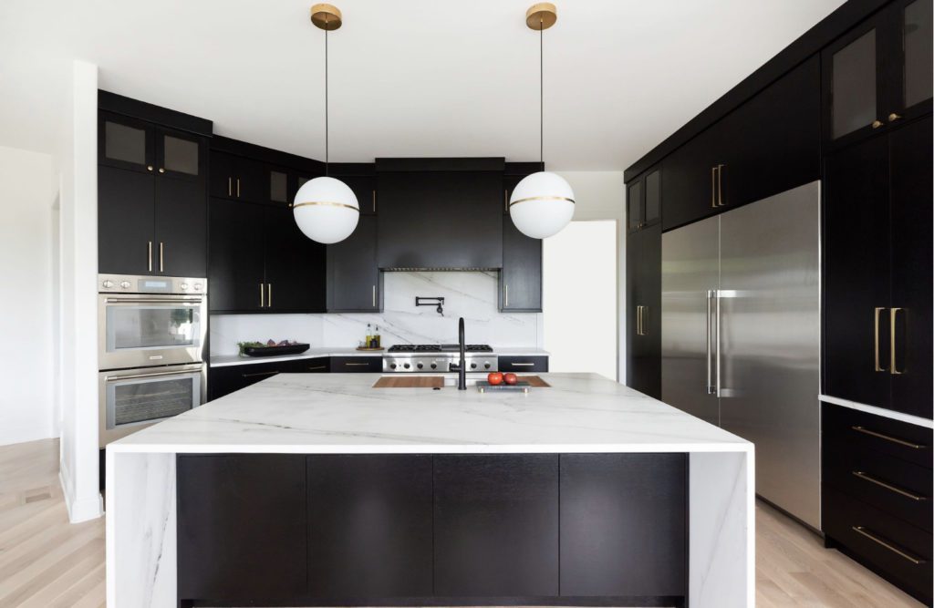
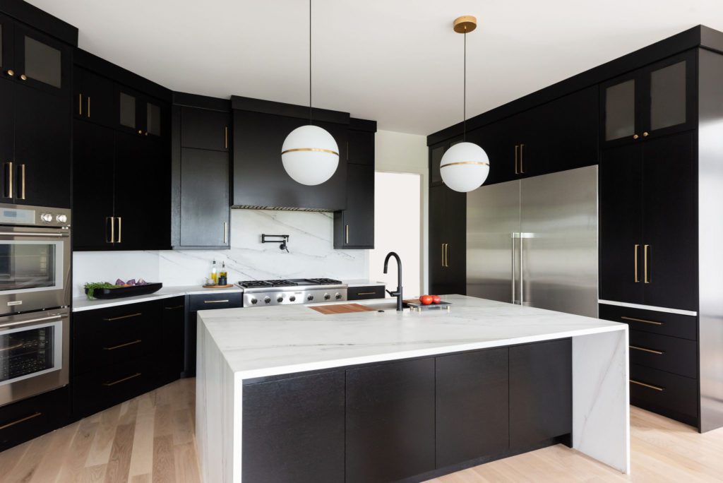
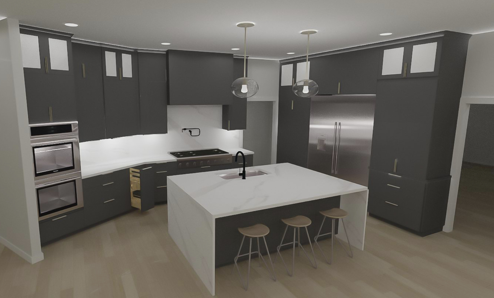
We start with the function of any space making sure it has a good flow and walkways are not just to code but better. We use the 42” NKBA (National Kitchen & Bath) guideline for the clearance from main cabinets to the island. We took out the entire Bar Peninsula and created a central island instead. Centering the Island sink with the range helped to ground the room and keep things aligned.
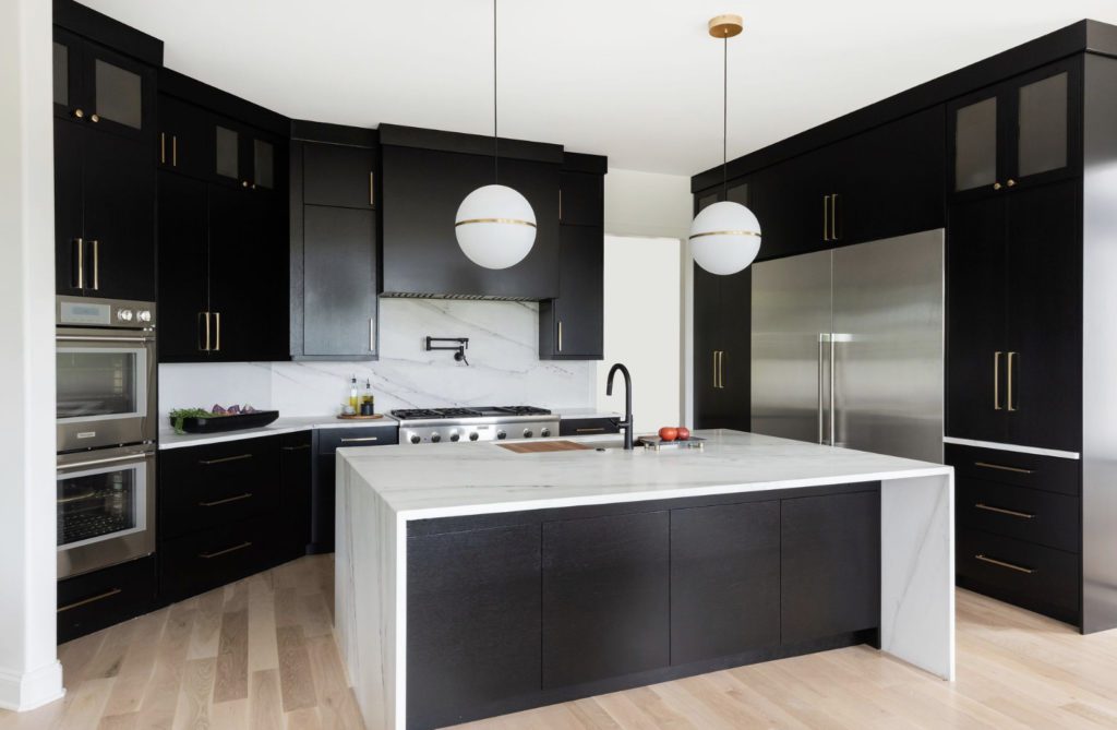
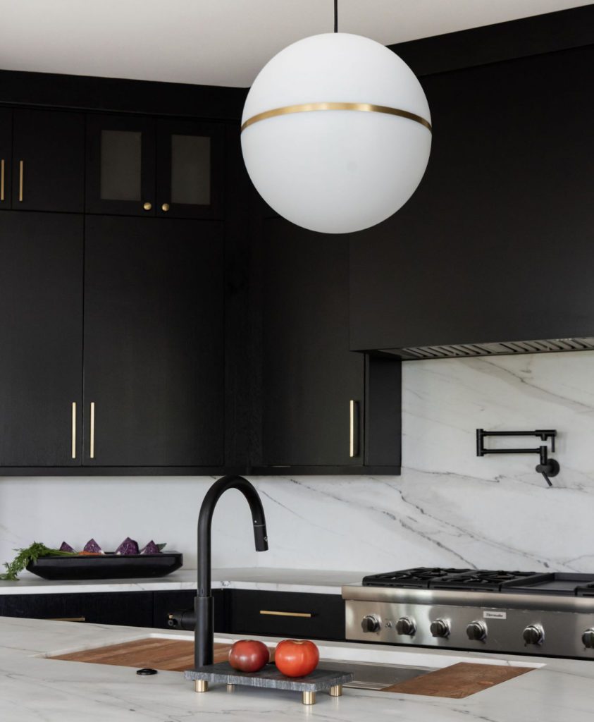
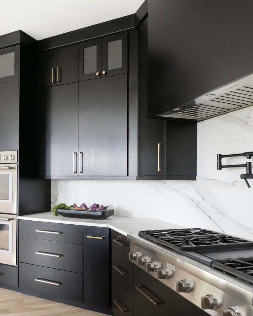
For the finishes, we always show our clients something that they ask for and then an option that we think would be amazing. I was so happy they liked the black stained, sleek cabinetry. Once they saw the sample of black stained wood, they were sold. There is plenty of natural light flooding into this room, so it could use the deep tone.
The other major change was getting rid of the brown tones in the wood flooring and coming back with a natural matte finish. It completely changed this house! Below are more Drawings of this project.
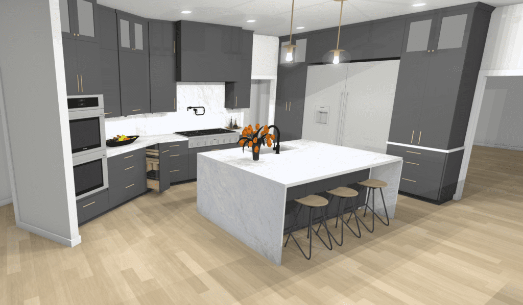
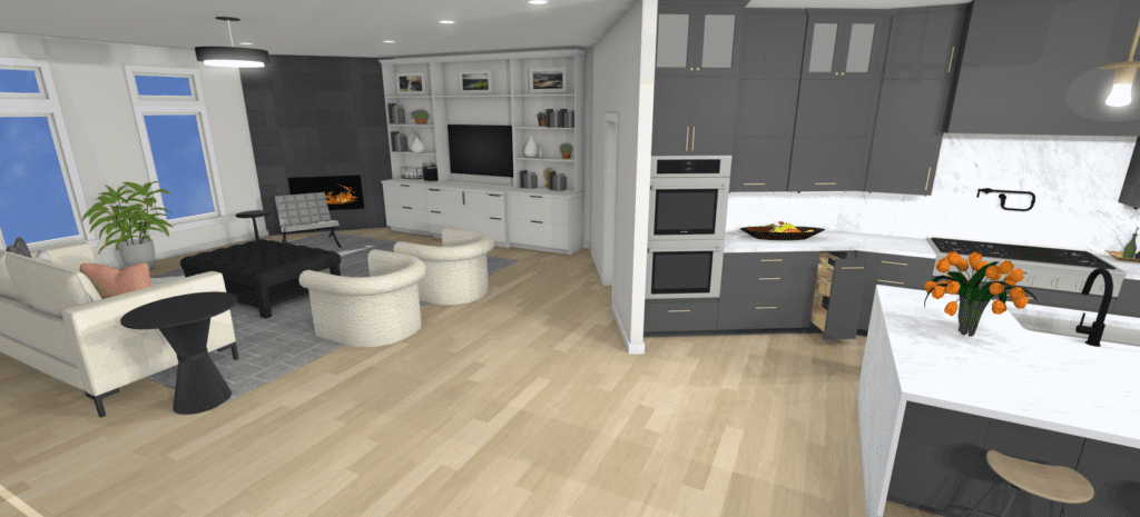
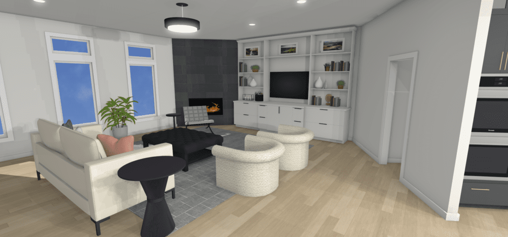
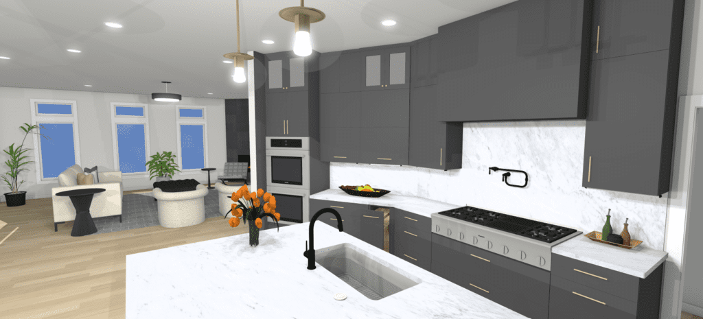
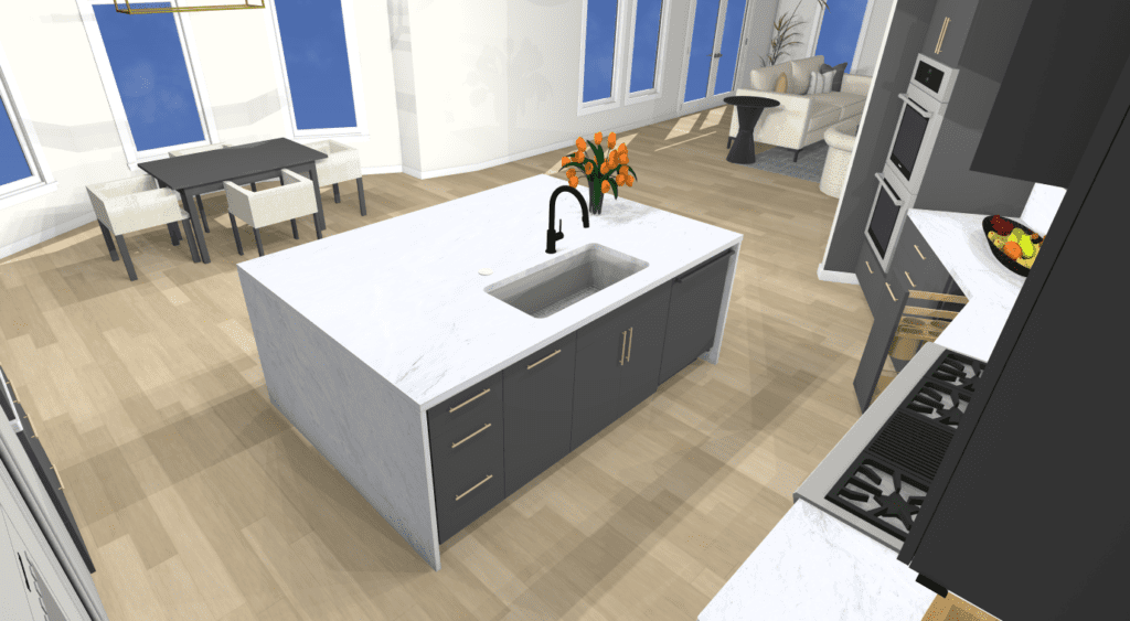
Even though I hand draw for fun, we use a CAD software for our design projects. This not only helps us develop the plan set for builders, but also let’s us get design intent across efficiently with several view points for presenting. Another great tool is the 360 panoramic view. See the 3D plan on our home page and use your mouse/curser to look inside the room! 😉
The Afters
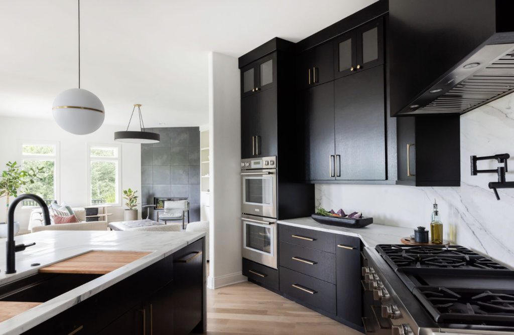
The living room was balanced with a dark charcoal large format porcelain tile. See below
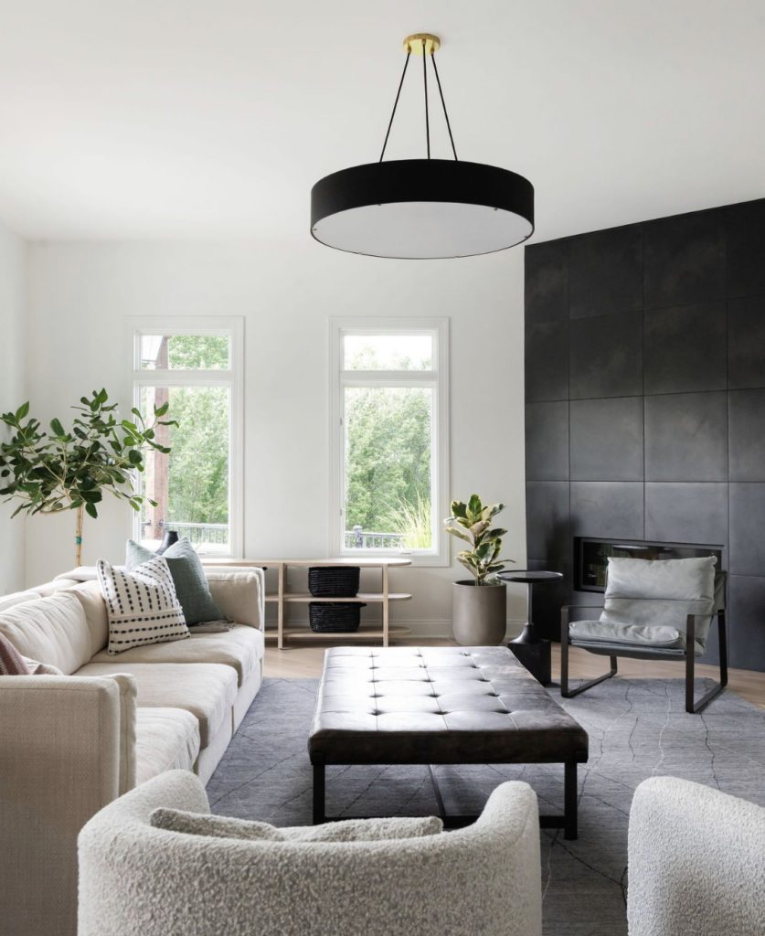
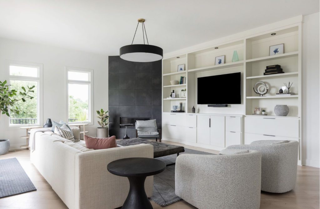
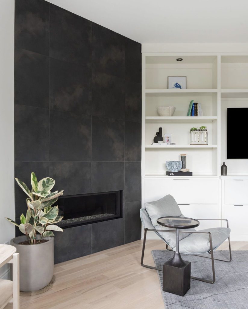
In modern interiors we focus on high contrast in the overall design. So with a dark fireplace we painted the living room cabinets a bright white. After we changed out drawer fronts, took out the chicken wire, got rid of bead board, and updated the hardware, it was a perfect pairing to the Kitchen design.
Every Kitchen project gets a cabinet deep dive. This is where we decide together what accessories will function best and make life easier in any kitchen. Below are some of our favorites that worked best for this client and their unique way of living.
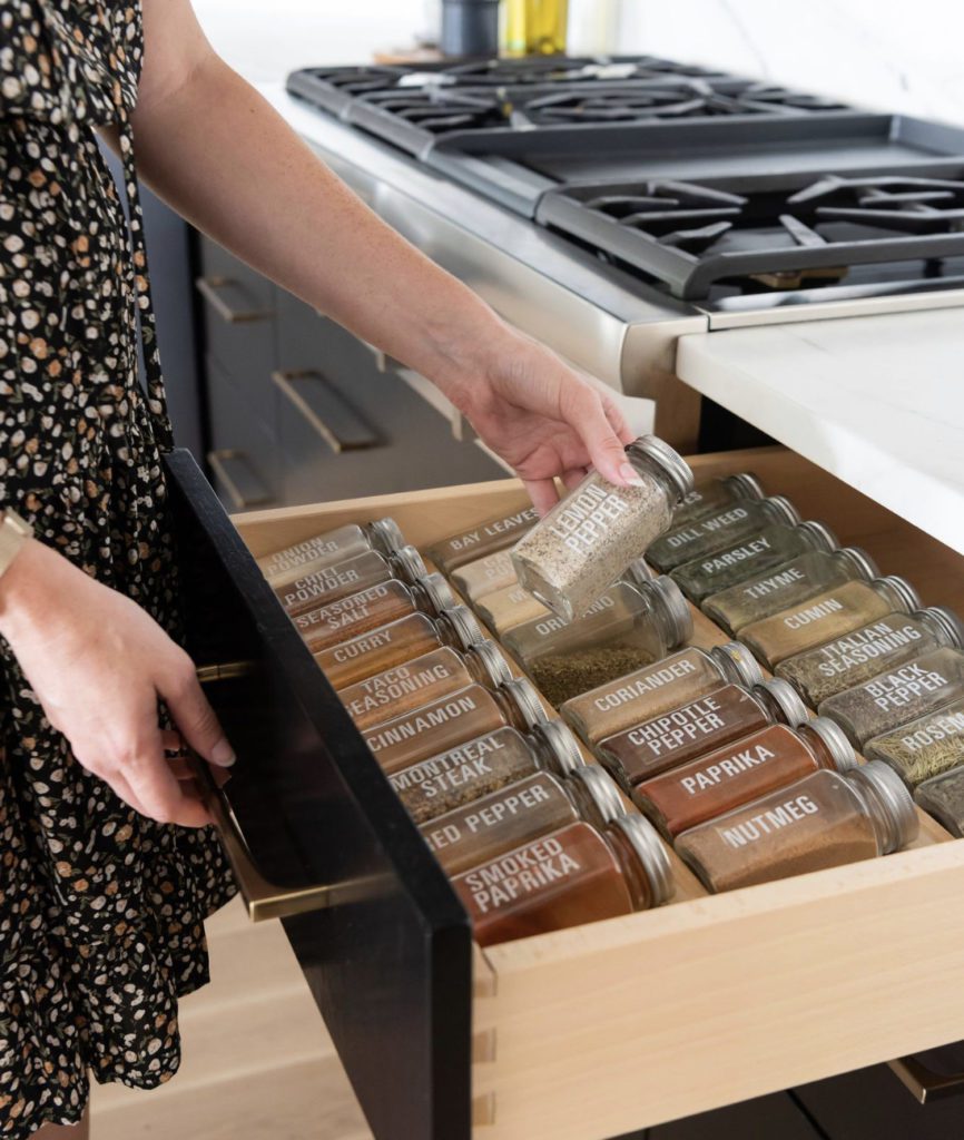
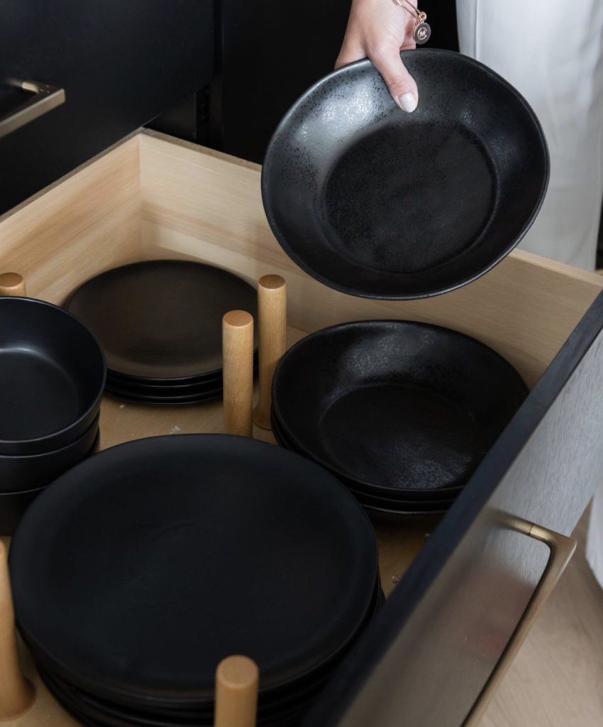
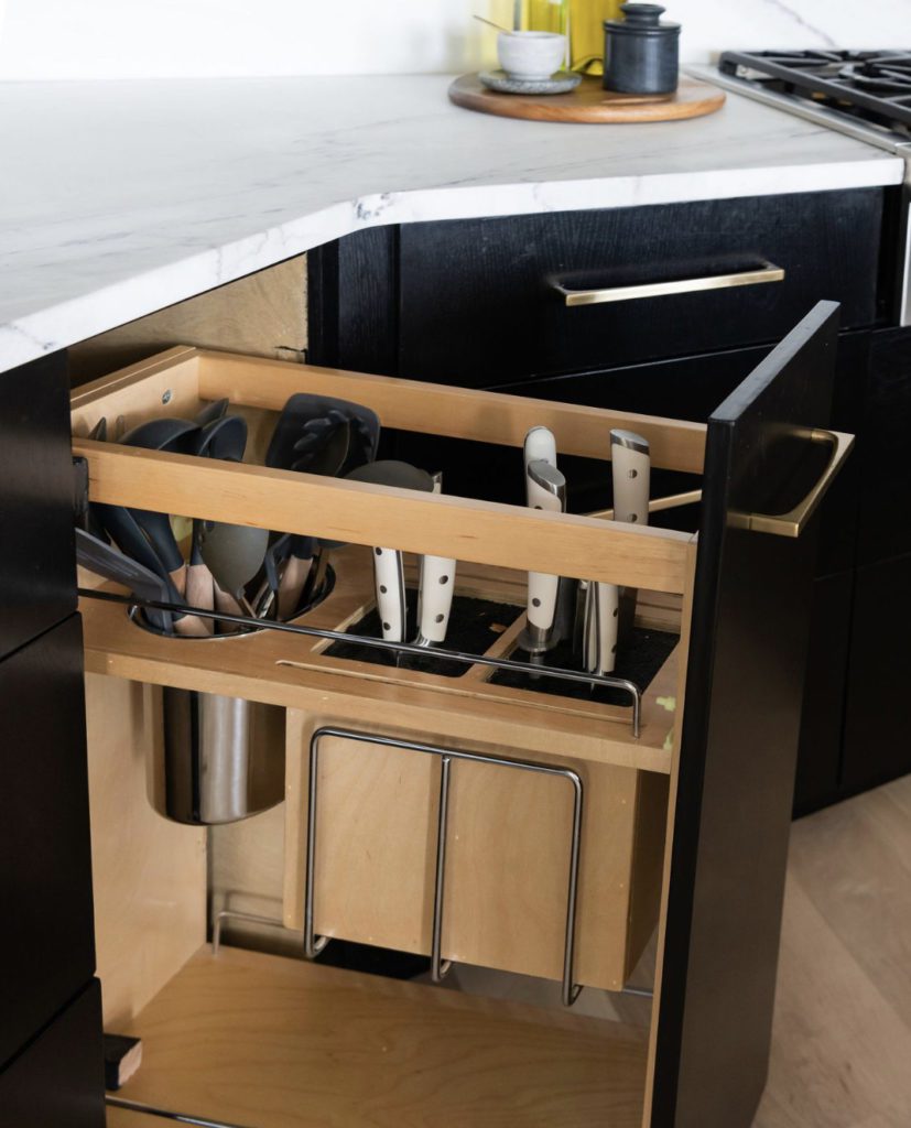
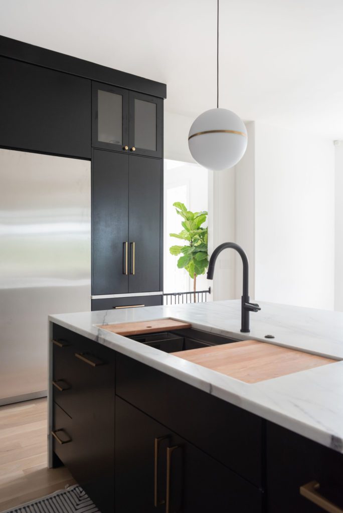
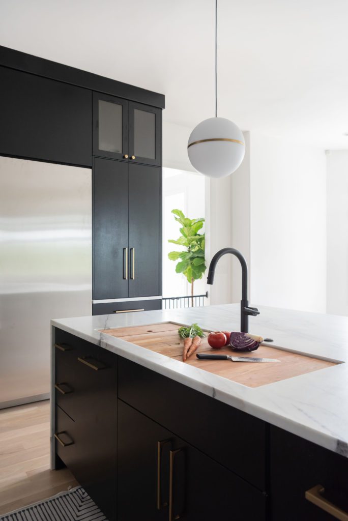
Finally, we gave this Kitchen a great work sink by Circuit Chef. It is a 45″ sink with great accessories that you can use during prep or to completely cover your sink while entertaining. See below.
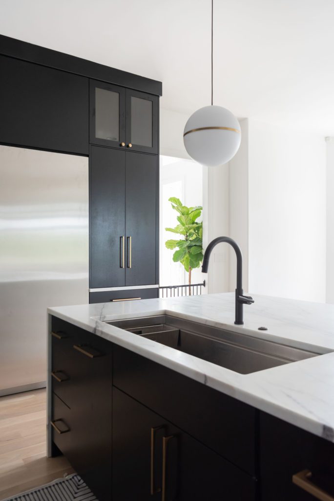
Such a stunning transformation! We can’t wait to work with them again on another project!

Be the first to comment