We are so excited to share our NEW Design Studio with you! It took 2 years to find it and a year to get the design implemented, but here we are! Let me show you where we began.
The challenge with finding an office space was that we either found 300 Square feet (SF) or 5,000 SF. We only needed 1,000SF. The other things we were looking for was to be located in or near Nashville’s Design District and tons of natural light. Our Interior Design firm teamed up with our favorite architects at Four Square Design Studio and we decided to go in together to create one great Design Studio!
True story- I hated what we found when we first saw it! BUT, we literally thought out of the box and purchased more than one office space to get what we wanted. Below you will see the plan before and then what we did with it.
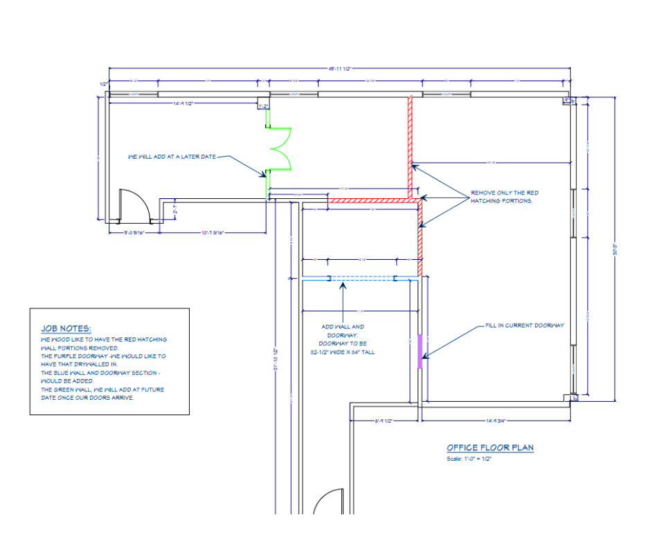
We took 2 Office spaces and tore down 3 major walls in between. You will see them in the plan above shown in reds. The blue lines show the new walls we added to create a client intake area. The green lines represent the glass walls we added for a conference room. The purple shading shows a wall we closed up so we could have our resource library there.
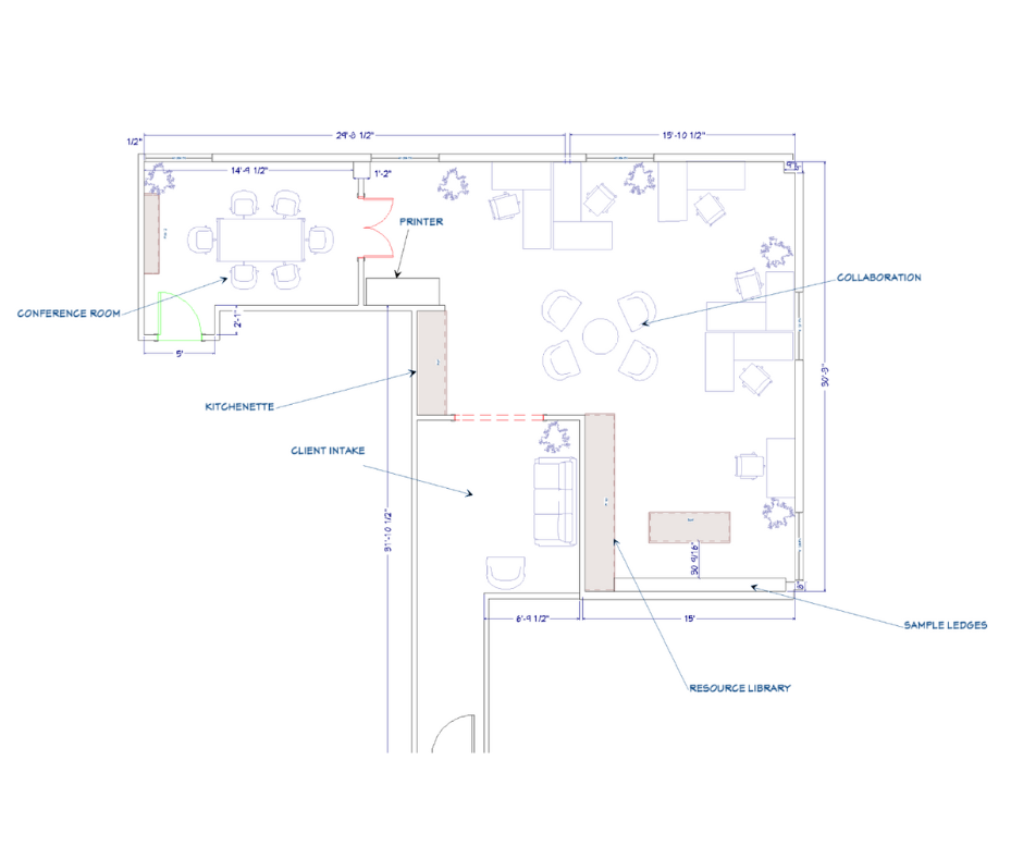
This is the plan we went with and is REAL close to what we ended up with. Below are some pictures of half of one of the suites we took over. The only thing we liked was the expansive windows pulling in so much natural light, which is so good when looking at samples for our client projects.
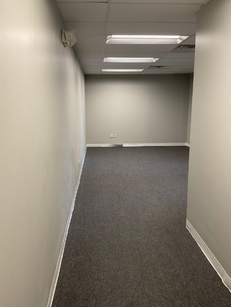
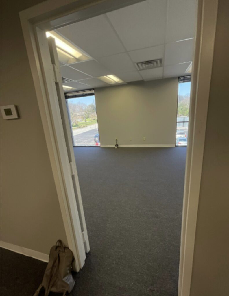
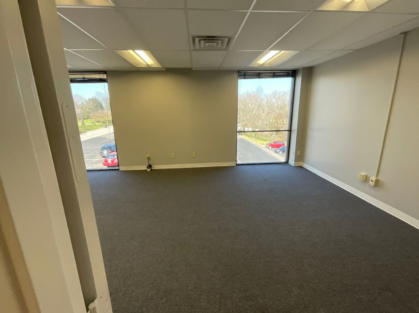
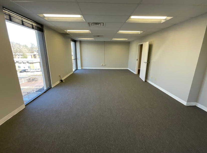
The existing office had horrible gray carpet that could hide all the murder stains. It also had fluorescent lighting and 2 different ceiling grids ( from the different offices). While we did love the windows, the lighting definitely had to go! With all the drawing we do, we need a cleaner LED light source. We ended up with a whole new grid and LED cans that we can change the color temperature.
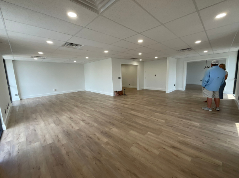
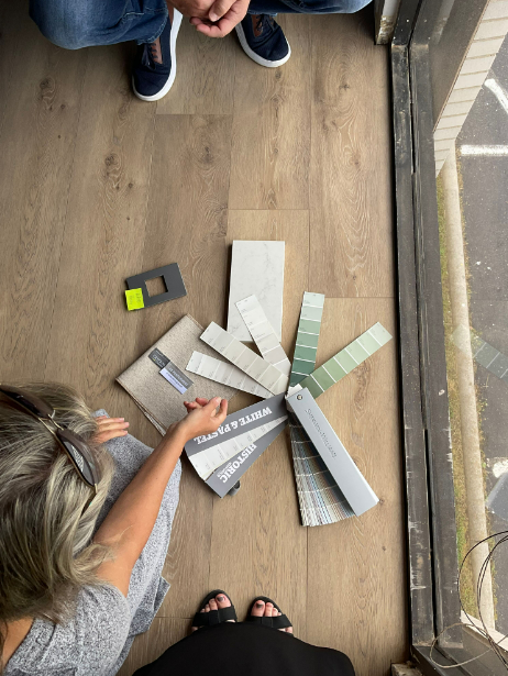
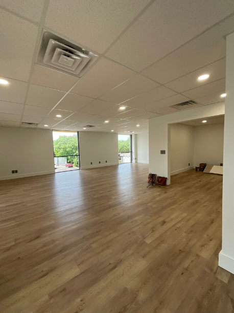
For the flooring we used a LVT (luxury Vinyl Tile) that would be light weight in this commercial setting and very durable. We really love the light Oak appearance. Then we gave the walls a fresh look with Sherwin Williams, Pure white and then using the same color on the trim but a brighter sheen. We needed the color to be a backdrop to all that goes into a Design Studio and not to compete with it.
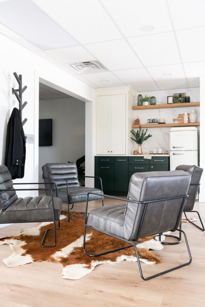
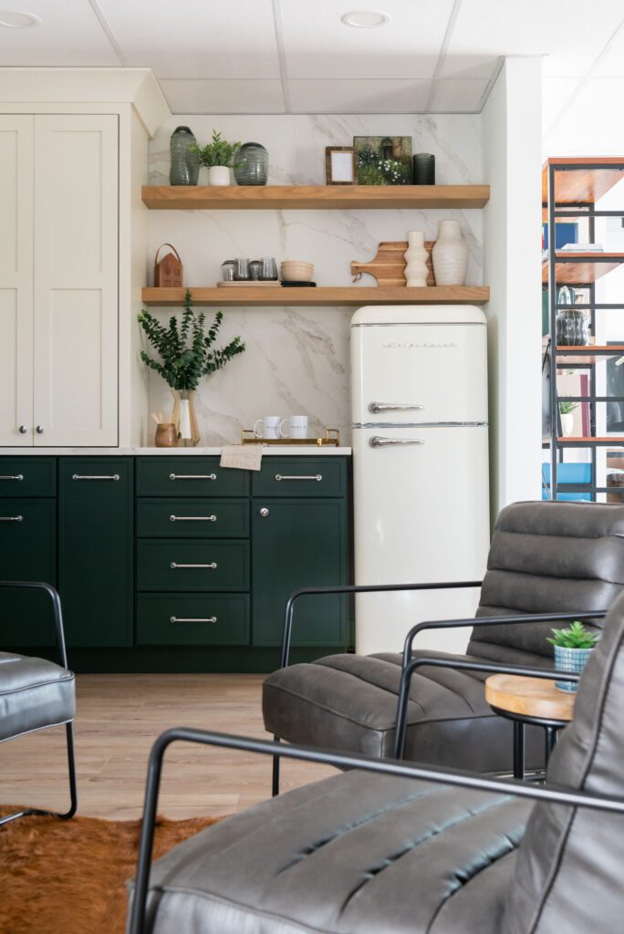
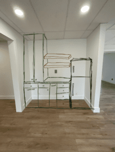 Once the shell of our new office was redesigned and built, we then moved to designing the custom Kitchenette situated near our client in-take area and our Conference Room. While we didn’t have the option to pull plumbing in and having a sink, we did plan for a fridge, cabinet storage, trash pull out, paper towel pull out, and a wall cabinet with pocket doors to hide the microwave and coffee maker.
We went with a Vadera Quartz countertop and solid backsplash and then added floating shelves made by one of our favorite cabinet guys, Seth Brown Cabinets. He is truly an artist and was able get the stain to compliment our floors.
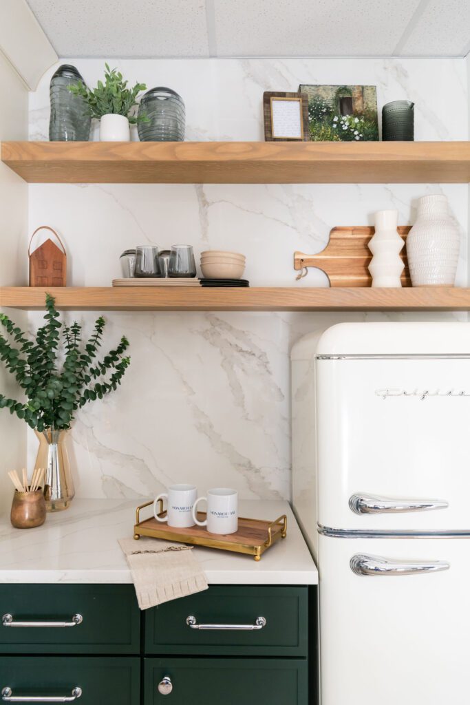
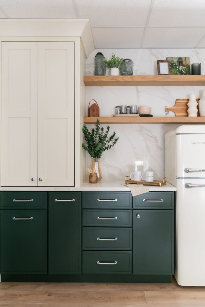
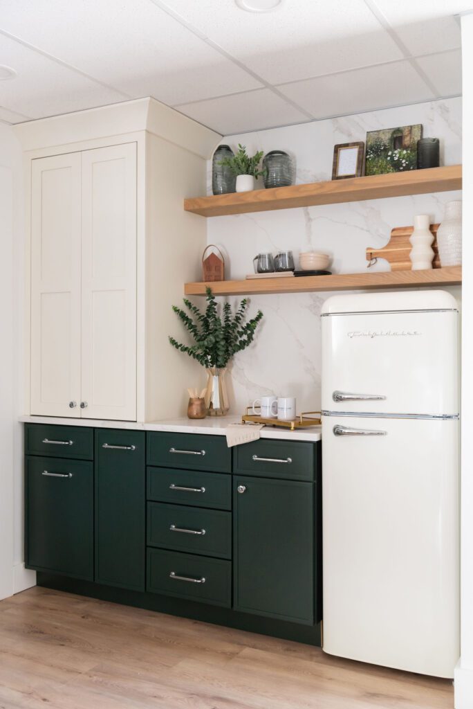
For the cabinetry we chose a deep green for the base and then kept the wall cabinet light and close to the creamy color of the fridge.
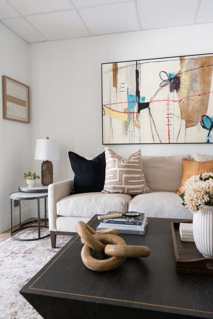
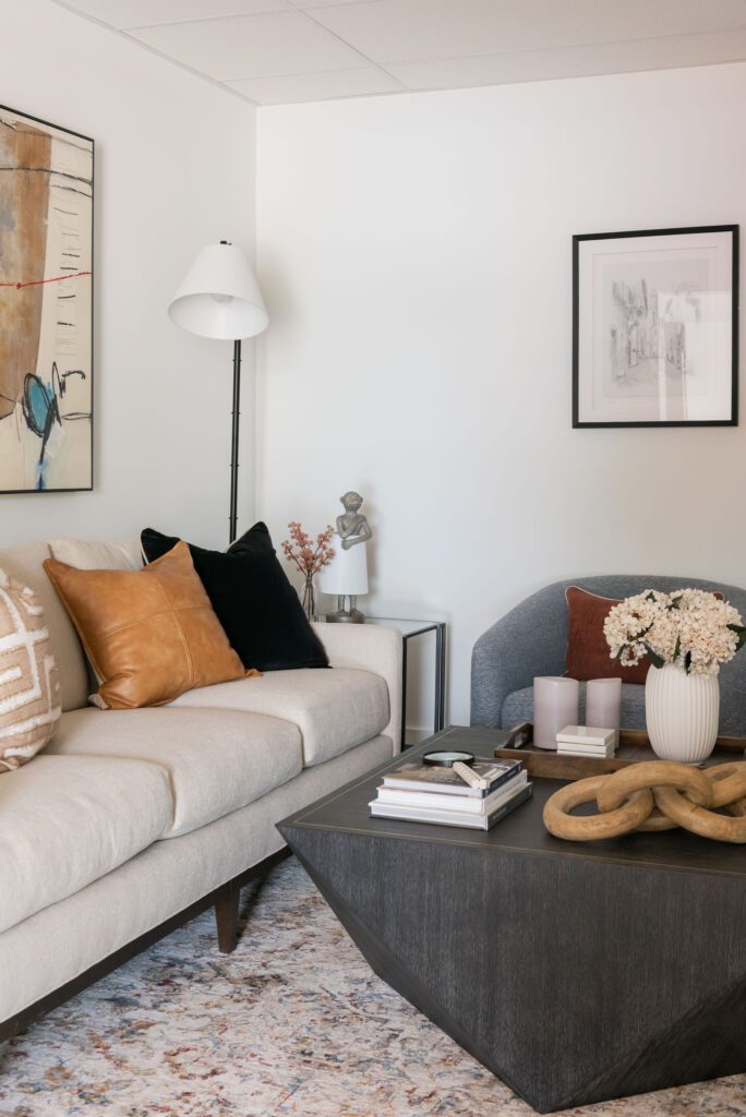
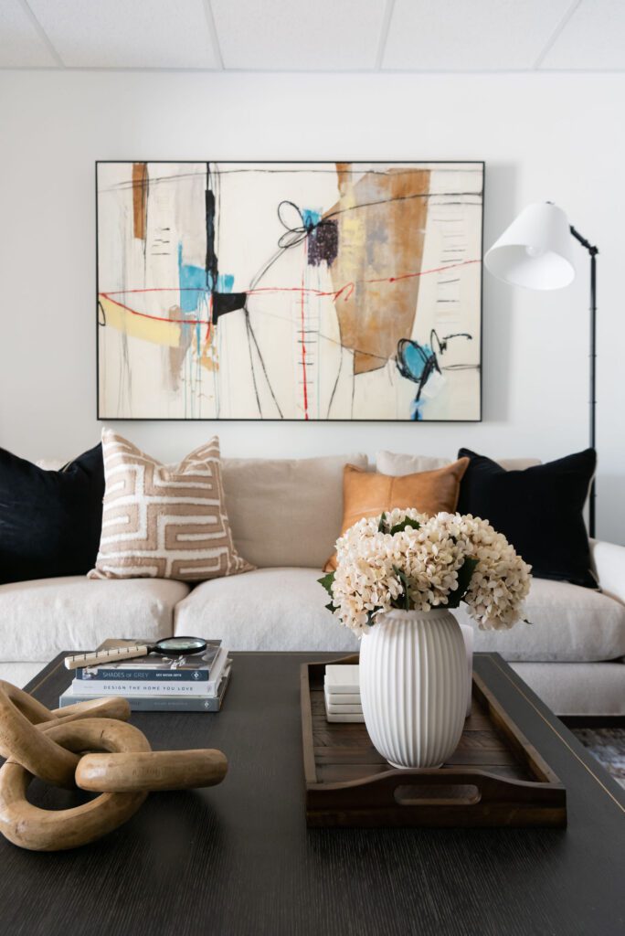
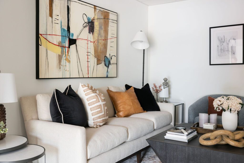
For the in-take area we created a small seating area that we could have a brief meeting with a client or vendor, catch a phone call, or simply to give off a welcoming vibe to people coming in. We used upholstery from Lee Industries, we found the coffee table at Highpoint market from Alder and Tweed, and the rest was filled in from local findings. What I know is this room will constantly change as we get inspired and as we find new things.
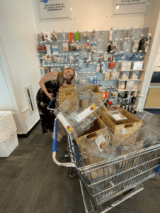 Time to organize the Resource Library!
The thing about Interior Designer’s is we have a lot of samples! We have the most awkward shapes and sizes of things to contain so sometimes it can be challenge. First, we planned out our storage pieces using sticky notes to make sure everything was accounted for and what we were putting where. Then, we headed to the container store and loaded up on all the best baskets and clear containers.
We know the key to efficiency in our projects is organization here in our Studio. So we made sure to get even more than we need. This will make it easier when we find more samples!
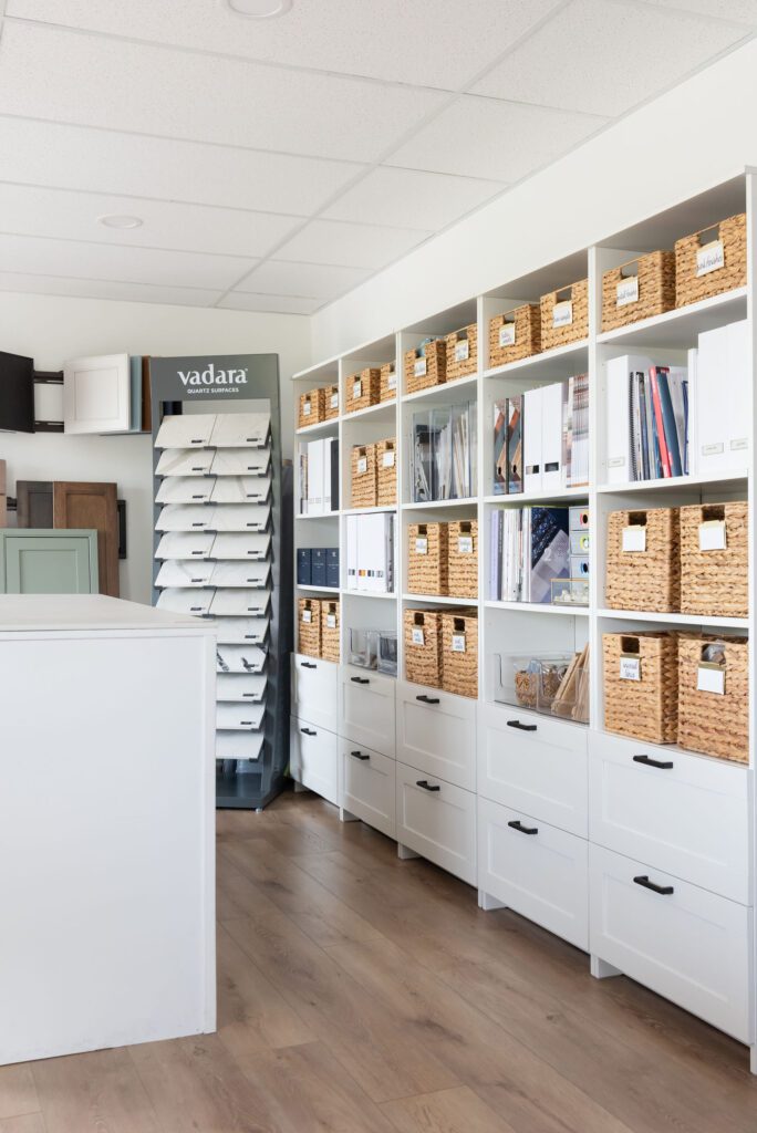
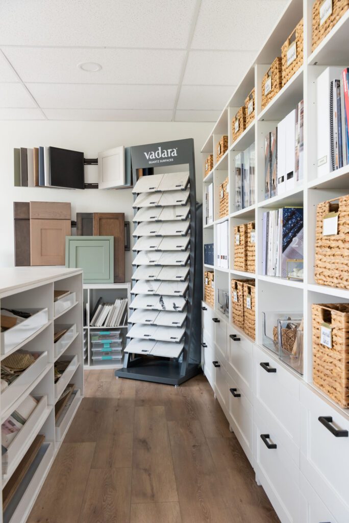

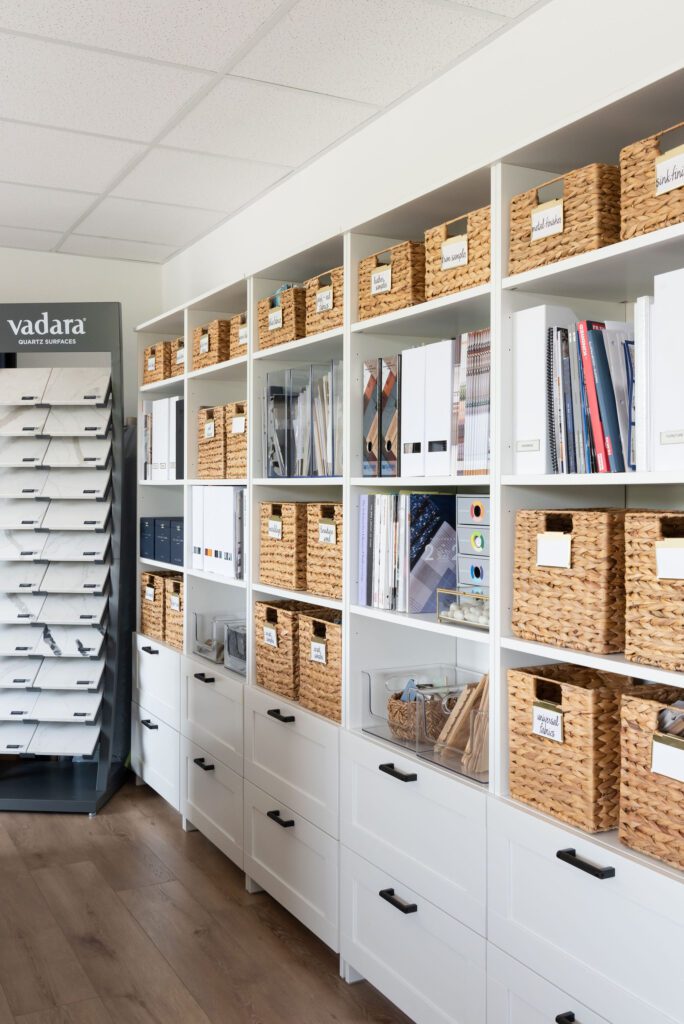
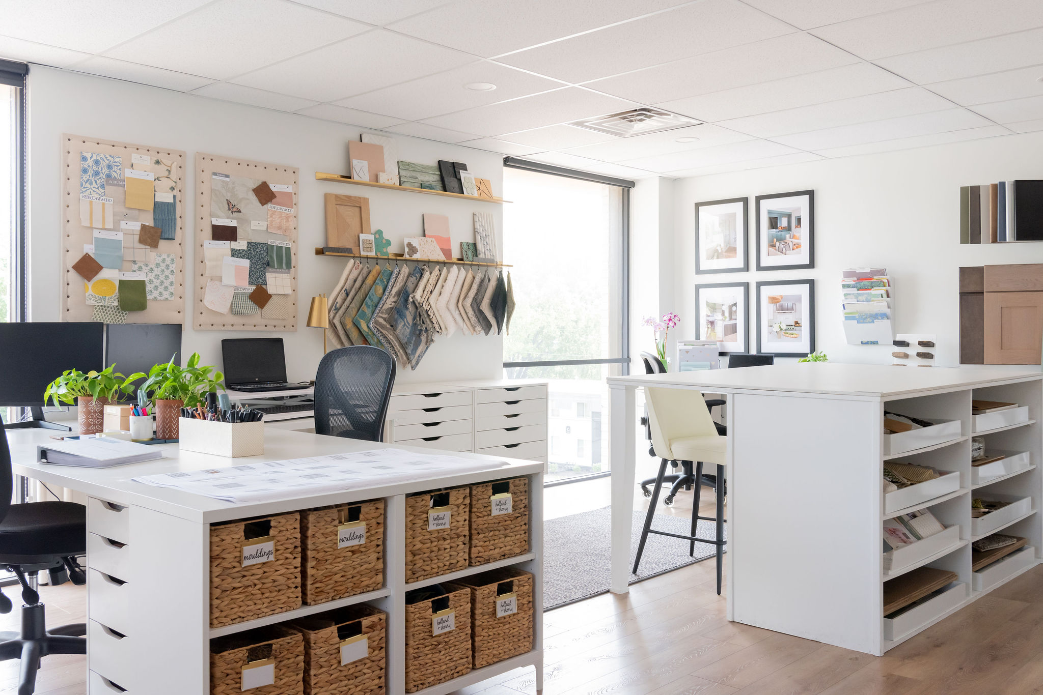
For the Resource Library, we used these bookcases from Ikea and added our own hardware. Inside the drawers we have clear containers to house samples like; wood finishes, molding, flooring, paint samples, etc. The baskets house many different leathers, fabrics, plumbing and lighting metals – just to name a few!

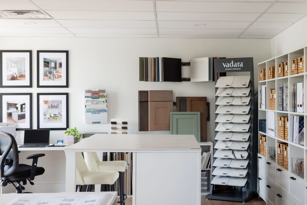

Then we had one of our favorite carpenters build a Work table/Island with seating for two people one side and 8 shelves on the other side. The shelves give us places to store our large client project trays. We get these from West Elm and they are perfect!
On the window wall across from the Bookcases, we hung two metal floating shelves that we use S-hooks to hang rugs from. We also use the shelves to showcase materials we are inspired by and hope to use in upcoming projects.
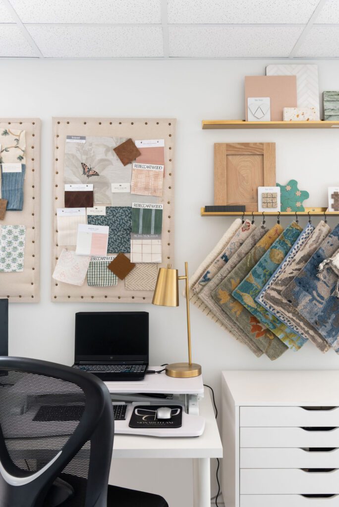
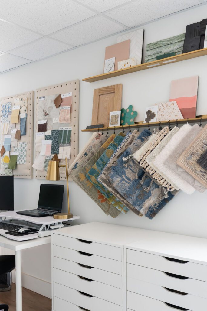
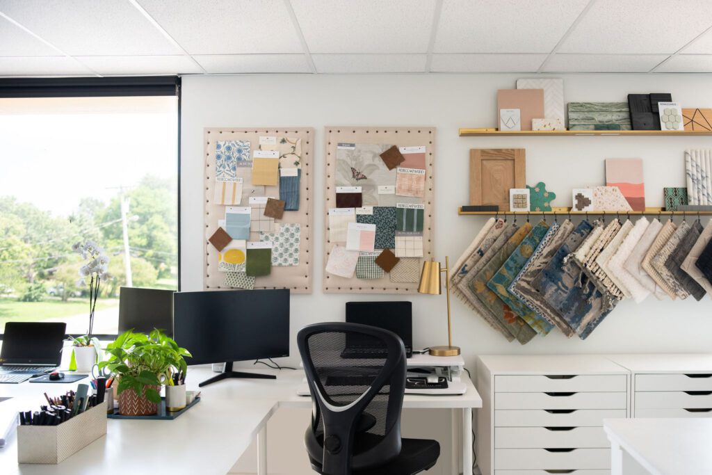
Every creative needs pinboards to put up new and inspirational fabrics. We made these with regular cork boards and then wrapped them with linen and brad studs. We change these pin boards out seasonally or when we get a new shipment of fabrics and want to display. Sometimes these boards are used to pull together a new concept. Any way you look at it, they are like artwork!
Between all the desks we wanted a central seating area for collaboration, small meetings, coffee breaks, and end of day cocktails! We took these four leather chairs and grounded them with a small leather hide rug.
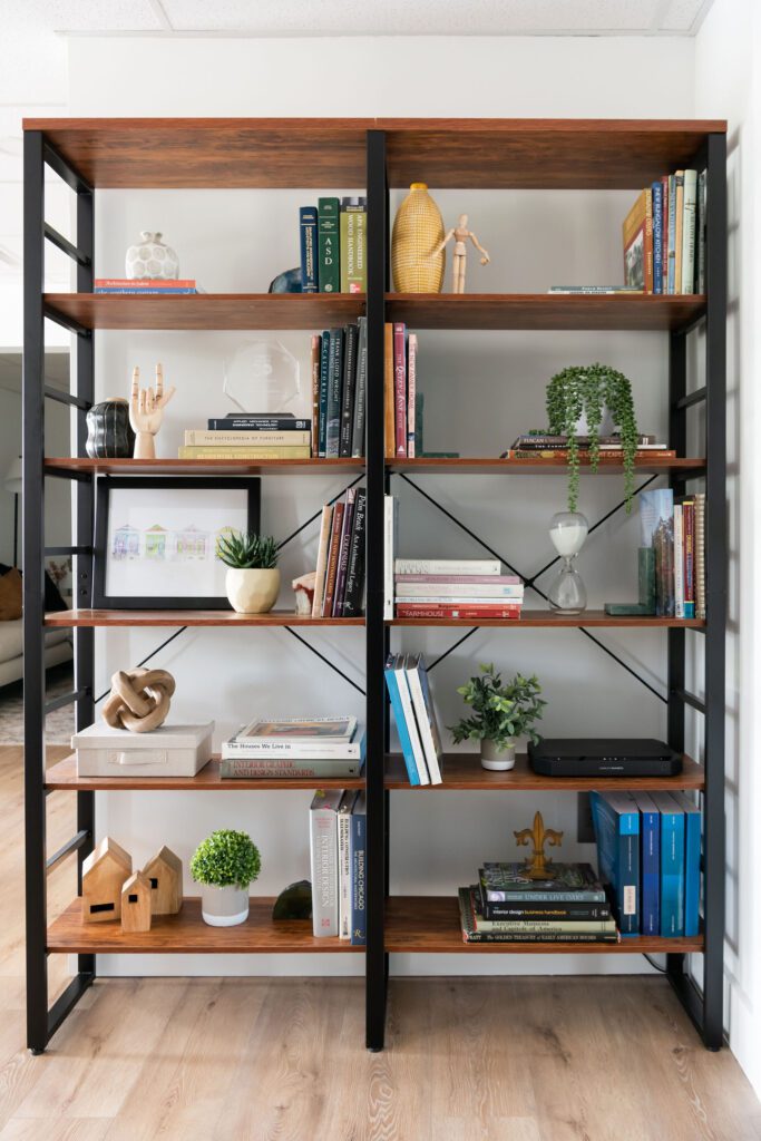
Then going into the Conference area we added bookshelves on one side and a bar cart on the other side.
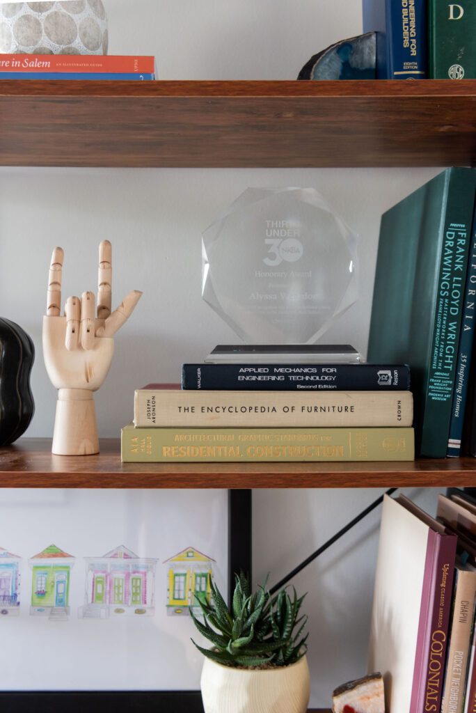
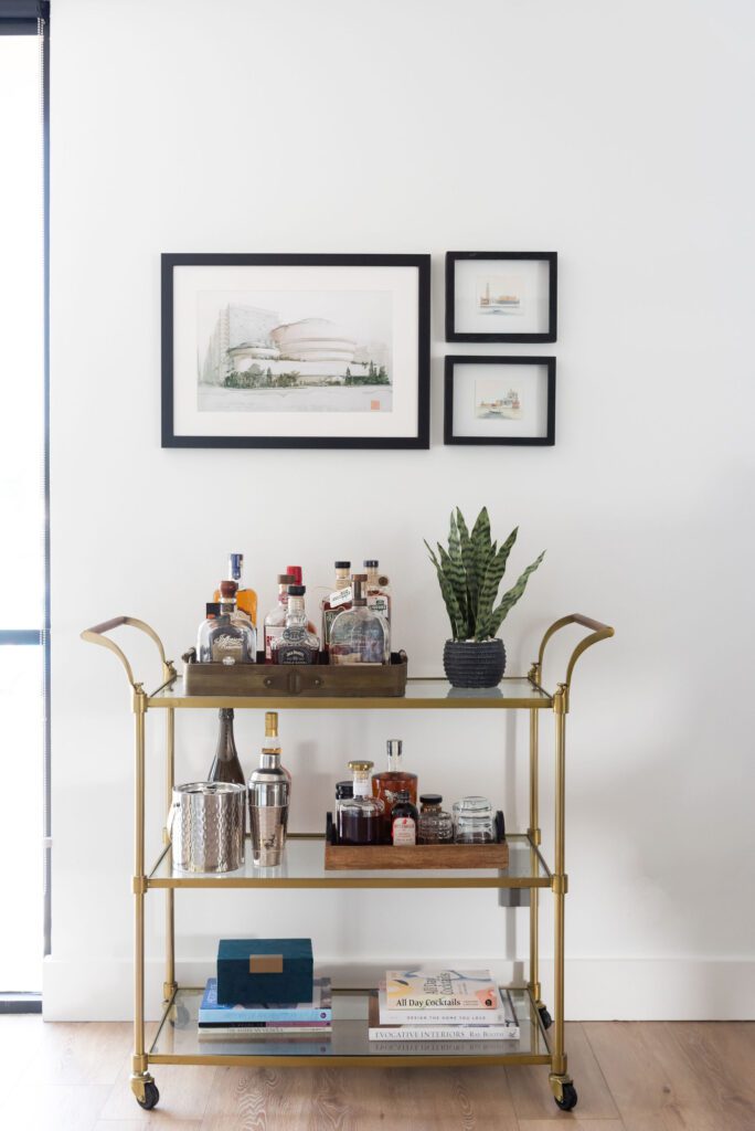
The conference room we enclosed with a glass wall and doos. It keeps the space light and is the perfect place to present to our clients or meet with contractors, reps, and other trades.
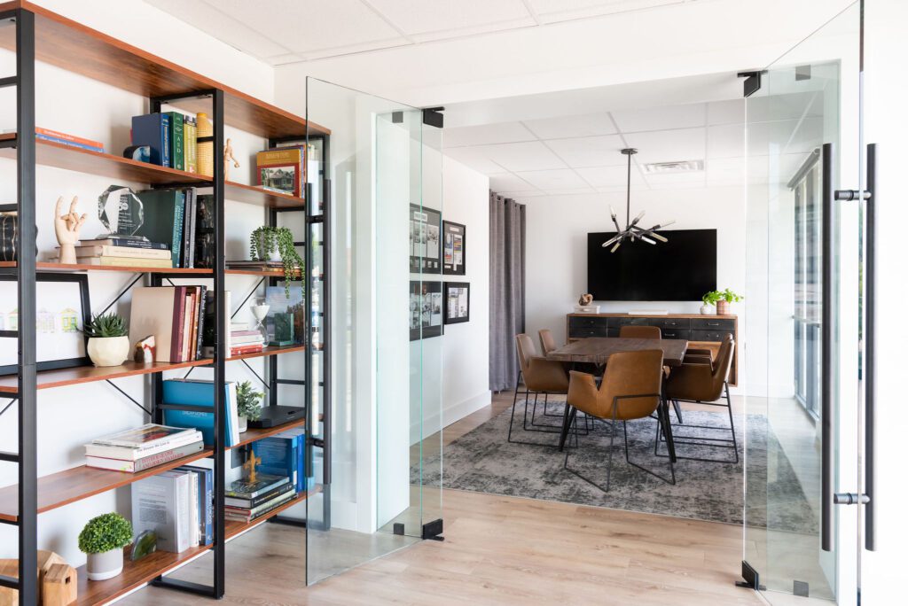
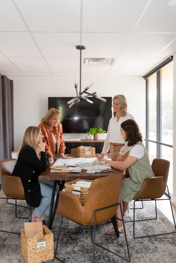
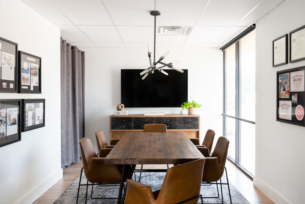
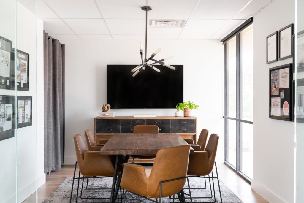
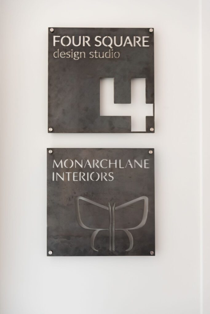
As I mentioned in the beginning, we share our Studio space with friends and Architects Andrew Heideman and Brad Sayers with Four Square Design Studio. While we are separate companies, we do feel that our clients and contractors benefit from the collaboration we have together and our Studio gives our clients a design power house!
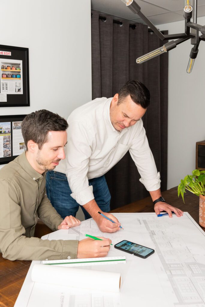
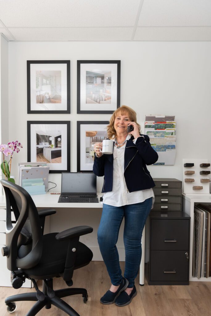
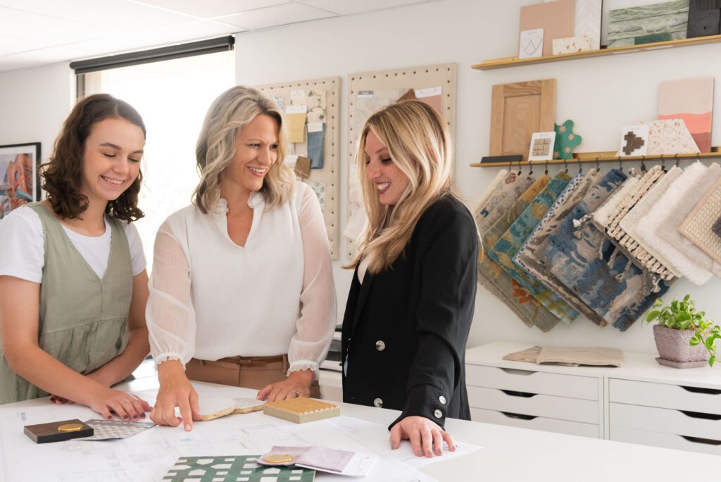
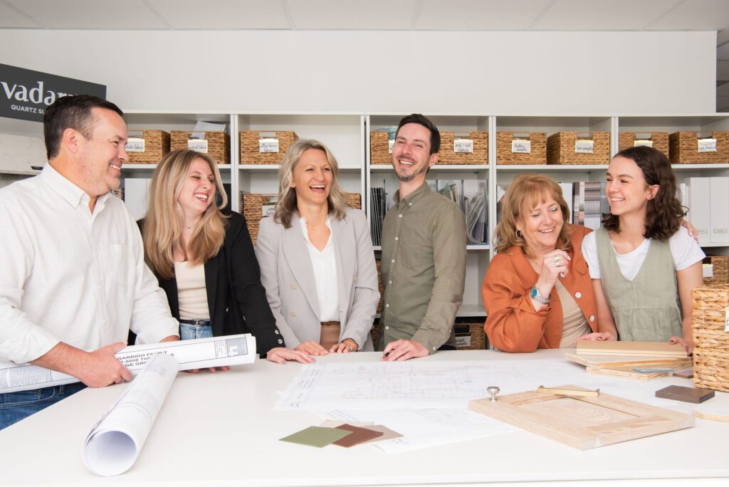
We also make sure to have a lot of fun! We have really enjoyed working here and our clients have liked the new space too! Looking forward to all that the future holds for this Design Studio and our collaboration.

The space looks stunning! What a warm and inviting place to welcome clients into and for project design! Congratulations!
Thanks Amber! We are super excited. Look forward to seeing you at Bloom & Grow Live! 😉
It’s absolute perfection!!!
I’m SO happy for you Rebecca!!
Thanks Elizabeth! You will have to come visit
Rebecca, Beautiful space and so organized and fresh! You have inspired me!
Hope your new space feels life-giving and full of joy and profits in all the things that matter most!
Thanks Sharon! I am so glad it inspired you! It definitely reminds us how the spaces we are in affect how we feel. And it has been such a blessing! Thank you!