For this project reveal we are showing you a walk out basement that includes places for the family to hang out and guests to visit. This does not feel like a basement. With it’s tall ceilings and big windows, it is a welcoming place to be. Below is the floor plan for this project.
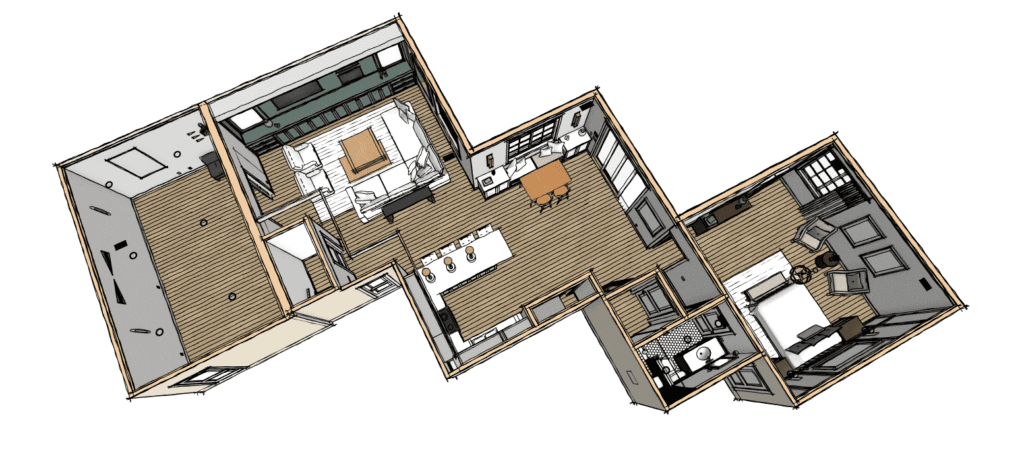
When you arrive at the bottom of the stairs you enter a great living room space. To the left of the Living Room is a movie room or playroom. Then adjacent to the Living Room is a full kitchen and eating area that opens up to the back yard. Next to that is the elevator and a guest suite with full bathroom. We also did a full double porch and will share that project soon! 😉
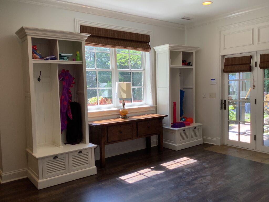
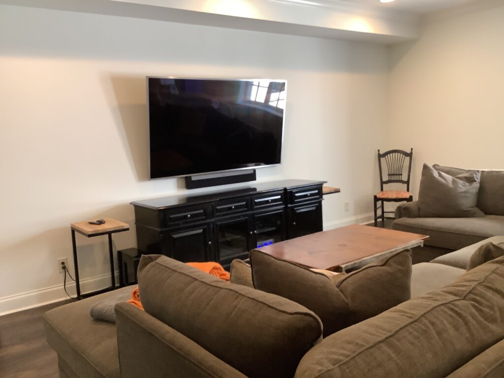
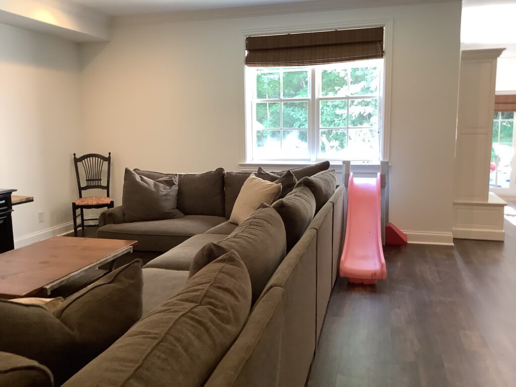
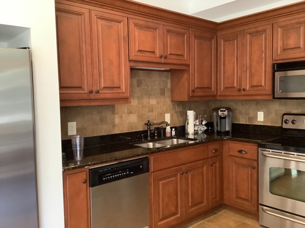
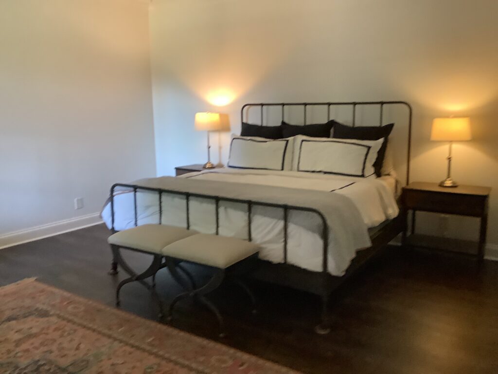
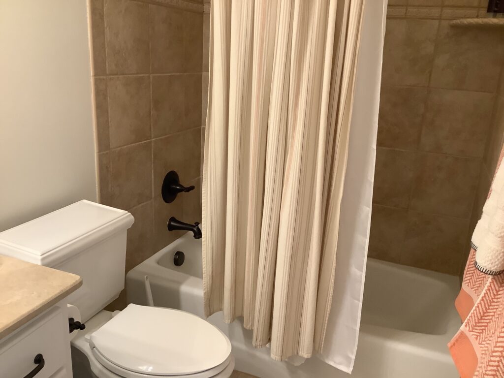
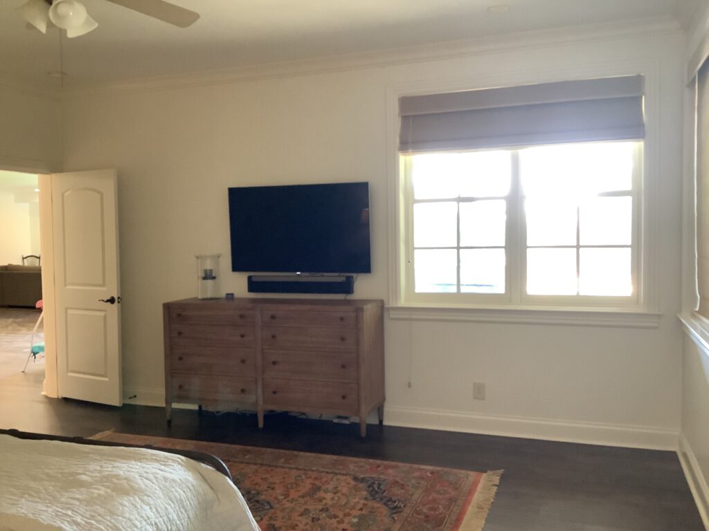
Before
Everything was just dark, heavy, and not our client’s taste. They knew this could be such a great space for their family and friends, they just had to make it work for them. Here is where we started out.
The Design
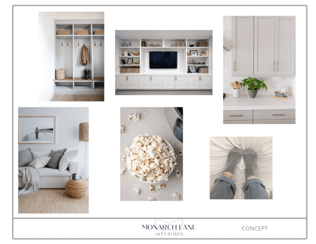
Sometimes concepts evolve throughout a project. The mood for this entire project was a tone on tone with soft colors and lots of texture. By the 2nd or 3rd meeting, we told our client that her favorite color was texture! And that was how the name for this project came about. This sophisticated palette really brightened up the different rooms and the displayed the layers of texture and gave every space depth.
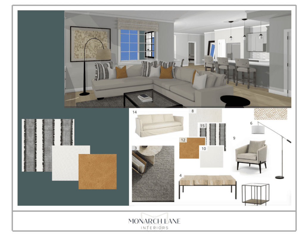
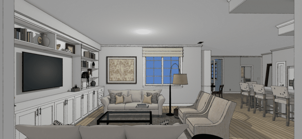
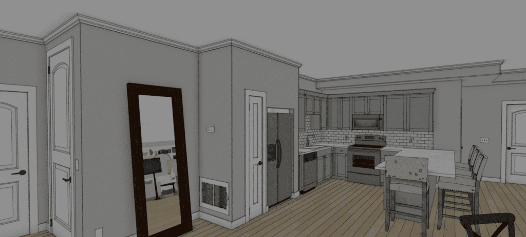
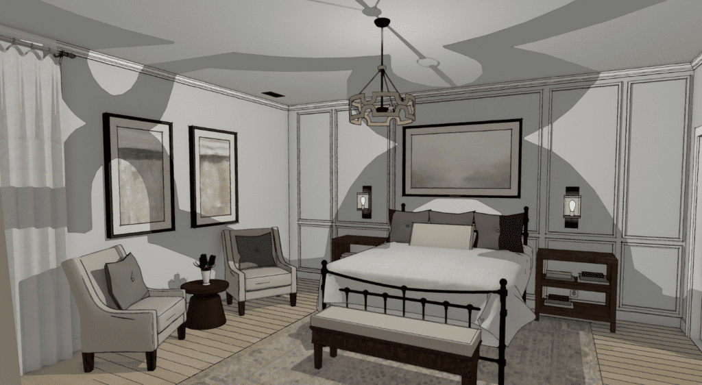
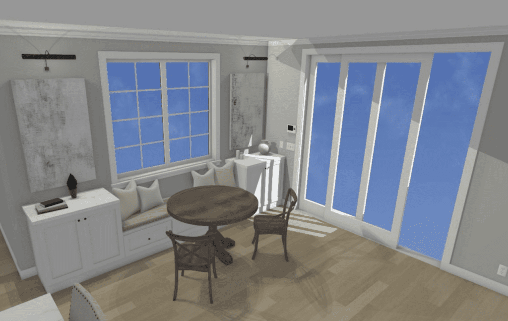
THEN – when picking the color for the entertainment wall, our client fell in LOVE with this moody blue green color! I absolutely LOVE color and I feel like this accent wall really sets off the other spaces really well. No longer just neutrals, but a literal POP of color! Below are some Renderings to show off the design intent.
After
See the pictures below to see how this project turned out. We are in LOVE with this Space!
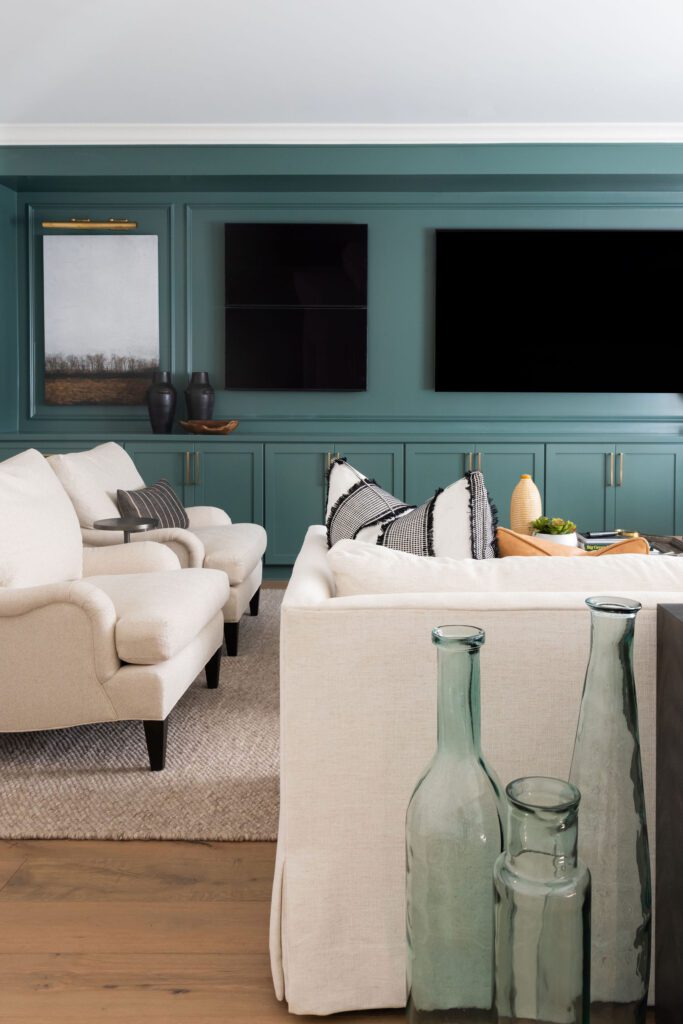
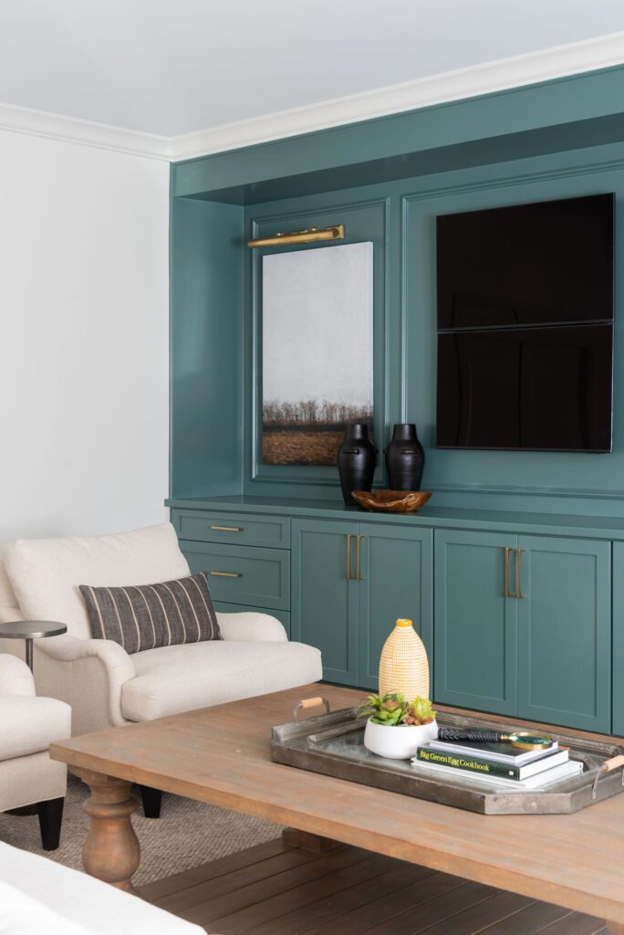
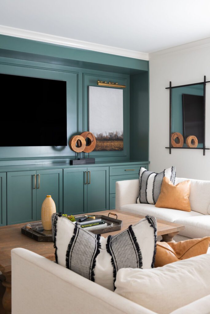
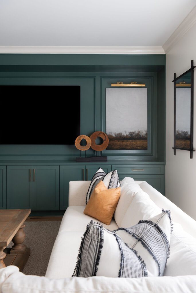
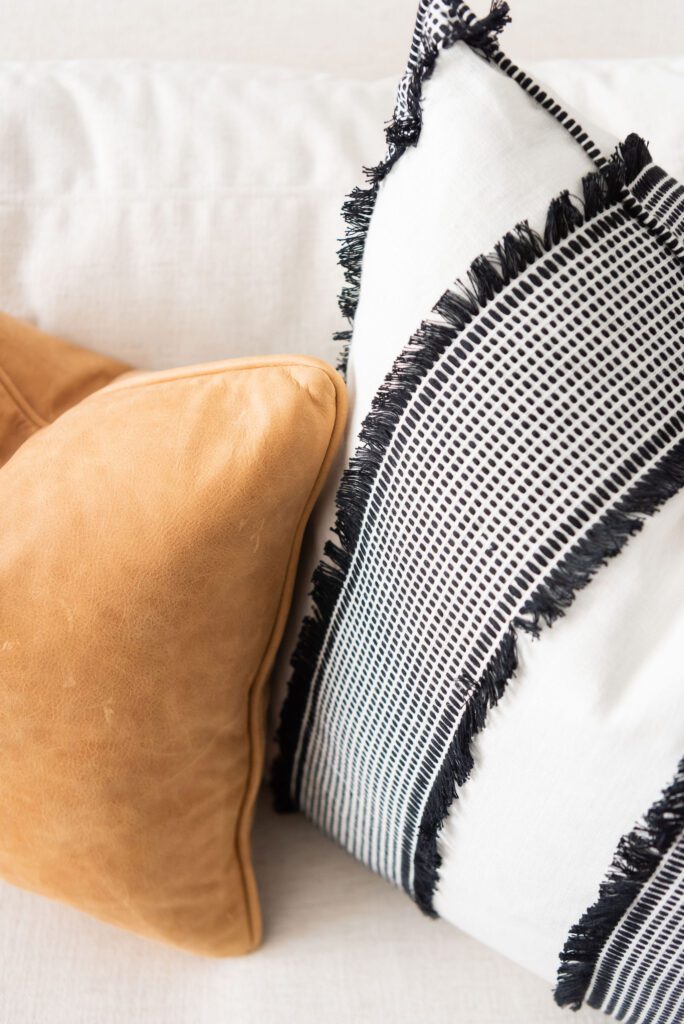
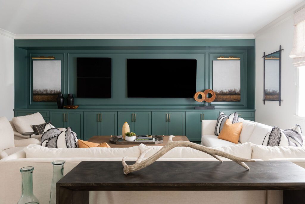
We replaced all the floors throughout with a white oak in a natural finish. For the living room area we gave them another great sectional to hang out along with some chairs for conversation and additional seating. The moody green/blue color on the media wall is balanced with all the natural light pouring in. We made sure to give them a great roman shade with black-out lining so it will block light when watching their favorite movie or game.
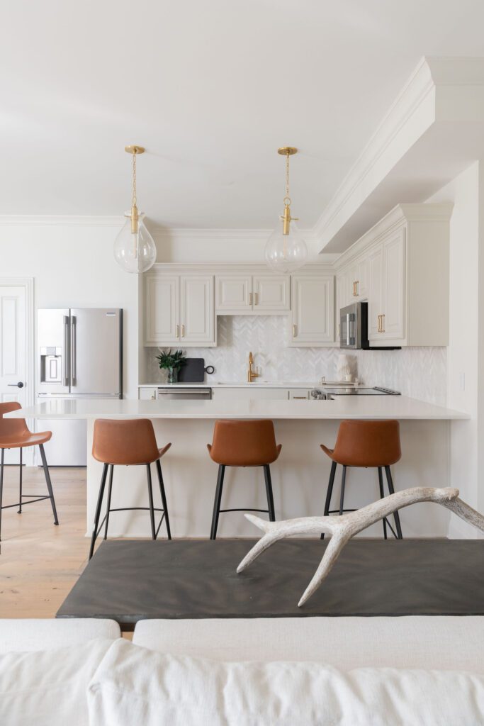
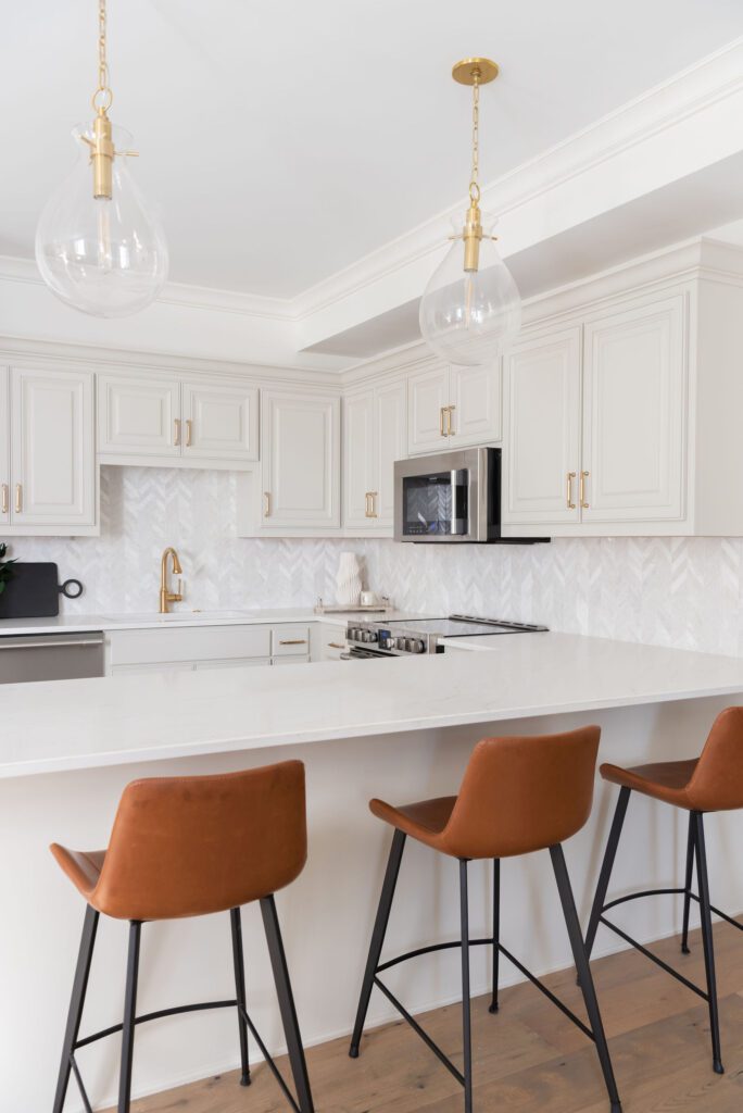
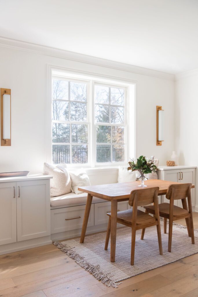
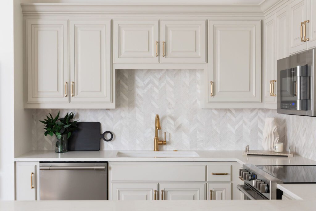
For the Kitchen we just freshened up the cabinets with new paint. Then changed out backsplash, counters, plumbing, and hardware. The drop zone became a great area to place a custom banquet seating to enjoy a cup of coffee or snack.
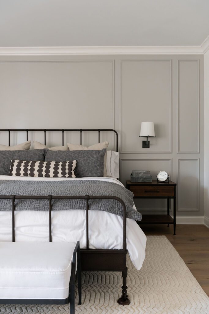
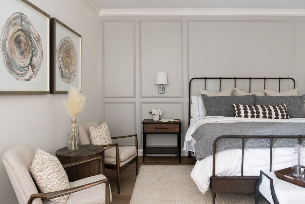
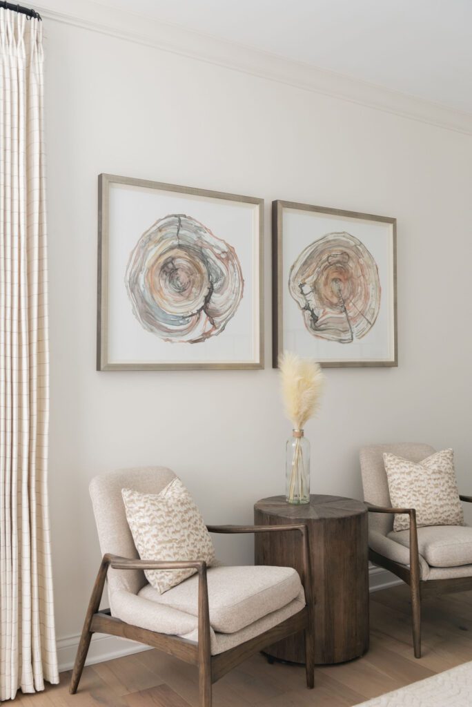
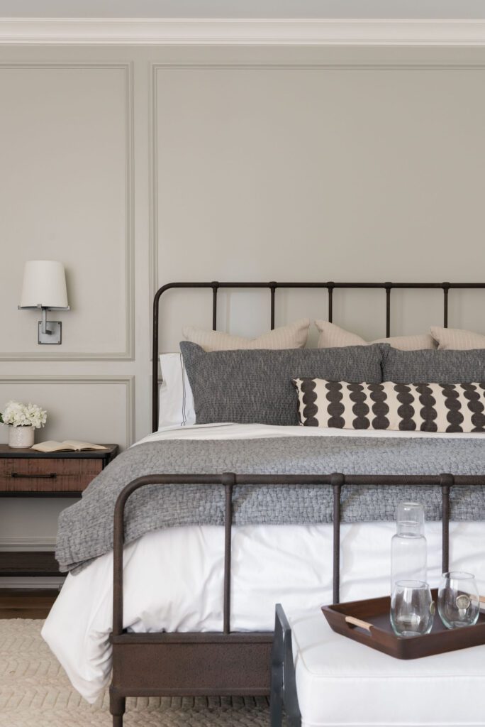
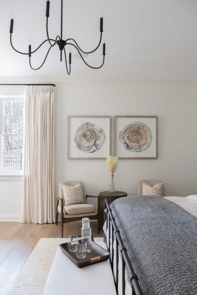
The Bedroom Suite had some great key pieces to start with the bed and dresser in play. We added drapery, linens, a super soft rug, a sitting area, artwork, and new lighting. Another great way we added texture to this room was to put picture frame molding on one wall accenting the bed and following the height of the room. It added a level of sophistication this guest suite was begging for.
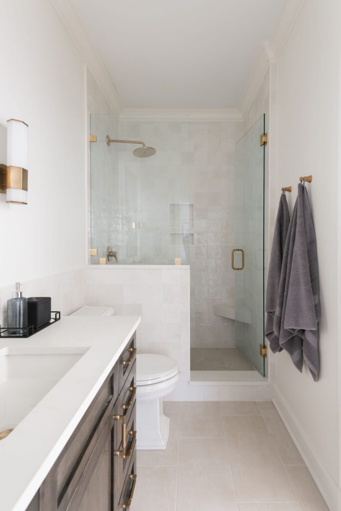
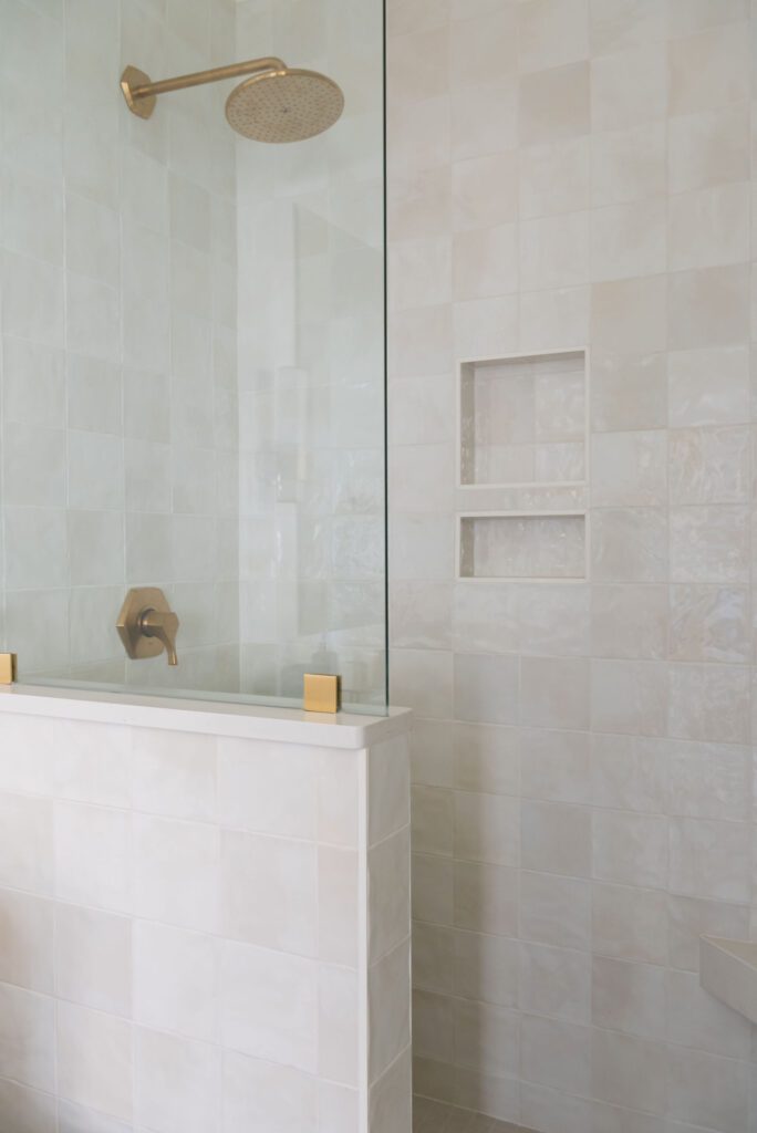
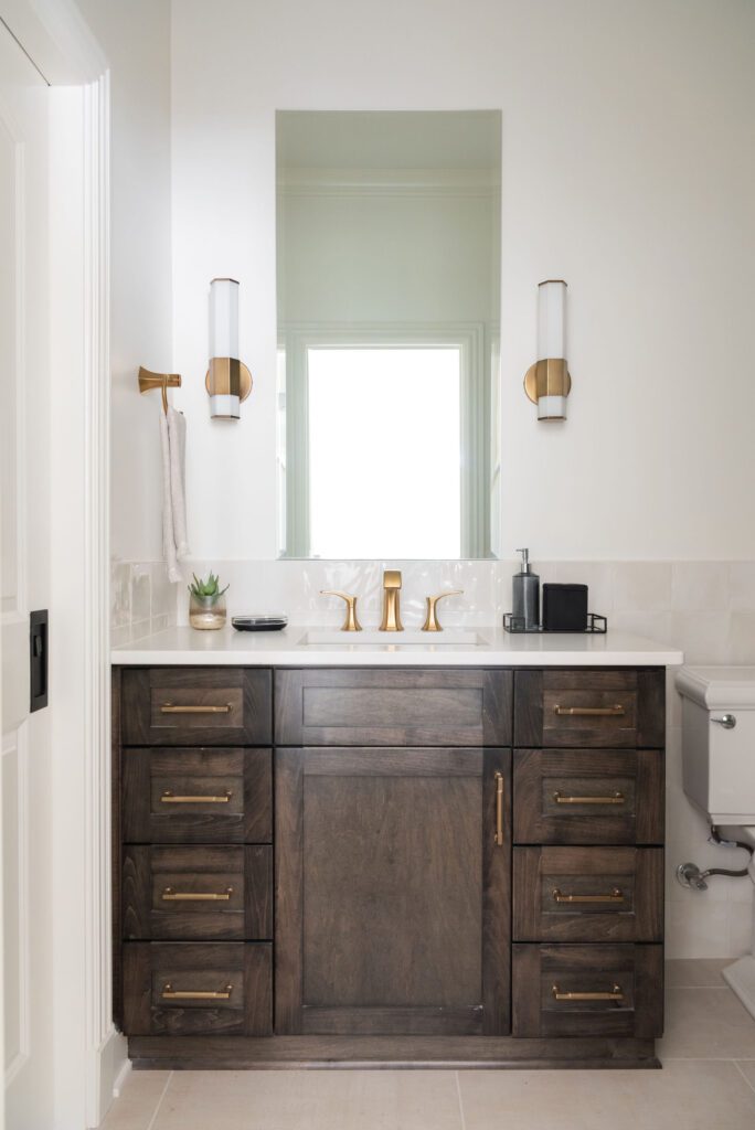
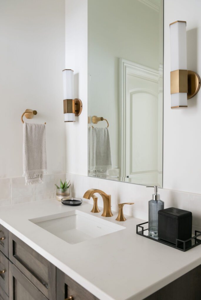
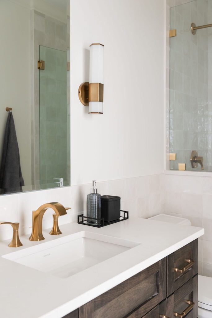
We love the deep cabinet color with the neutral tone on tone hand-made tiles in the shower and backsplash. The warmth of this combo really elevates this room. The burnished brass was a perfect way to compliment the other materials and finished the room off nicely.
This was such a fun project and great space for our clients to hang out. We worked with Kingdom Builders to remodel the entire basement and a double porch outside. We will share that project soon! To see more photos of this project, head over to the portfolio page.
Photo credits: Allison Elefante – Thank you for making us look so good!!

Be the first to comment