This project is called Down to Earth. Not only were our clients the sweetest, most down to earth people but they wanted they’re bathroom to be earthy and have natural materials.
Gone are the low cherry cabinets, dark cave of a shower, cumbersome tub deck and sconces on the wall to wall mirror. We don’t just want to update a bathroom to stay current, we strive to truly create a sanctuary for our clients to enjoy everyday.
This is where we started
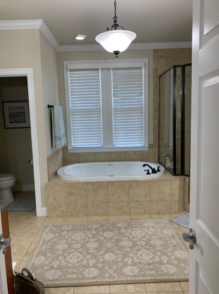
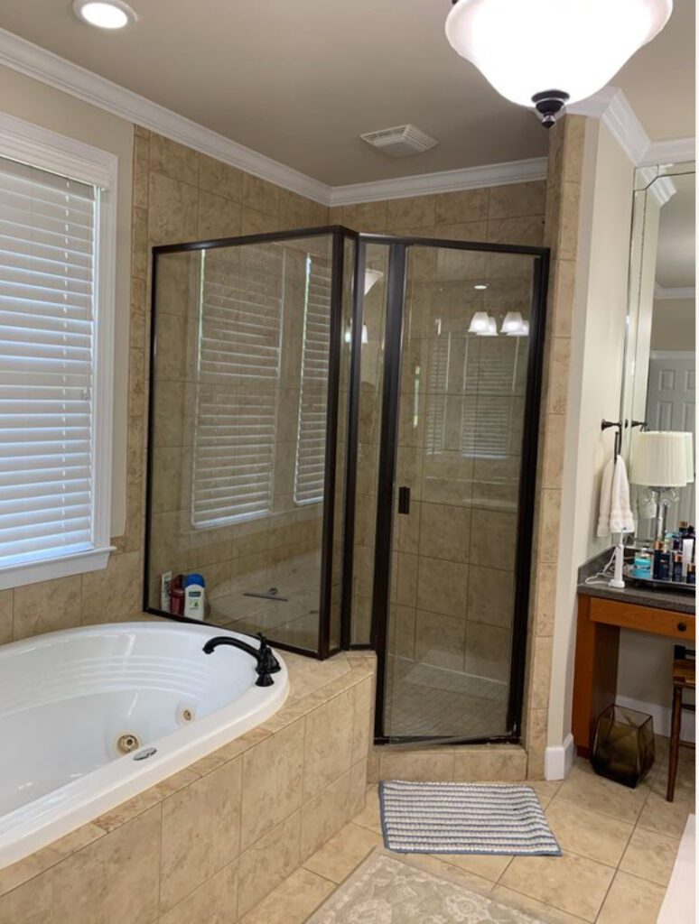
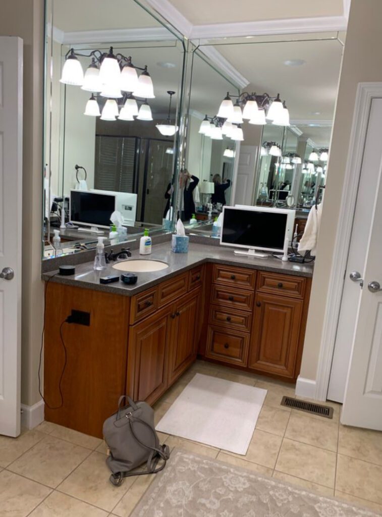
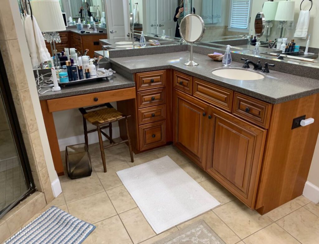
The old layout had the built-in tub surrounded by the angled shower and powder. This was a common design for bathrooms in the 1990’s and early 2000’s. It also had lots of dark cherry cabinetry, outdated fixtures, and wall to wall mirrors! The home-owners were ready for a change.
The Design
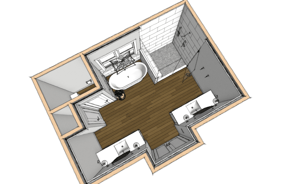
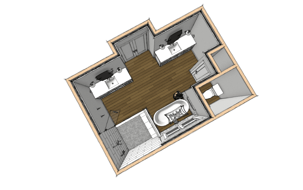
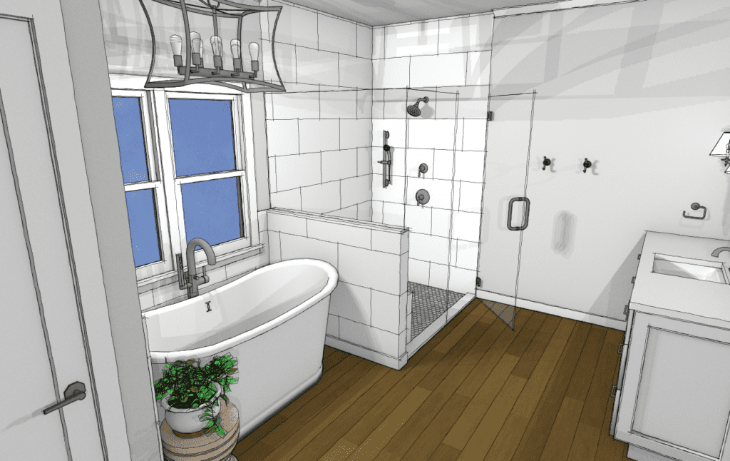
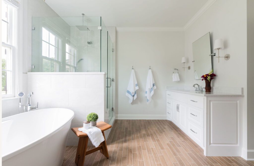
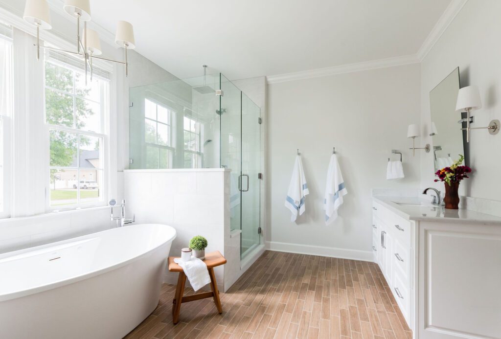
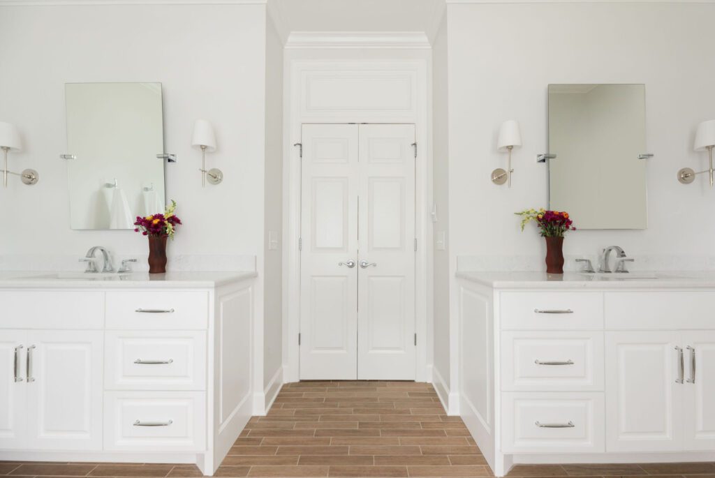
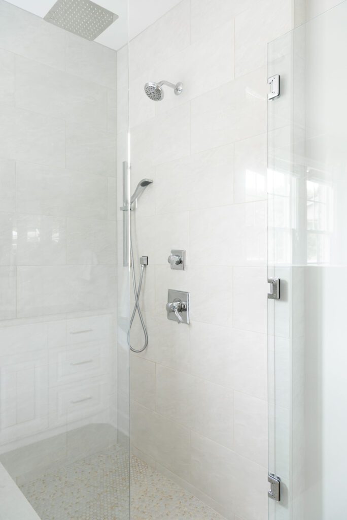
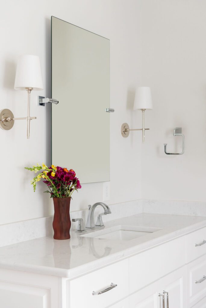
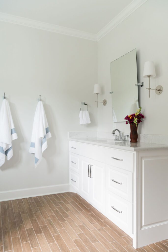
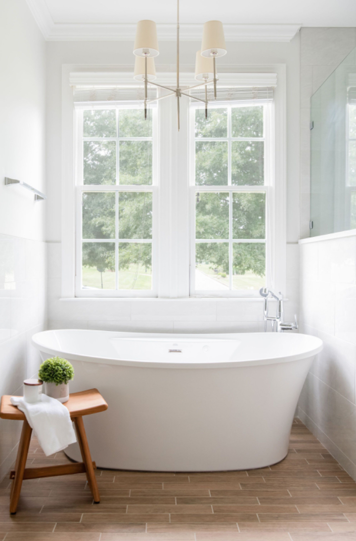
We took out the built-in tub and replaced it with a free-standing one. We increased the shower and got rid of the angle. They did not need a sit down vanity, so we eliminated some of the cabinetry to open up the floor space. Besides updating fixtures and finishes, we installed mirrors that are framed with sconces.
We focused on brightening the space up by bringing in bright whites, and warm nickel tones.
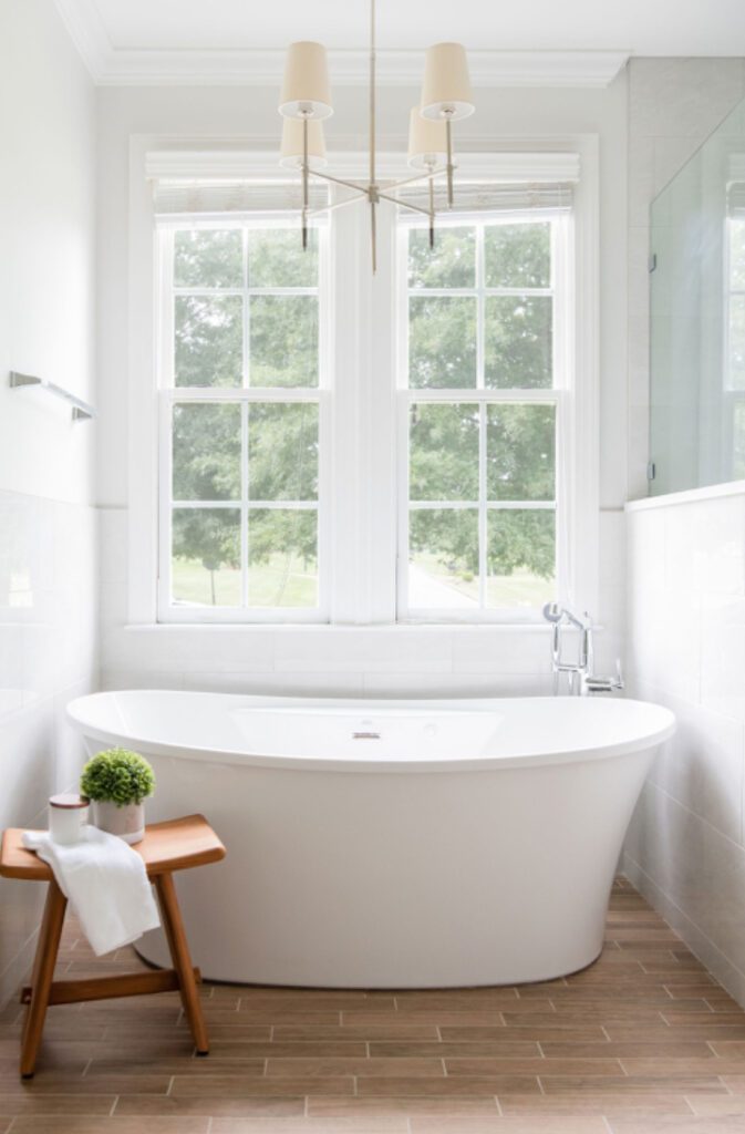
To bring in the nature, we decided to do a wood look for the tile floors, to bring in some warmth and natural elements while still being easy to clean. While in the shower you are surrounded by creamy white marble tile which bounces more light from the spacious window over the free standing tub. Now with having white tile, there’s white grout, and who wants to scrub grout all the time. Our favorite thing to let our clients in on is that we only use grout with the sealer built in.
Our client was not about to give up her relaxing nights in the tub, so we made sure to find a comfortable freestanding tub that perfectly compliments the space sitting under the window.
The Afters!
Photographer: Allison Elefante
Builder: Kingdom Builders
Click here to check out more of this project in our port folio!

Be the first to comment