It is no secret that trends come and go. And while we make a habit to design spaces that really reflect the client and what they love, dying trends is the reason we do so many makeover and remodeling projects. People want to revive their old and tired spaces!
I want to share with you 8 Scary and old Kitchen Trends and what we are loving in it’s place!
SCARY KITCHEN TREND #1 – ALL WHITE KITCHENS
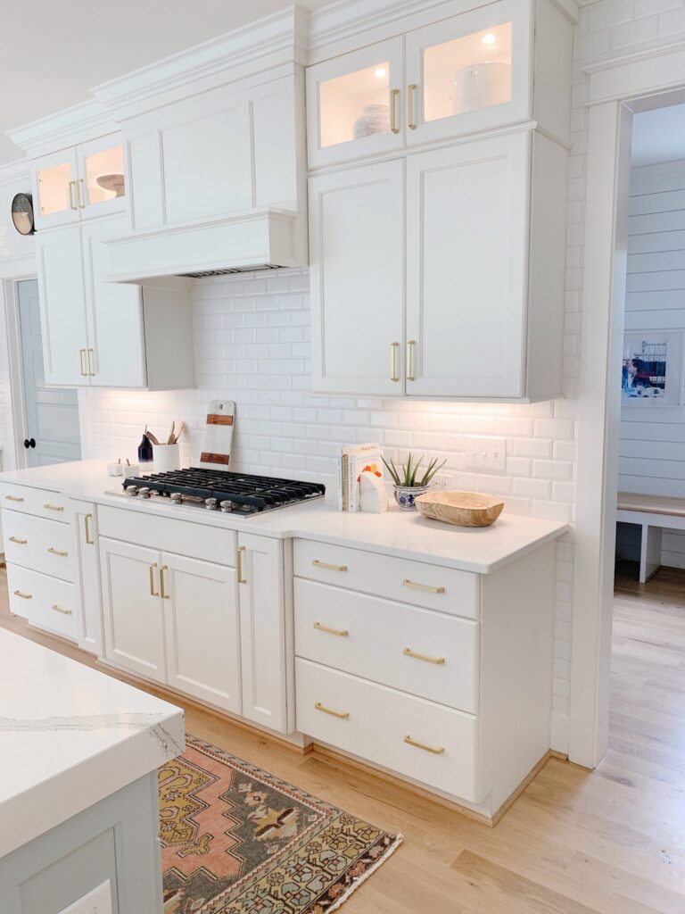
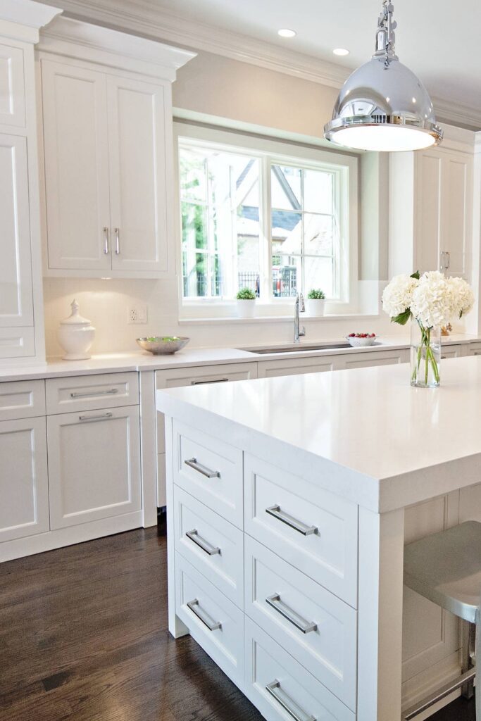
The All-white Kitchen was the movement about 10 years ago where you saw white cabinets, counters, and backsplashes. It was in response to the dark and heavy Kitchens prior (more on those coming up!) So while I see this trend as being a palette cleanser – they were so sterile and plain, and a life without color is scary!
WHAT WE LOVE INSTEAD OF ALL-WHITE KITCHENS: WARM CONTRASTING DESIGN
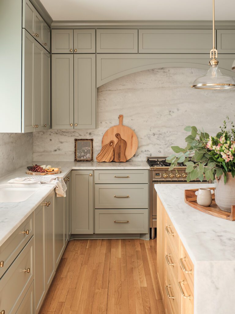
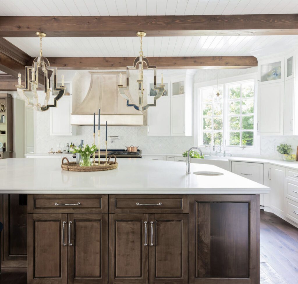
Following the all-white Kitchen trend was the two toned Kitchen. This made the white still a binder but bounced a little contrast with it. Now (end of 2023) you will see the warm color and or rich wood tone kitchen with a vibrant and or natural stone. We also love that If one chooses white cabinets, they are usually mixed with warm woods at an island or on a wood ceiling or beams.
The other direction we are gravitating towards is Rich and Moody. Whether you go all in with a dark color or you just add it into the island. This look is so sophisticated! It helps to have a well lit Kitchen and just determine how much of it you want to see. Below are two Kitchens we did.
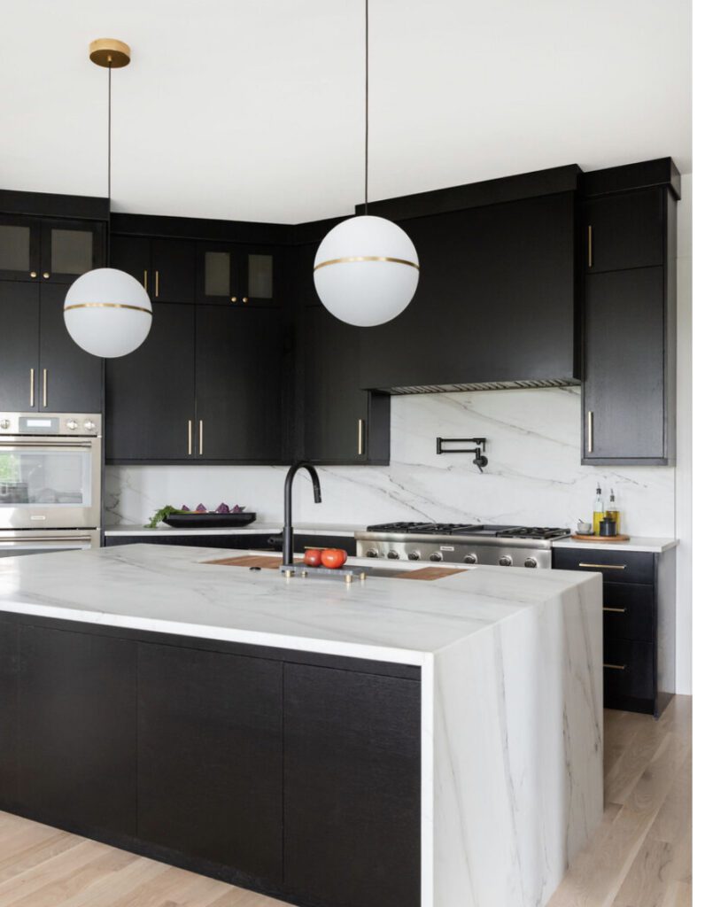
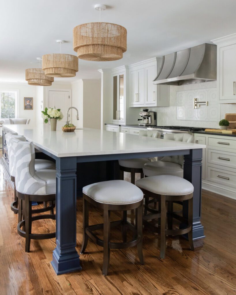
SCARY KITCHEN TREND #2- THE STANDARD DEPTH FRIDGE
If your fridge is sticking out into the isle, this is interrupting your site line and and pathway. If you can see the sides of your fridge because it is bigger than the panels, it will look off, like it doesn’t fit. This is the biggest offender of most Kitchens we see and if you change this one thing- I PROMISE you will see a huge difference!
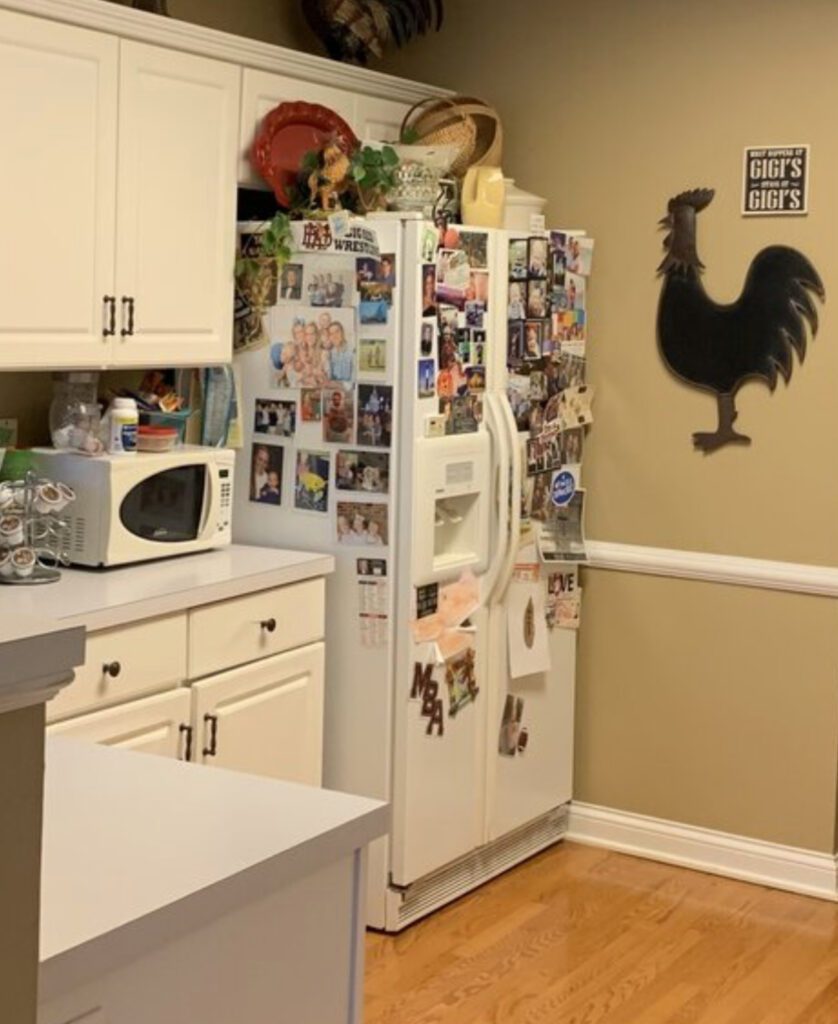
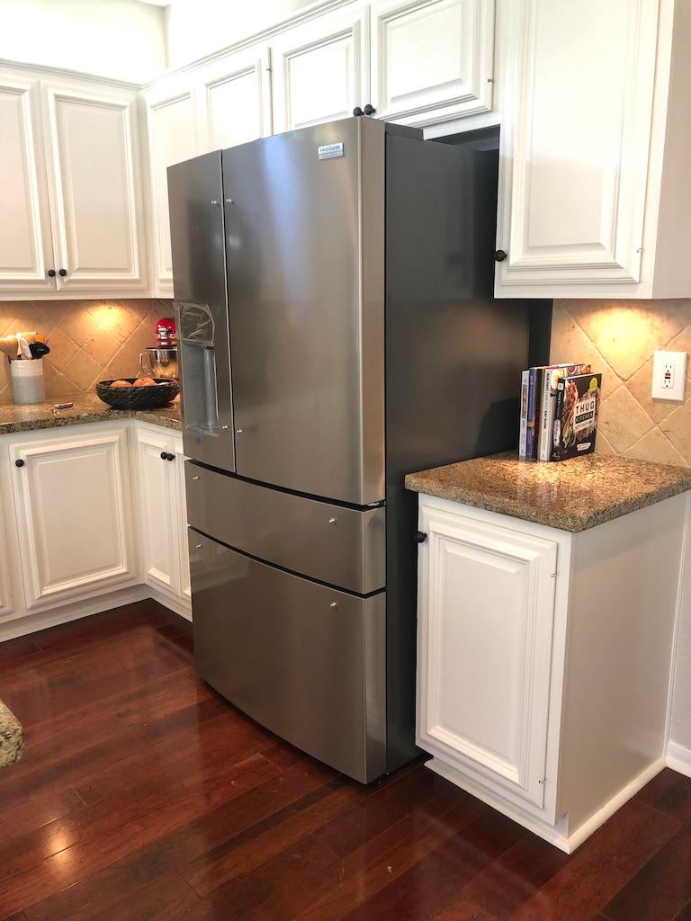
WHAT TO DO INSTEAD OF THE STANDARD SIZE FRIDGE: GET COUNTER DEPTH FRIDGE
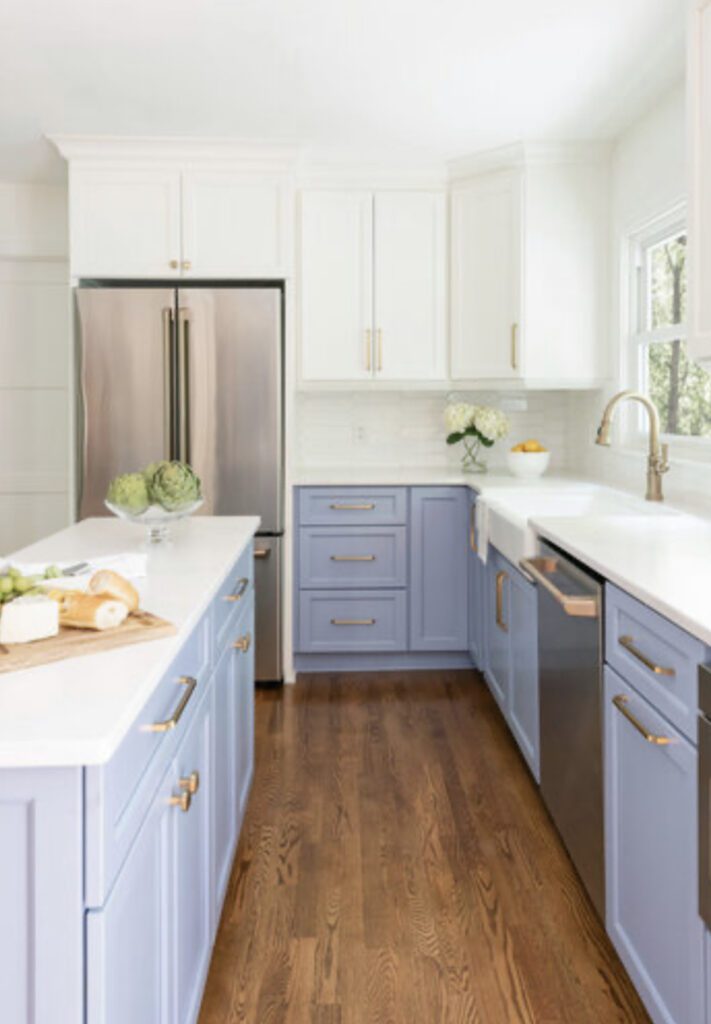
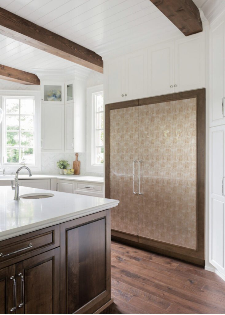
A Counter-Depth Fridge is usually 24” deep (not counting handles) and lines up beautifully with your cabinets. Integrated and paneled refrigerators are also a way to customize your Kitchen and make it unique.
SCARY KITCHEN TREND #3 – BASE CABINETS WITH NO ACCESSORIES
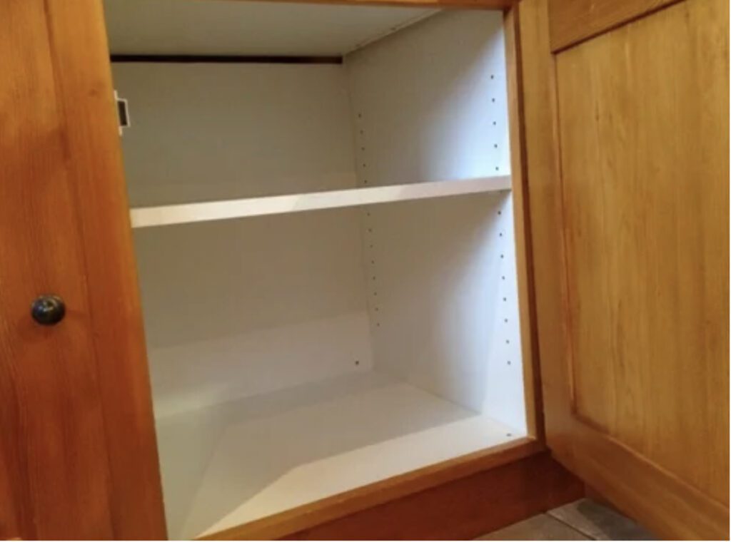
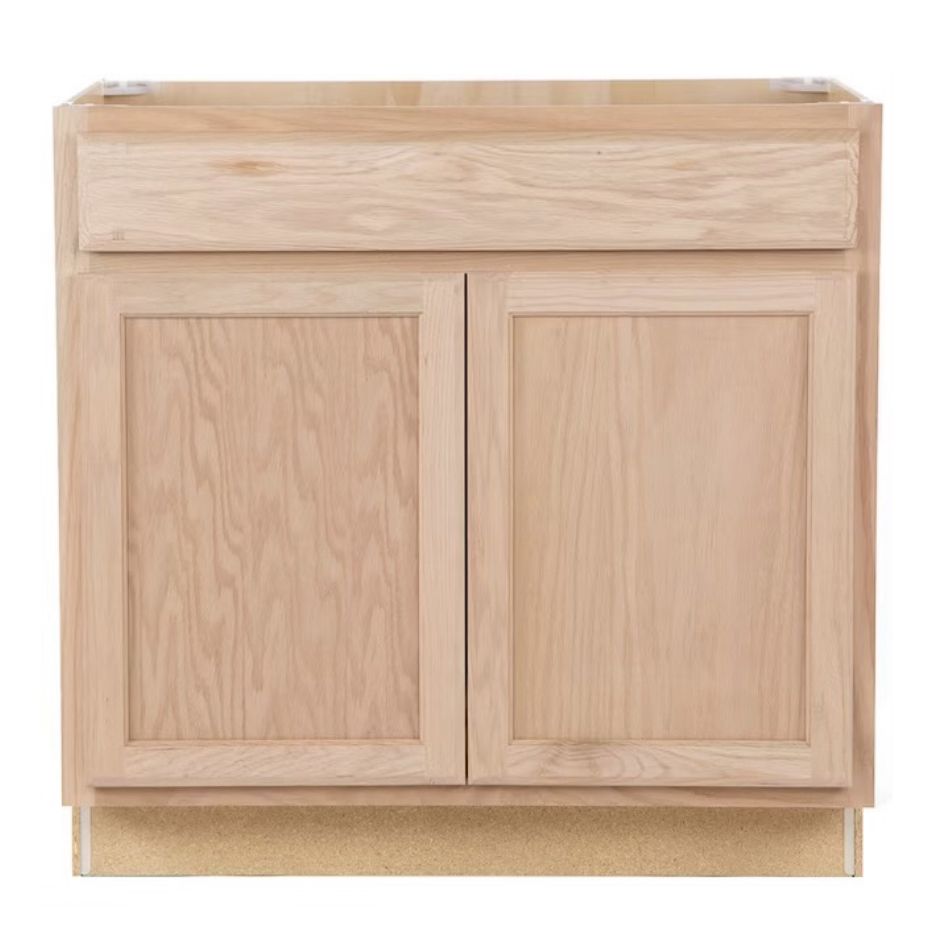
Base cabinets without pull outs are like hollow caves that force you to get on your hands and knees to get out what is buried inside. While these are less expensive than drawer bases, they need some accessorizing in order to make your life easier! It is kind of like the woman with the big purse and nothing organizing -“all the things”. You can’t find anything!
WHAT TO DO INSTEAD OF PLAIN BASE CABINETS: ADD ROLL OUT SHELVES
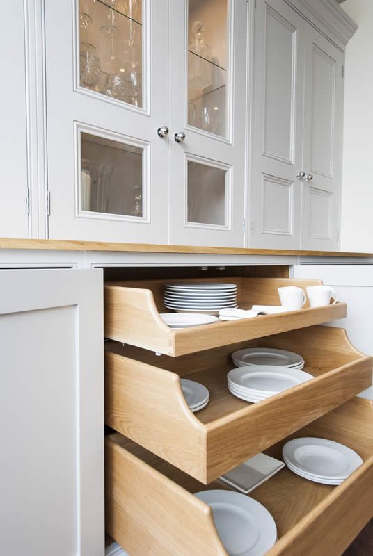
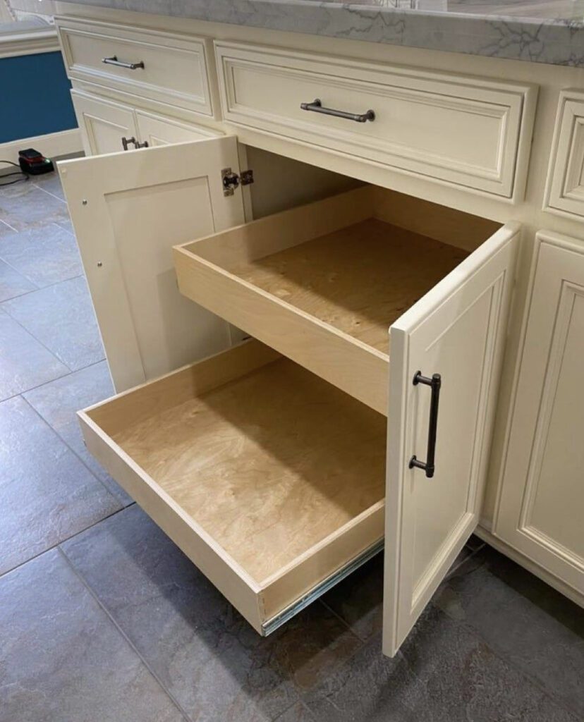
This will allow you to see everything in your cabinet with full-extension pull out shelves. The good thing is that you can add these to an existing cabinet. This will keep you more organized and save your knees!
SCARY KITCHEN TREND #4 – WEIRD ANGLED ISLANDS
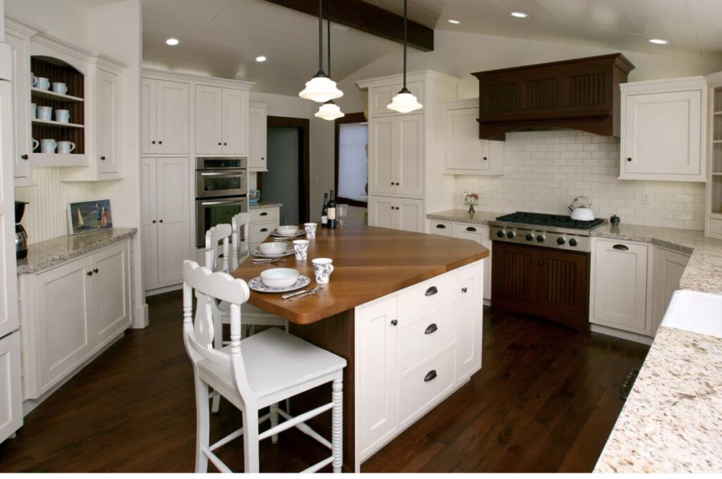
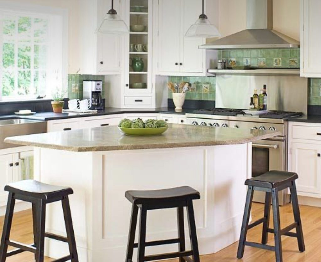
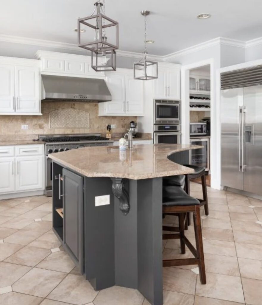
For some reason a weird angled island was all the rage 20-30 years ago. You would see triangles, arch’s, and other oddly shaped islands. It was something you saw in almost every Kitchen. Sometimes the shape was also either too small or too far from the perimeter cabinets.
WHAT TO DO INSTEAD OF WEIRD ANGLED ISLAND: FILL THE SPACE WITH AN EVEN SHAPED ISLAND
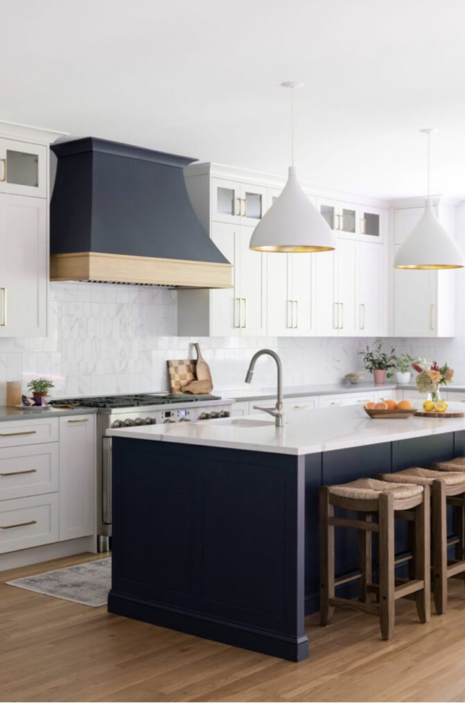
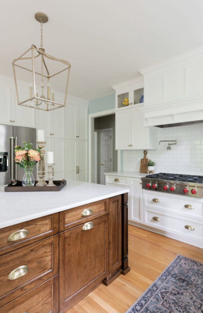
Instead of the weirdly shaped islands, we are liking to maximize the space and fill in with a rectangle or a square. There are all sorts of ways that we add interest to this with furniture leg detail, paneling, and even waterfall countertop. We help our clients to redesign the room’s layout and every single one of them are super pleased with their island!
SCARY KITCHEN TREND #5 – DOUBLE HEIGHT COUNTERS
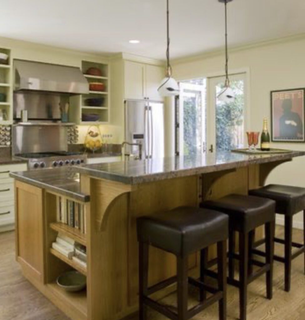
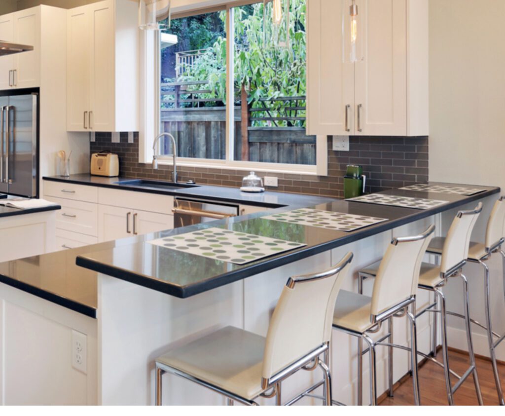
The double height counters were built to feel like you are separating the mess from your guests, but this also cuts off the Kitchen and promoted stuff to be all over the counters.
WHAT TO DO INSTEAD OF DOUBLE HEIGHT COUNTERS: CHOOSE SAME HEIGHT COUNTERS
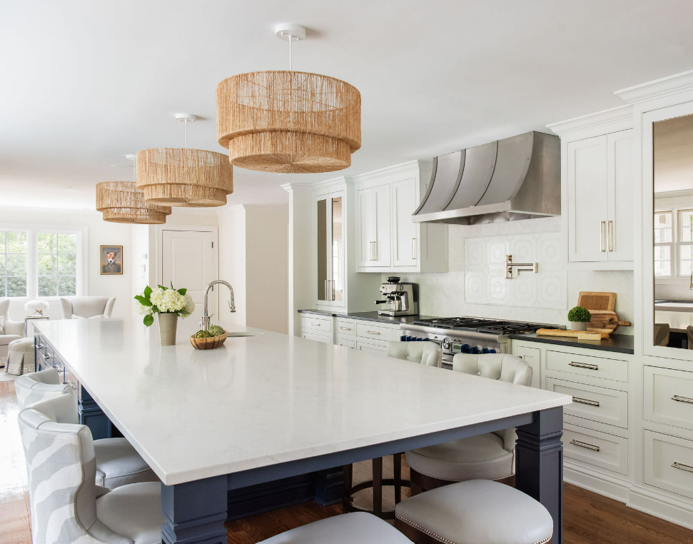
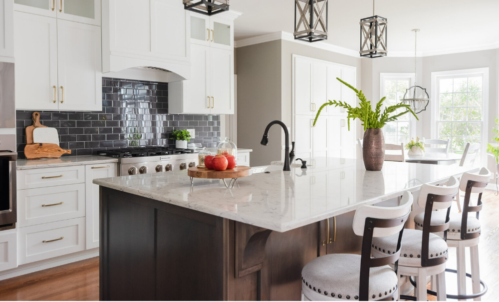
Keeping all your counters at same height is actually more more engaging and supports a cleaner environment. The same height counter opens the Kitchen up and doesn’t feel like a barrier. Even if you are only doing a Kitchen refresh project, you can still get rid of the bar height by modifying the back panels and then getting new countertops.
SCARY KITCHEN TREND #6 – RUSTIC TUSCANY KITCHEN
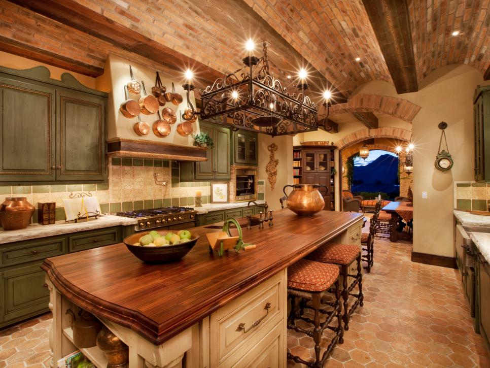
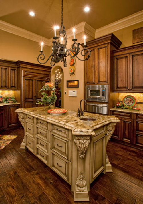
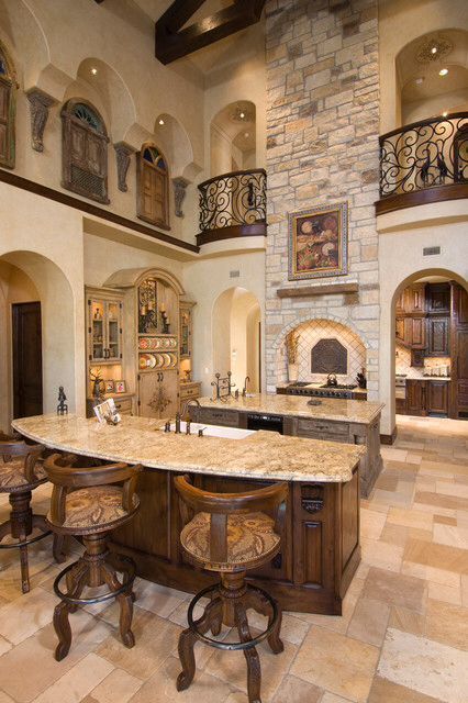
The look of Heavy Distressed and worn out cabinetry with elaborate carvings and heavy ironwork has been out of style for over 15 years, but we still see it! This was the American interpretation of Tuscany, and in fact a Tuscan Kitchen looks nothing like this. The use of natural materials that age gracefully because they are quality materials. Nothing “made” to look old.
WHAT WE ARE LOVING INSTEAD OF THE TUSCAN LOOK – NATURAL MATERIALS IN THE KITCHEN
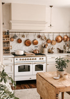
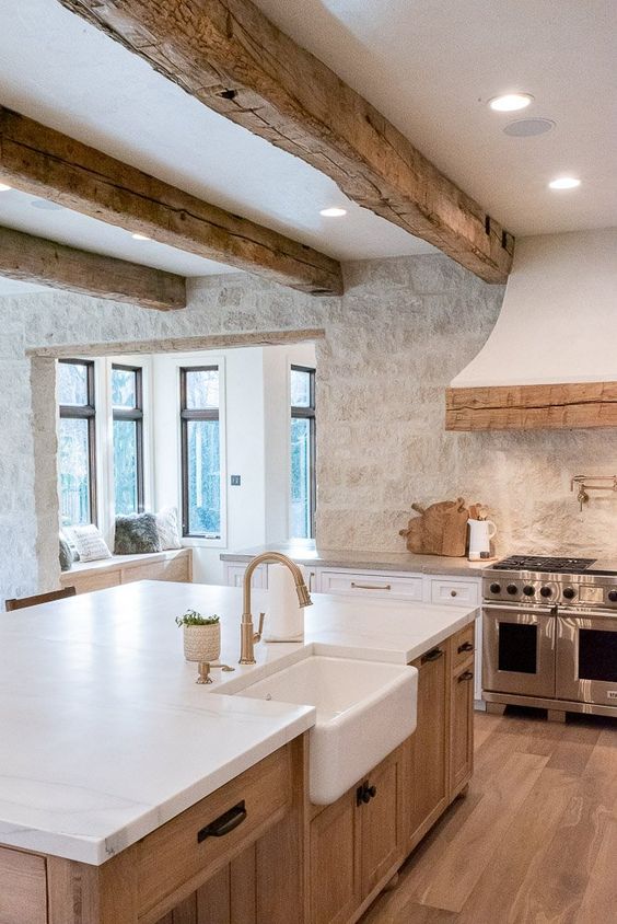
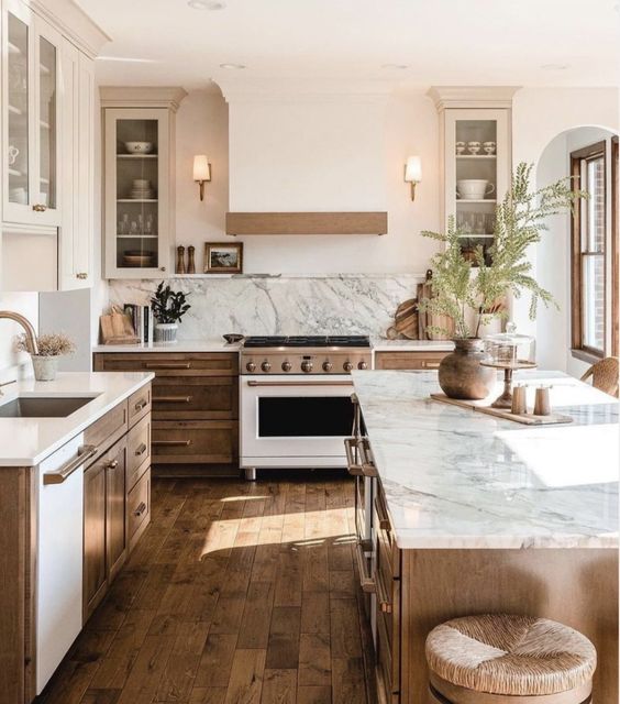
Due to our exposure of the internet and social media, styles have been less defined by a decade and more Eclectic in nature. Styles are blended and more diverse with materials used. We are loving the natural stone and woods with honed and matte finishes. They overall aesthetic is very peaceful, calming, and balanced.
SCARY KITCHEN TREND #7 BORING CLOSET PANTRIES
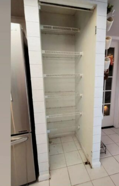
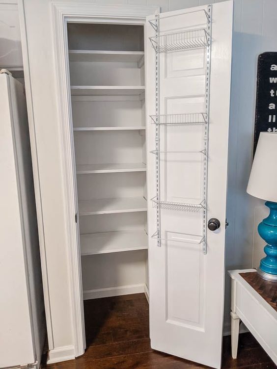
This builder grade pantry design is often with small hard to reach shelves. Sometimes the shelves are wire and items fall through the cracks. If you only have a small area, we like to opt for a cabinet pantry with pull outs. See image below. If you have more room, we like the idea of hiding it!
WHAT WE ARE LOVING INSTEAD OF CLOSET PANTRY: HIDDEN ROOM PANTRY
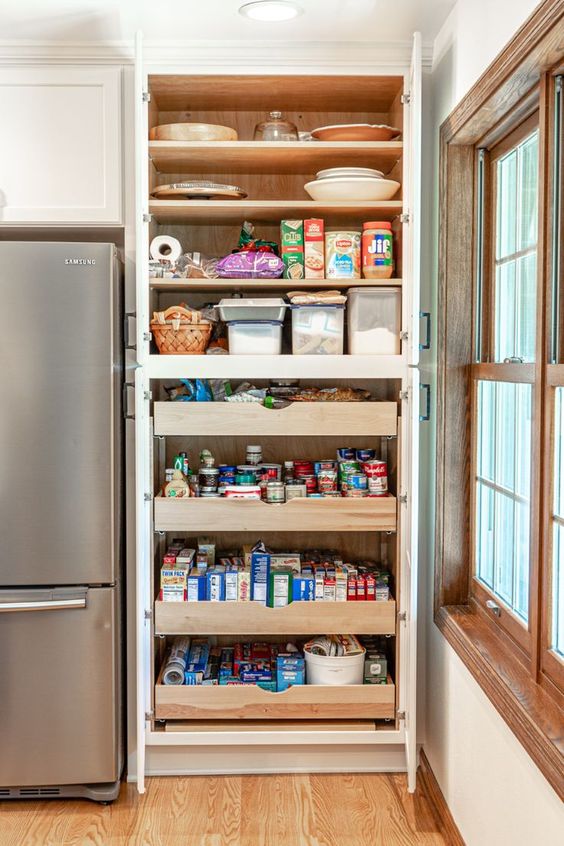
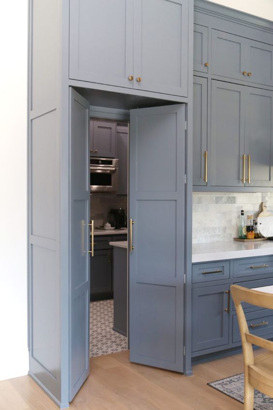
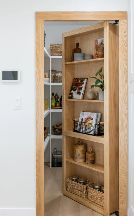
If there is no room to expand we suggest these cabinet pantry cabinets with pull roll out shelves. This way you can see everything and keep it all organized. When space does allow we are liking the Hidden Pantry. Above you will see one pantry hidden by cabinetry and then another one hidden by a bookcase.
SCARY KITCHEN TREND #8 BUSY BACKSPLASH TILE
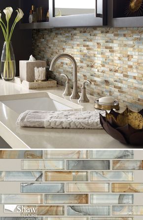
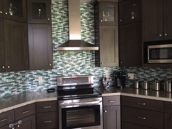
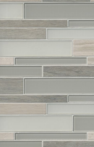
The multi-colored glass tile blends with high contrast were all the rage 10-15 years ago. But they are out dated and very busy! If you want color in your backsplash opt for a solid color or a more calming pattern instead.
WHAT WE ARE LOVING INSTEAD OF BUSY BACKSPLASHES: SOLID COLORS OR CALMING PATTERNS
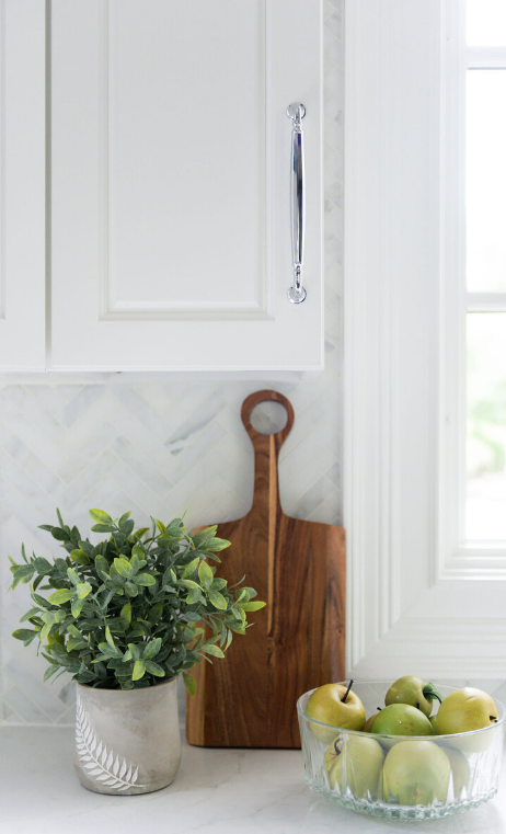
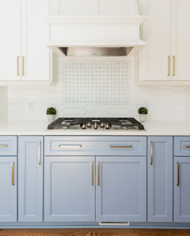
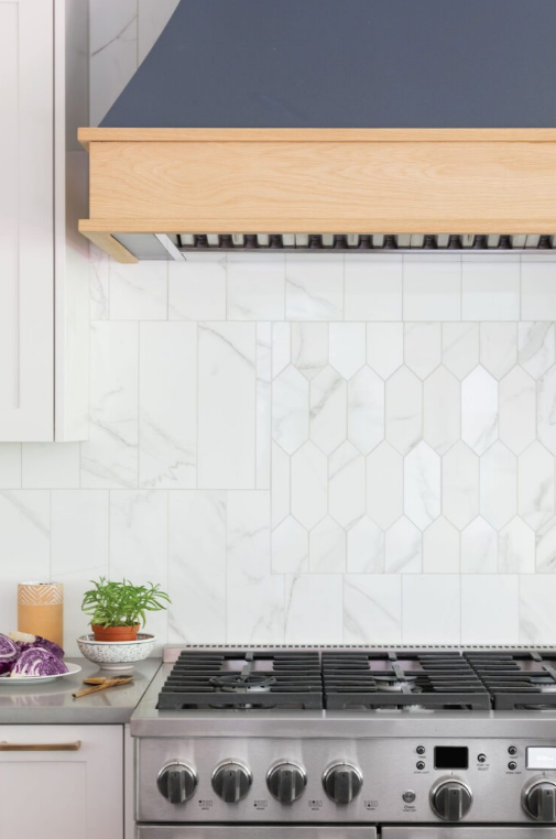
What we are seeing is a subtle use of pattern sometimes with the same tile, but just different pattern or an accent over the range. We are not seeing a busy tile in multi colors. If you want more color, opt for something not so jarring and also solid colors. Below are are some more colorful options we like.
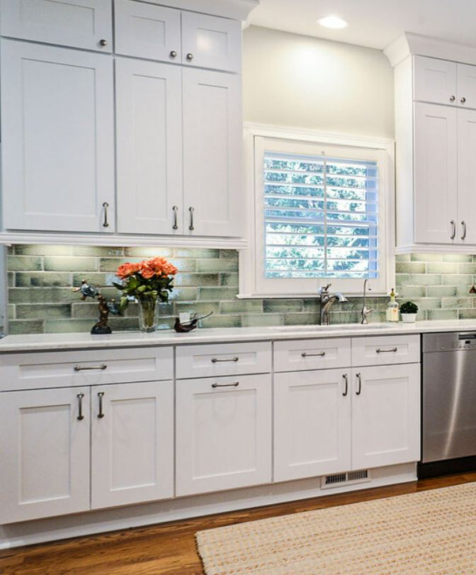
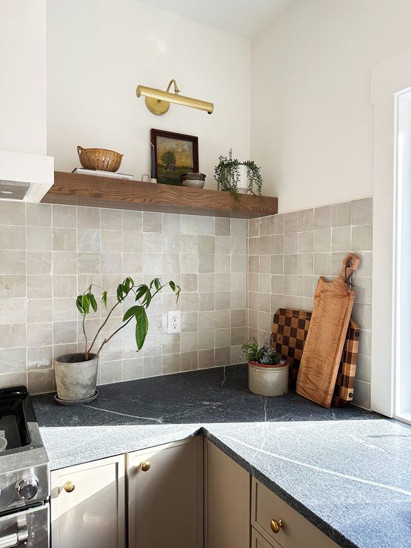
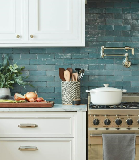
If color is what you want to see, we like the natural glazed tiles. From left to right you will see different types: Raku fired green tile, square matte beige tiles, and then glossy blue clay tiles. The variation of handmade tiles is a subtle but beautiful outcome!
We hope you enjoyed this blog with our Scary Kitchen Trends and what you can do to change them! If you need to plan a Kitchen remodel for your home, download our Kitchen Project Planner below (in the footer) and if you need help designing your new Kitchen, Check out our Kitchen Remodeling Package.
This is a great post! Packed with great design ideas ❤️
Thanks Gina!