Welcome to the Mind your Materials project, Our clients for this job have a keen eye for quality and their love for high-end wood materials was a major driving force behind this design. They wanted a space that not only looked stunning but also elevated their daily routines.
Here is where we started
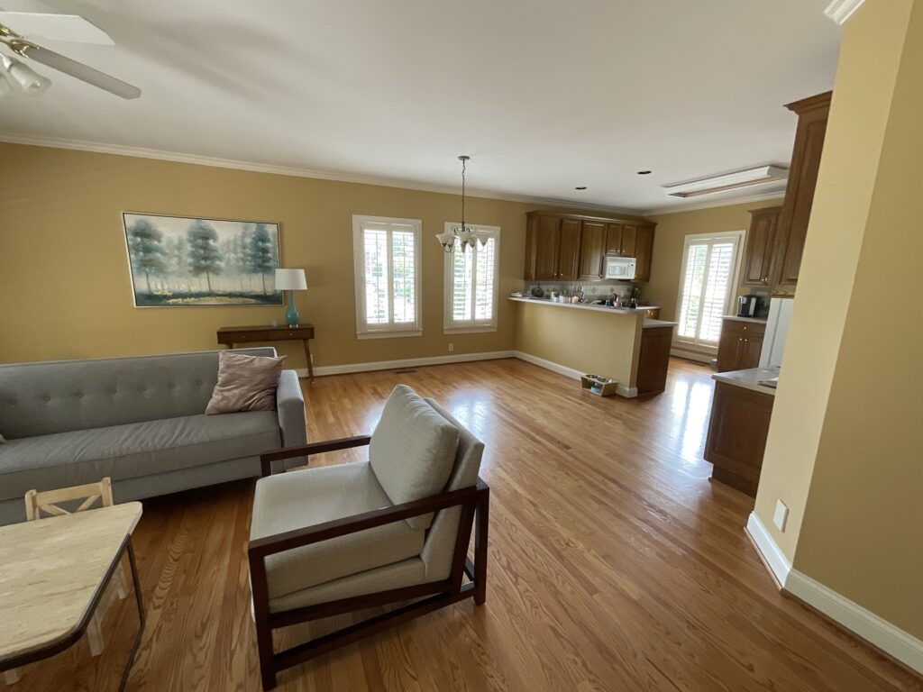
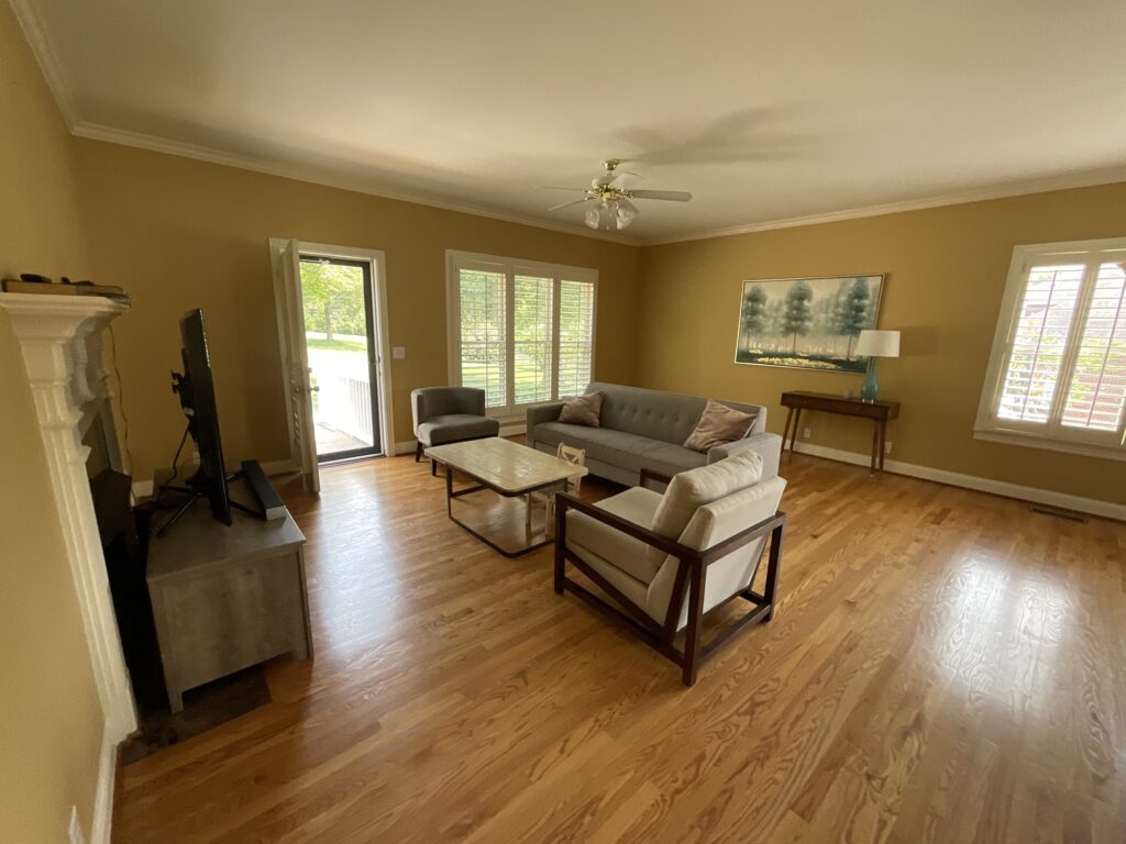
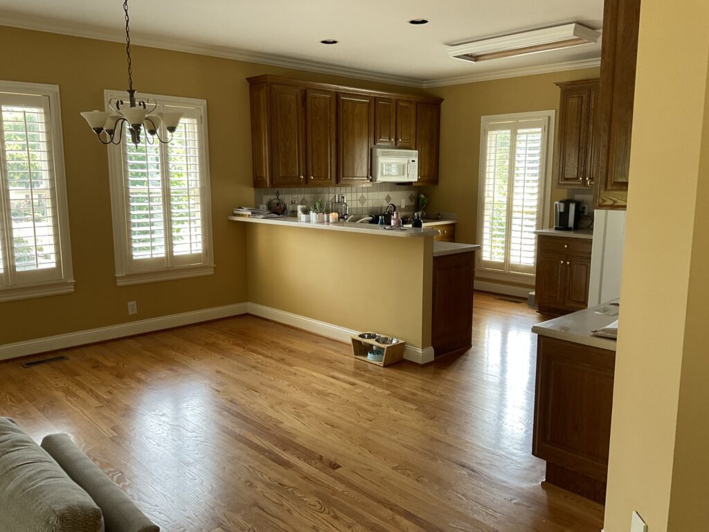
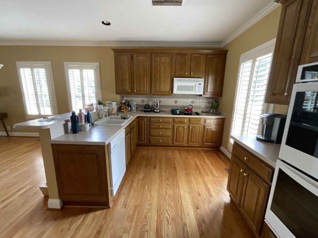
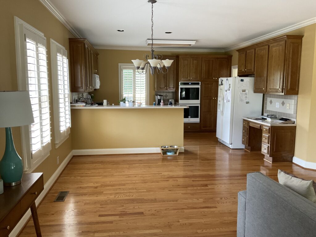
The house was built in the late 90’s and is a 2nd generation home to my client. Having grown up here, she always wondered why the kitchen was so little compared to the home. All I can say is that Kitchens had a different purpose back then. Now Kitchens are very much a part of our every day lifestyle and the main place we entertain. We need our Kitchens to be functional for our unique way of living.
Below is the existing plan and what we decided to do with it.
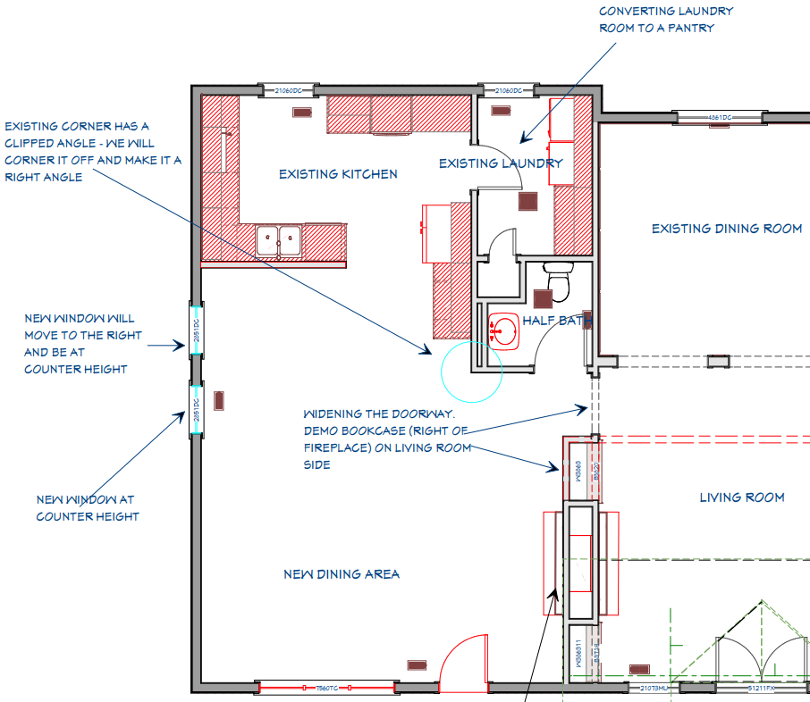
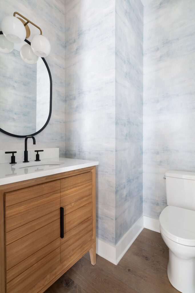
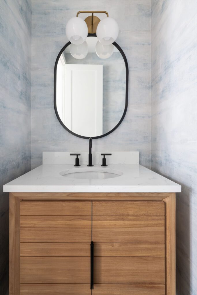
In the plan we knew that the Kitchen would expand and we would bring in a new dining area where the den was. We wanted to open up the doorway between the living room and the new Kitchen and Dining area, so they would feel more connected. We also raised the casing since the ceiling height allowed. We moved the Laundry Room to another part of the home and turned it into a great pantry. We also freshened up the powder room right next to the Kitchen with some new fixtures and materials.
The Design
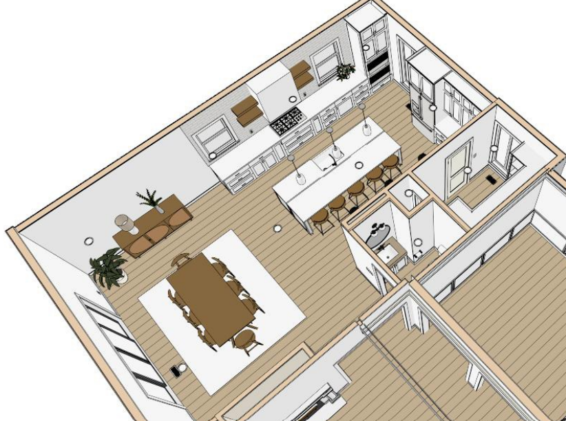
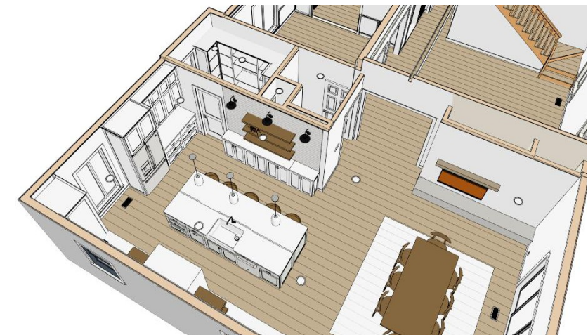
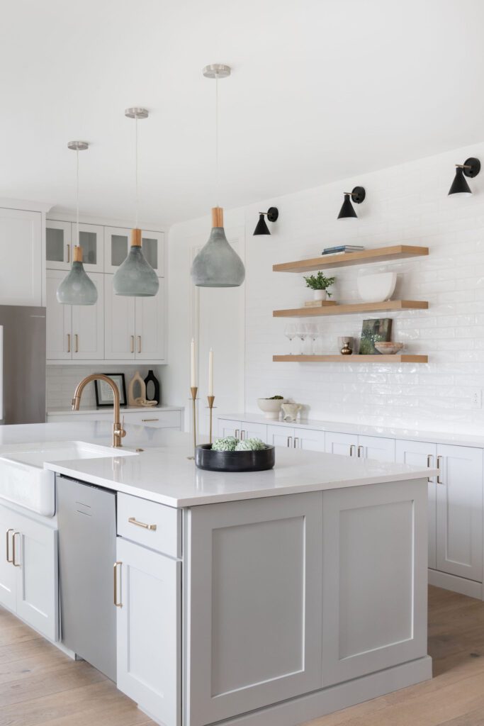
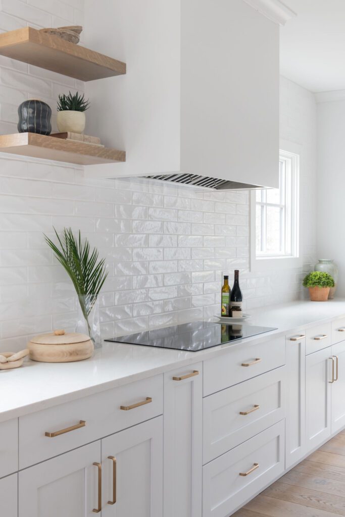
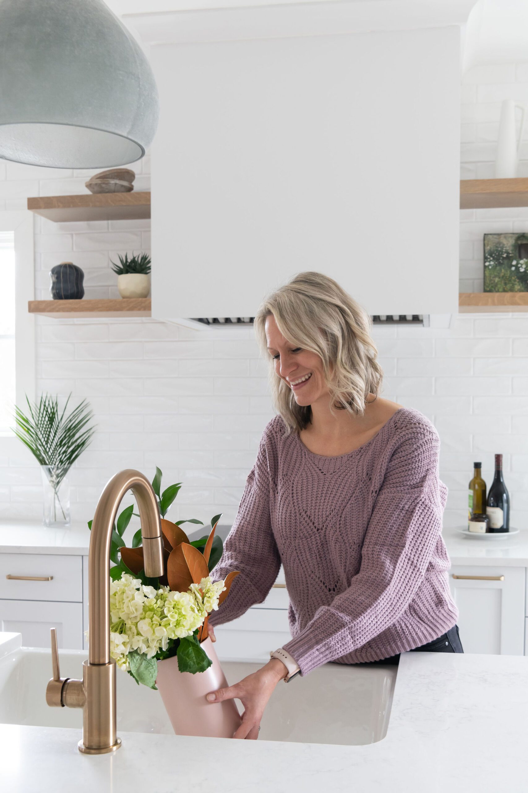
In the Design we divided the two spaces and gave each one a main focal point. For the Dining area we created a double fireplace pulling from the other side and anchoring that space. For the Kitchen portion, we used the vent hood and kept one of the windows in it’s location while making sure to put a new on in on the other side, flanking floating shelves to the hood to provide symmetry. We did have to use a slightly smaller window for the one we kept so it could accommodate a kitchen counter underneath. But overall, this made the room work!
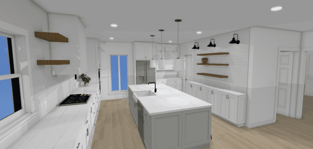
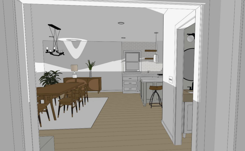
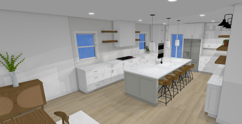
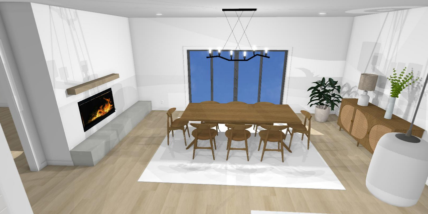
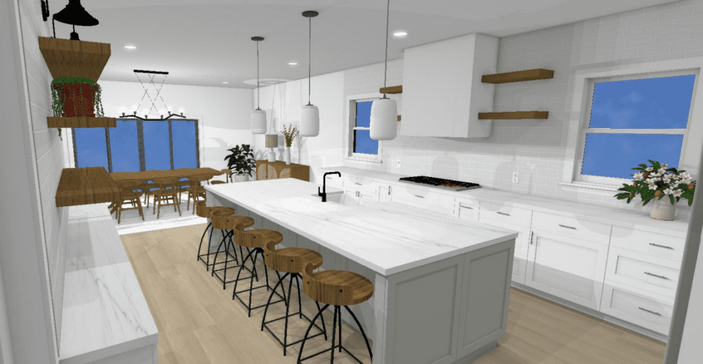
Since our client has a lot of experience with wood materials, We incorporated all new hardwood floors throughout the home that were hand picked for the best color and quality. We made sure that any other natural wood were the perfect stain compliment to the floors. For the overall design, this client loves a clean, Scandinavian palette, so we washed the rooms (along with the whole house) using soft whites and gave the island a warm gray to break it up and add definition.
Construction
At Monarch Lane we help you from concept to completion! We don’t just want to design a pretty space, but we want to make sure it is built the way we designed for you. So we make sure to attend meaningful and important site meetings and visits – ALL included in your Kitchen Design Package! We care about the finished design and we have got your back!
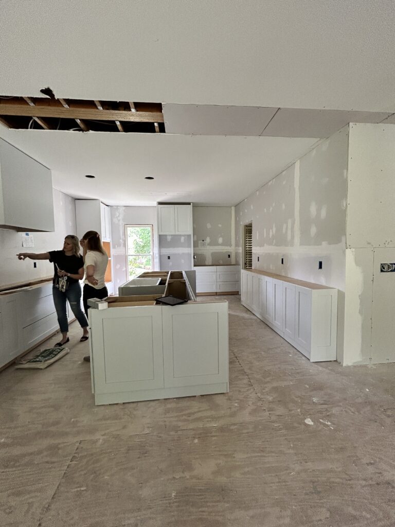
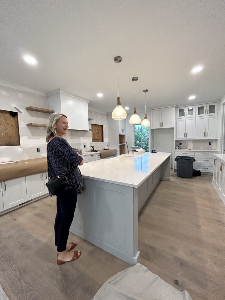
On the left you will see that we are going through details after the cabinet install and talking over next steps. The photo on the right you can see that we are almost ready, but waiting on our beautiful new windows! It’s a process, but we are here for the whole thing!
The Afters!
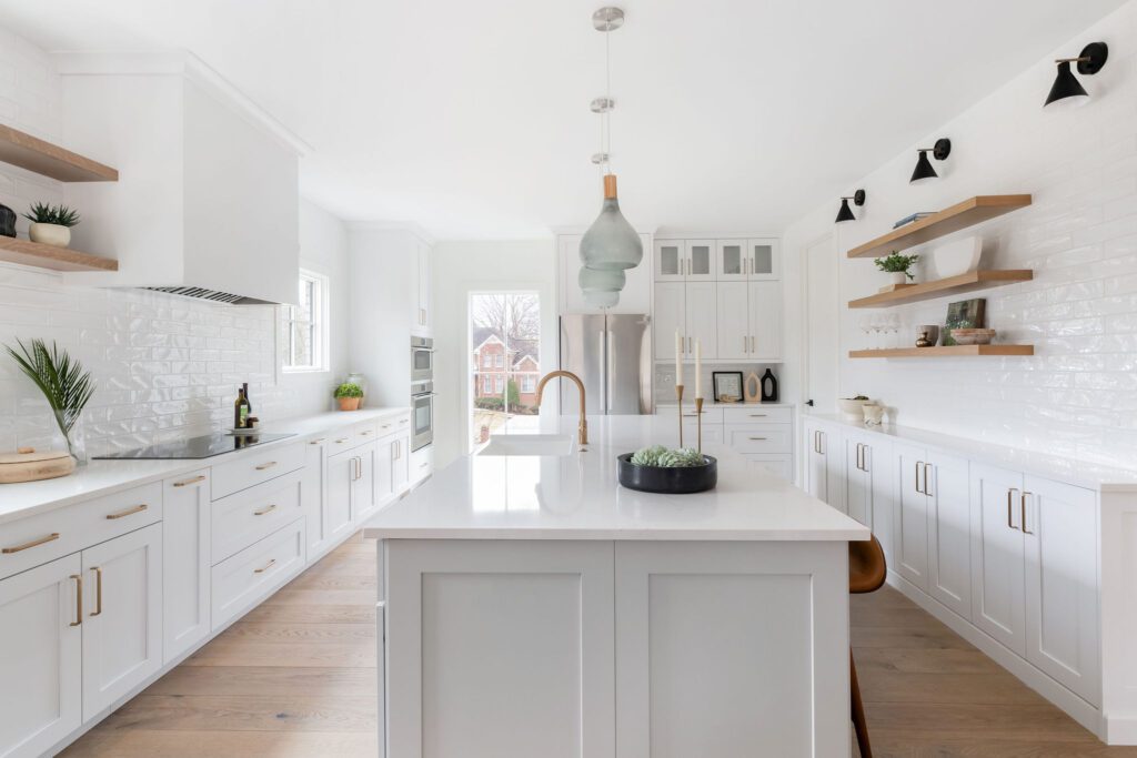
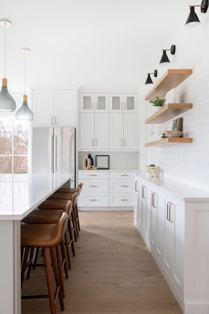
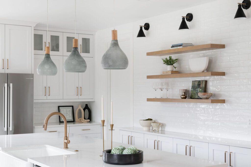
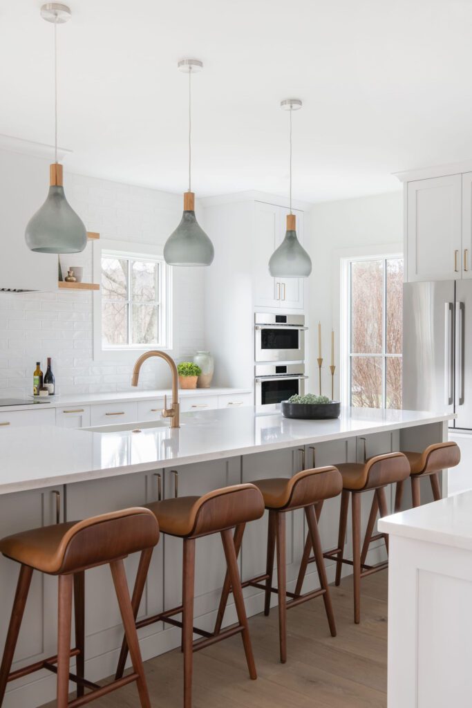
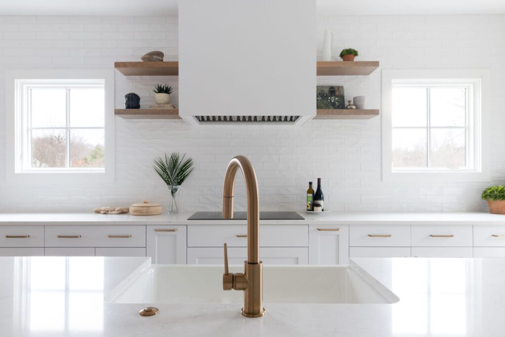
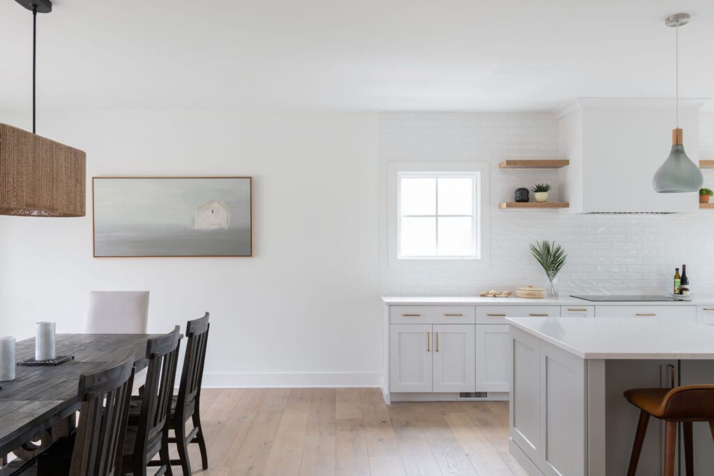
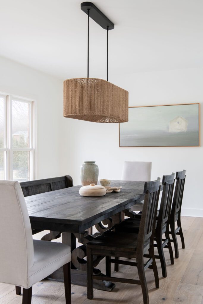
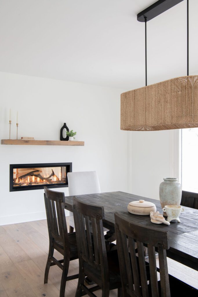
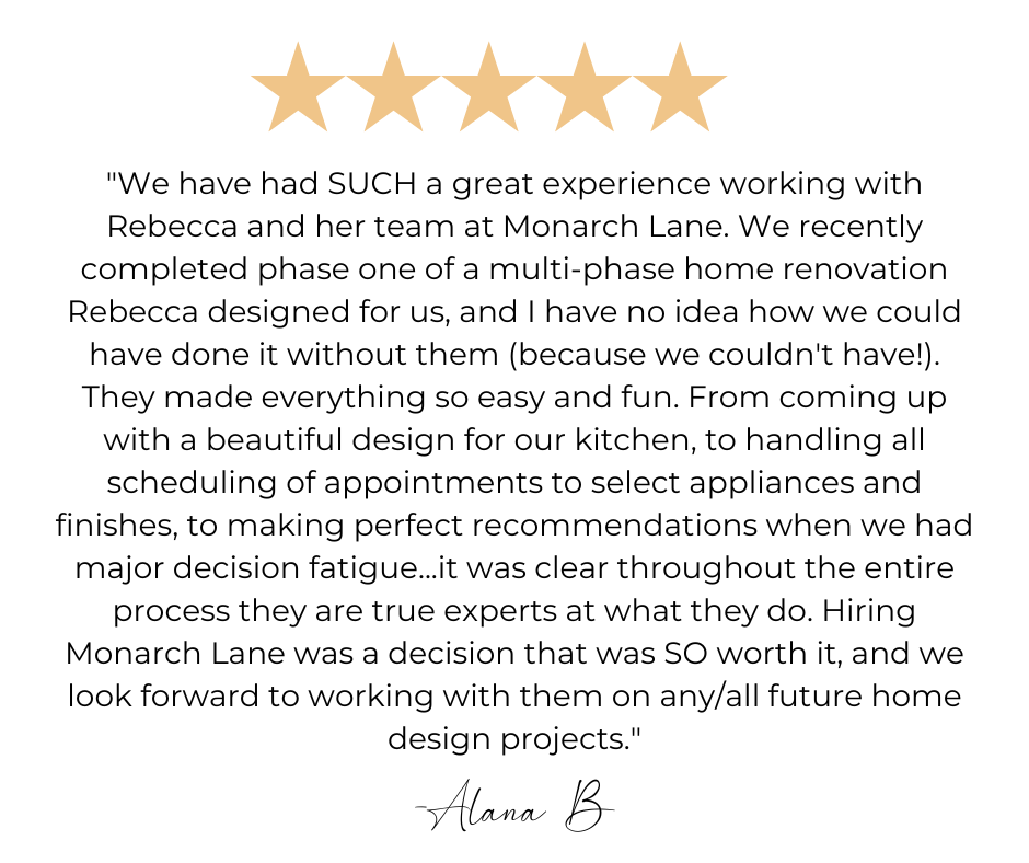
We are so excited about this transformation and cannot wait to work with our client’s on phase two! But don’t take our word for it! Here is what they had to say.
Contractor: RSU Contractors
Photographer: Allison Elefante
Are you ready to see the full potential of your Kitchen? Rebecca is a certified Kitchen and Bath Designer and specializes in making the heart of your home your favorite room in your house! Check out our Kitchen Design package here!

Be the first to comment