


Some projects are memorable because of the design. Others are memorable because of the people. This one is both.
From the moment we met our client, her joyful spirit, welcoming personality, and love of gathering with family and friends made a lasting impression. It didn’t take long before “Have you met her?” became a phrase we found ourselves saying often—and eventually, it became the perfect name for this project.
As with every home we design, the transformation didn’t begin with selecting paint colors or furniture. It began by understanding how our client lived, what she loved, and how she wanted her home to feel. Here’s a look at where the journey started.

This is where we started

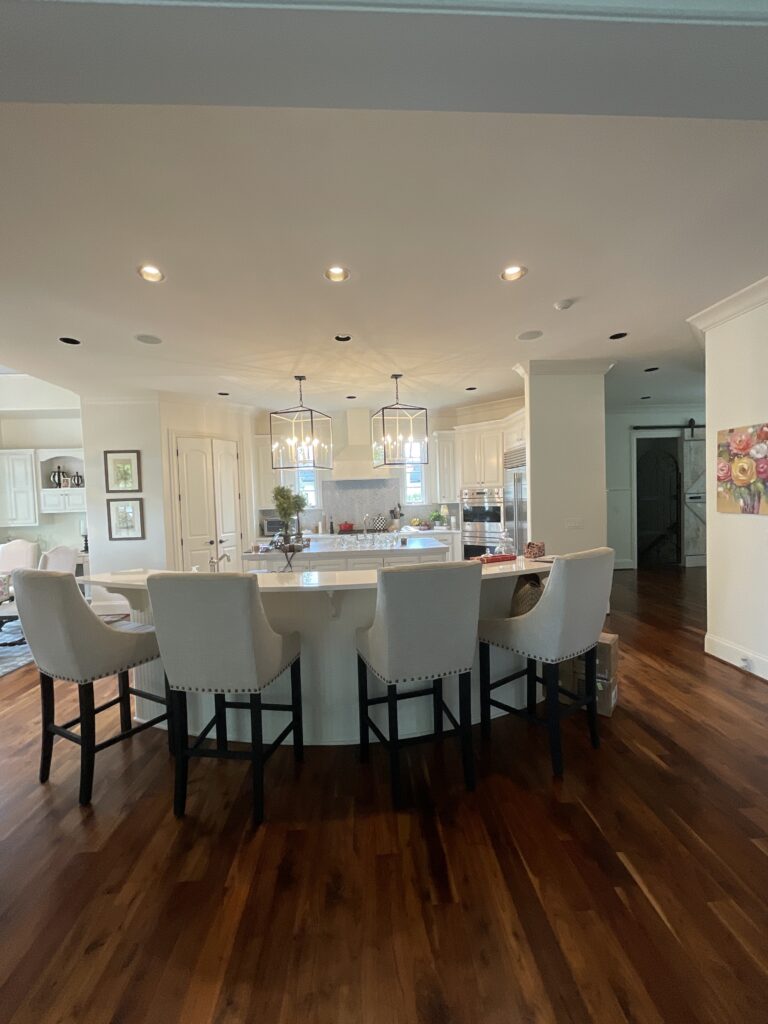
While the kitchen had plenty of square footage, it wasn’t making the most of it. A large pantry occupied valuable space, and the oversized curved island took up the center of the room while offering very little functional storage. Our goal was to rethink the layout so every square foot worked harder for the way our clients live and entertain.
The Design

One of the biggest improvements came from rethinking the pantry. Rather than allowing it to occupy valuable space within the kitchen, we relocated it to the existing butler’s pantry. By removing the interior walls and redesigning the cabinetry, we transformed that area into a much more functional walk-in pantry with significantly better storage.
This allowed us to eliminate the pantry that had divided the kitchen from the breakfast room. By opening that wall and reclaiming the square footage, the kitchen immediately felt larger, brighter, and more connected to the adjoining spaces. The new layout improves traffic flow, creates better sight lines, and gives the homeowners the open, welcoming space they envisioned for entertaining.
THE PANTRY- BEFORE AND AFTER

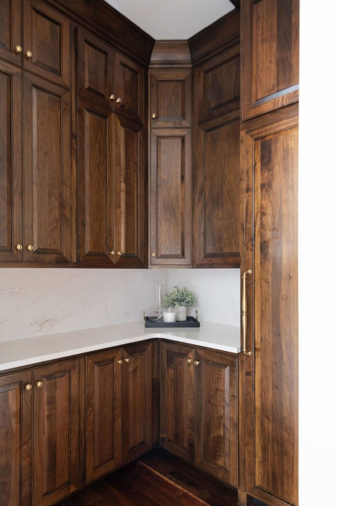
Rather than keeping a small pantry with a single wall of shelving, we removed the doorway and reconfigured the space to maximize every inch. The new layout nearly doubled the available storage while adding countertop workspace, creating a functional area for meal prep, serving, and keeping everyday appliances tucked away.
THE BUTLER’S PANTRY- BEFORE AND AFTER
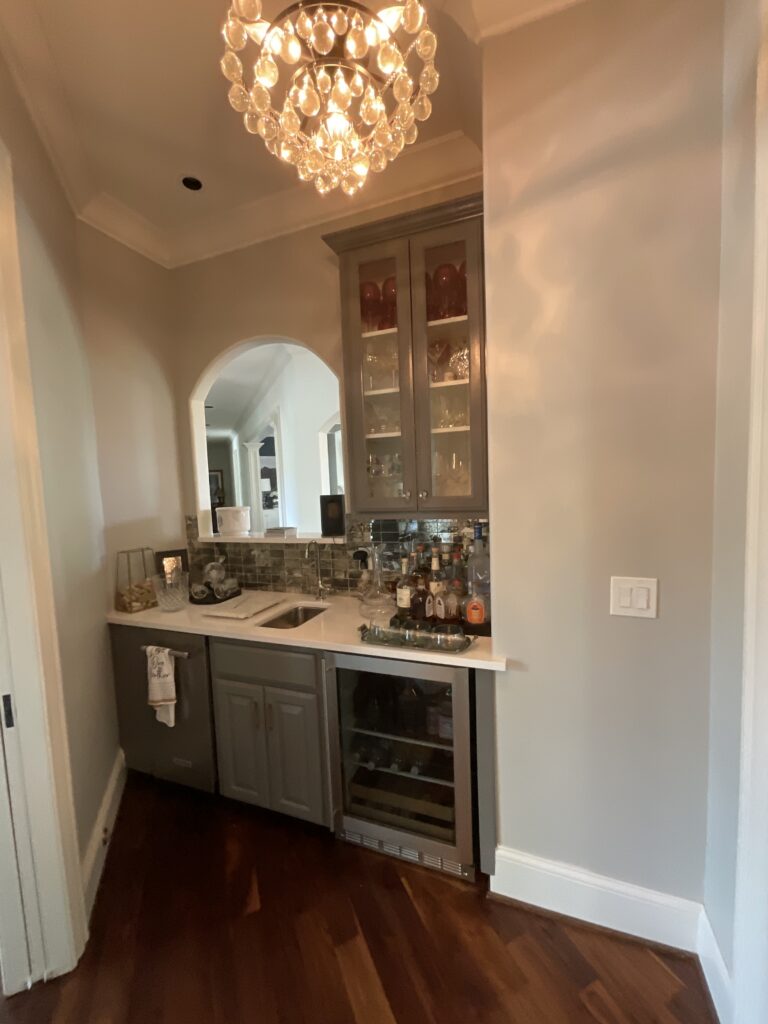

On the opposite side of the pantry is the butler’s pantry, which connects the kitchen and dining room. Originally, a pass-through window occupied this wall, but it wasn’t being used in a way that supported our clients’ lifestyle. By enclosing the opening, we were able to create additional cabinetry and countertop space, transforming the area into a beautiful and highly functional serving and storage space that better supports both everyday living and entertaining.
THE BREAKFAST NOOK – BEFORE
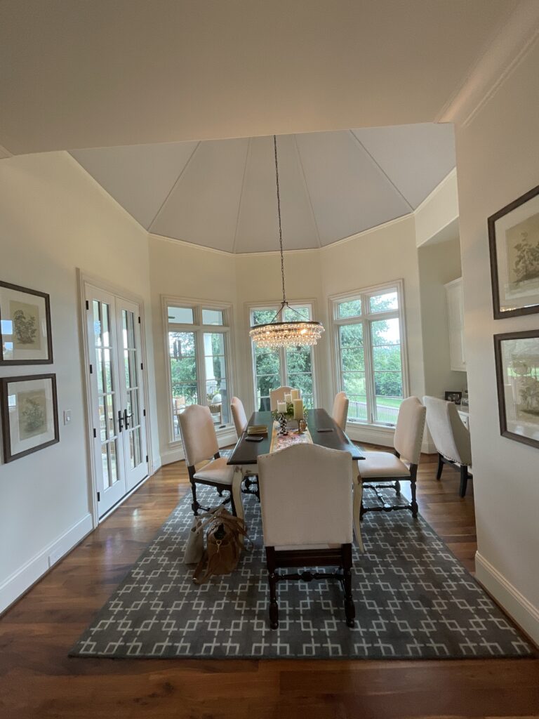

The breakfast nook felt disconnected from the kitchen, largely because the corner pantry projected into the space and interrupted the flow. It also included a built-in desk, a feature that became popular in the 1990s when kitchens often doubled as the family’s home office. Today, however, we find ourselves removing these desks far more often than designing them.
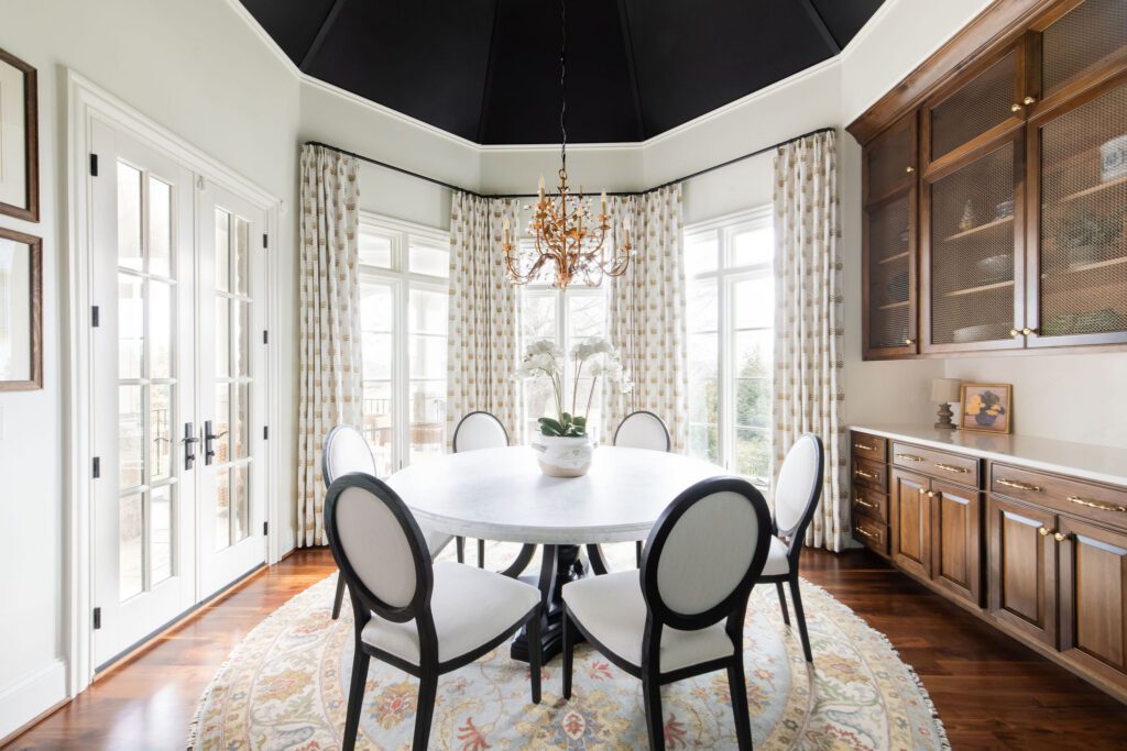
Rather than dedicating valuable square footage to a workspace that no longer suited our clients’ lifestyle, we created a custom dry bar designed for entertaining. The new cabinetry provides storage for serving pieces and beautiful pottery, while brass metal mesh cabinet doors introduce texture, warmth, and a custom detail that makes this feature feel both elegant and intentional.
To complete the breakfast nook, we introduced new furnishings, a beautiful rug, a statement chandelier, and custom drapery that soften the space and make it feel inviting. Above, the ceiling was painted a rich black to highlight the architectural details while creating striking contrast that adds depth and visual interest to the room.
THE BREAKFAST NOOK – AFTER
THE RANGE WALL – BEFORE
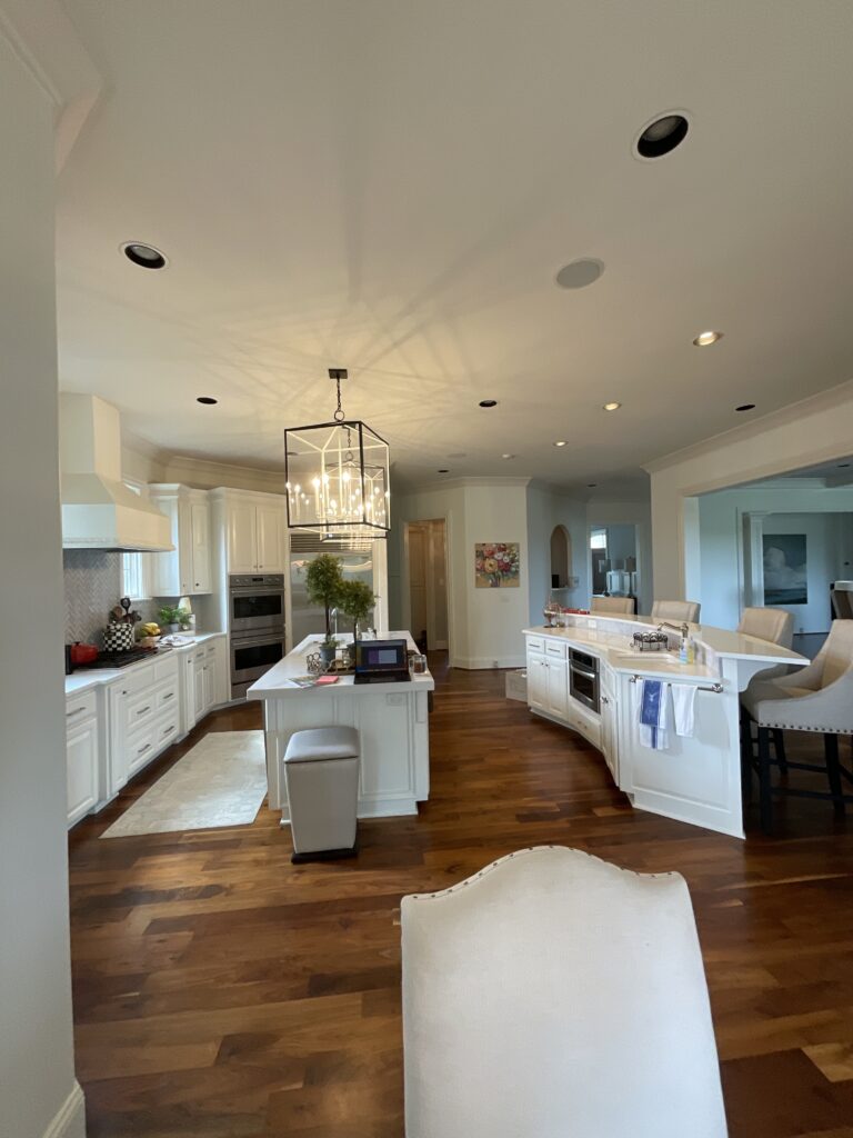

The original kitchen was filled with white and gray finishes, but it lacked the warmth, storage, and functionality our clients needed. The layout created several crowded work zones, making the space feel more confined than it actually was.
Rather than dedicating valuable cabinetry to a separate double wall oven, we chose a statement French-inspired range that became both a beautiful focal point and a hardworking appliance for everyday cooking and entertaining. We kept the range centered between the windows, preserving one of the kitchen’s best architectural features.
Removing the angled pantry and the wall oven cabinet allowed us to simplify the floor plan by straightening the perimeter cabinetry. The result is a kitchen with better circulation, more efficient storage, and a much more natural relationship between the perimeter cabinets and the island.
THE RANGE WALL -AFTER

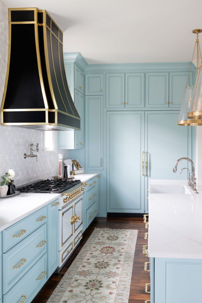
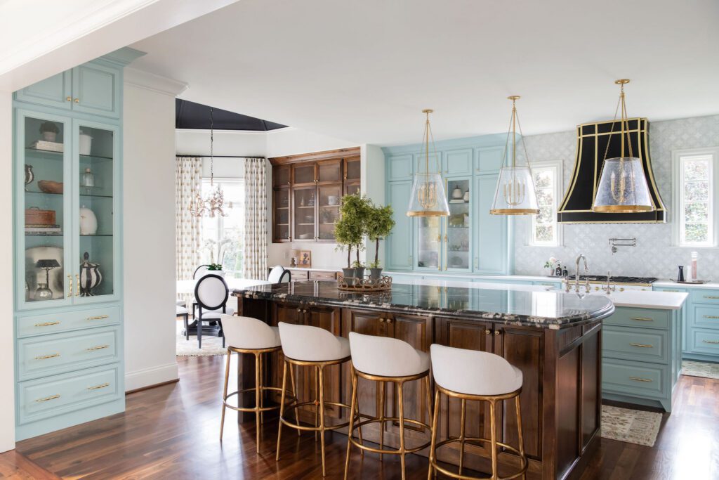
To complement the happiest shade of blue, we layered in timeless elements that add depth and sophistication. A stunning French-inspired range serves as the centerpiece of the kitchen, while a custom black metal hood creates a striking focal point that beautifully balances the softness of the cabinetry.
ISLAND #1 BEFORE & AFTER


The first island, located across from the range, serves as the kitchen’s primary work zone. While the original island was undersized for a home of this scale, the new island was designed to be a true workhorse. Its generous size provides ample space for meal preparation, baking, serving, and everyday tasks, giving the homeowners room to spread out without feeling cramped.
ISLAND #1 (BACKSIDE) BEFORE AND AFTER


On the back side of the original island, open cabinet cavities offered very little practical storage and quickly became difficult to organize. By increasing the size of the island, we were able to replace those open spaces with deep drawers that make it easier to store cookware, serving pieces, and everyday essentials. It’s a simple change that dramatically improves both organization and functionality.
ISLAND #2 BEFORE

ISLAND #2 AFTER
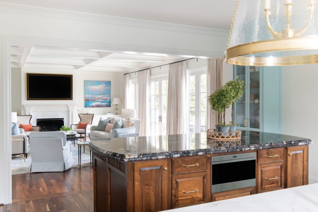
The second island was designed with entertaining in mind. Because our client enjoys sitting at bar height, we maintained a raised countertop that creates a comfortable gathering place for family and friends. To add warmth and visual interest, we introduced rich walnut cabinetry on the second island, carrying the same finish into the dry bar and pantry. This repetition of natural wood tones adds depth, breaks up the painted cabinetry, and gives the kitchen a layered, collected feel.
THE LIVING ROOM
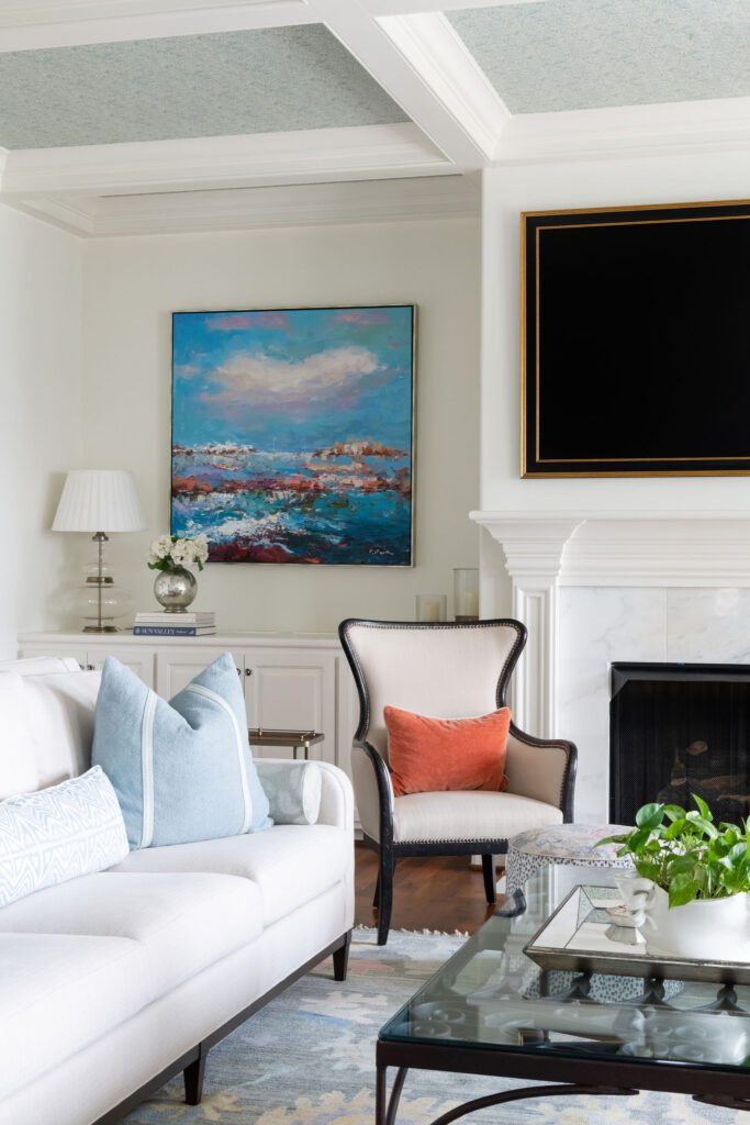
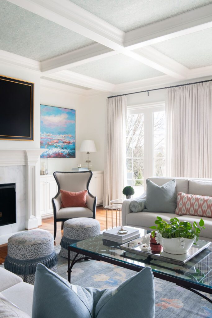
Just beyond the kitchen, the main living room continues the home’s colorful story. Rather than replacing everything, we began with a rug the client already loved and designed the room around it. New seating creates a more inviting conversation area while allowing the existing rug to remain the foundation of the space. We used different patterns and textures in the custom upholstery, pillows, ottomans, and drapery. We commissioned the perfect artwork to finish off the room.
To add another layer of character, we wallpapered the coffered ceiling, introducing pattern and subtle movement overhead while giving a nod to the cheerful blue cabinetry in the adjoining kitchen. Throughout the room, soft waves of blues and greens create a seamless connection between the two spaces.
One of our favorite discoveries came from elsewhere in the home. Tucked away upstairs was a beautiful French gate coffee table that had been waiting for the perfect place. We gave it new life in the living room, where it beautifully complements the home’s French-inspired aesthetic and adds a sense of history that makes the space feel collected rather than decorated.


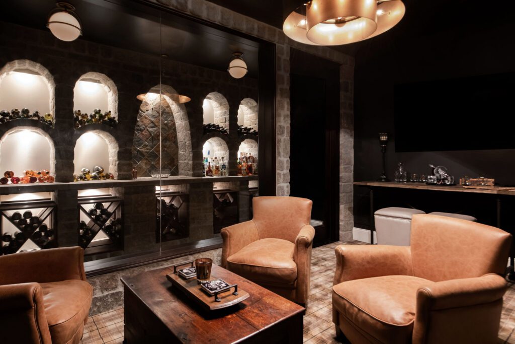
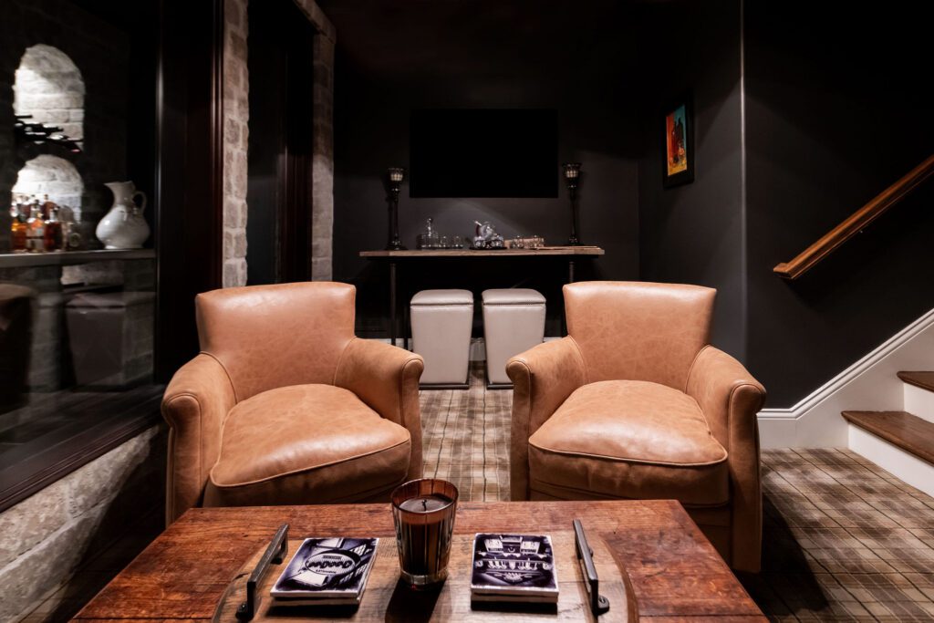
THE BOURBON LOUNGE BEFORE & AFTER

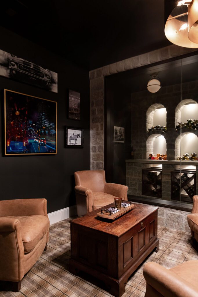
While the main level celebrates light, color, and gathering, the downstairs bourbon lounge was designed to embrace a completely different mood. The original space was bright, but it lacked the warmth and intimacy that invites you to settle in with a favorite bourbon and good conversation.
To create that atmosphere, we wrapped the room in a rich caviar black, painting both the walls and ceiling to establish a cozy, sophisticated backdrop. Underfoot, wall-to-wall plaid carpet introduces texture and timeless character, while a thoughtfully arranged four-person seating area encourages lingering long after the evening begins.
Every detail was intentionally curated, from the artwork that sparks conversation to the updated lighting that creates a warm, layered glow throughout both the lounge and the adjoining wine room. The result is a space that feels refined, inviting, and perfectly suited for slow evenings shared with family and friends.

Every client is different. Every home has its own story. And every space deserves a purpose and personality that reflects the people who live there. That’s what we love most about design. It’s never about following trends or creating rooms that simply look beautiful in photographs. It’s about understanding how our clients live, what brings them joy, and designing spaces that support those moments every day.
“Have You Met Her?” is more than a kitchen remodel or a home refresh. It’s a home that now feels every bit as vibrant, welcoming, and unforgettable as the woman who lives there. And for us, that’s always the greatest measure of a successful design.
If you’re dreaming of a home that reflects your personality and transforms the way you live, we’d love to help you begin that journey.

Click here to see the rest of the after photos
Builder: Mike Sloan
Photographer: Allison Elefante




Be the first to comment